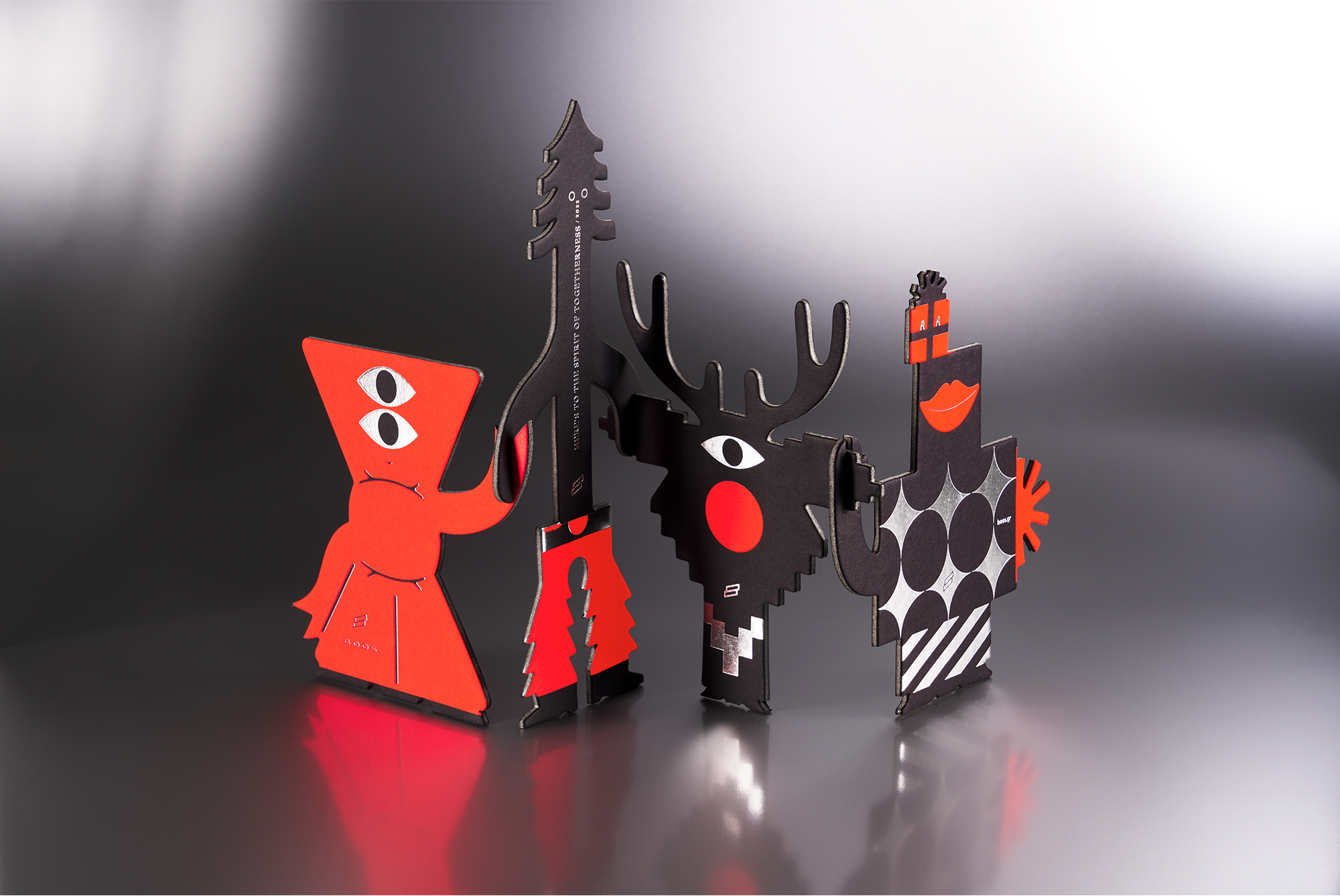
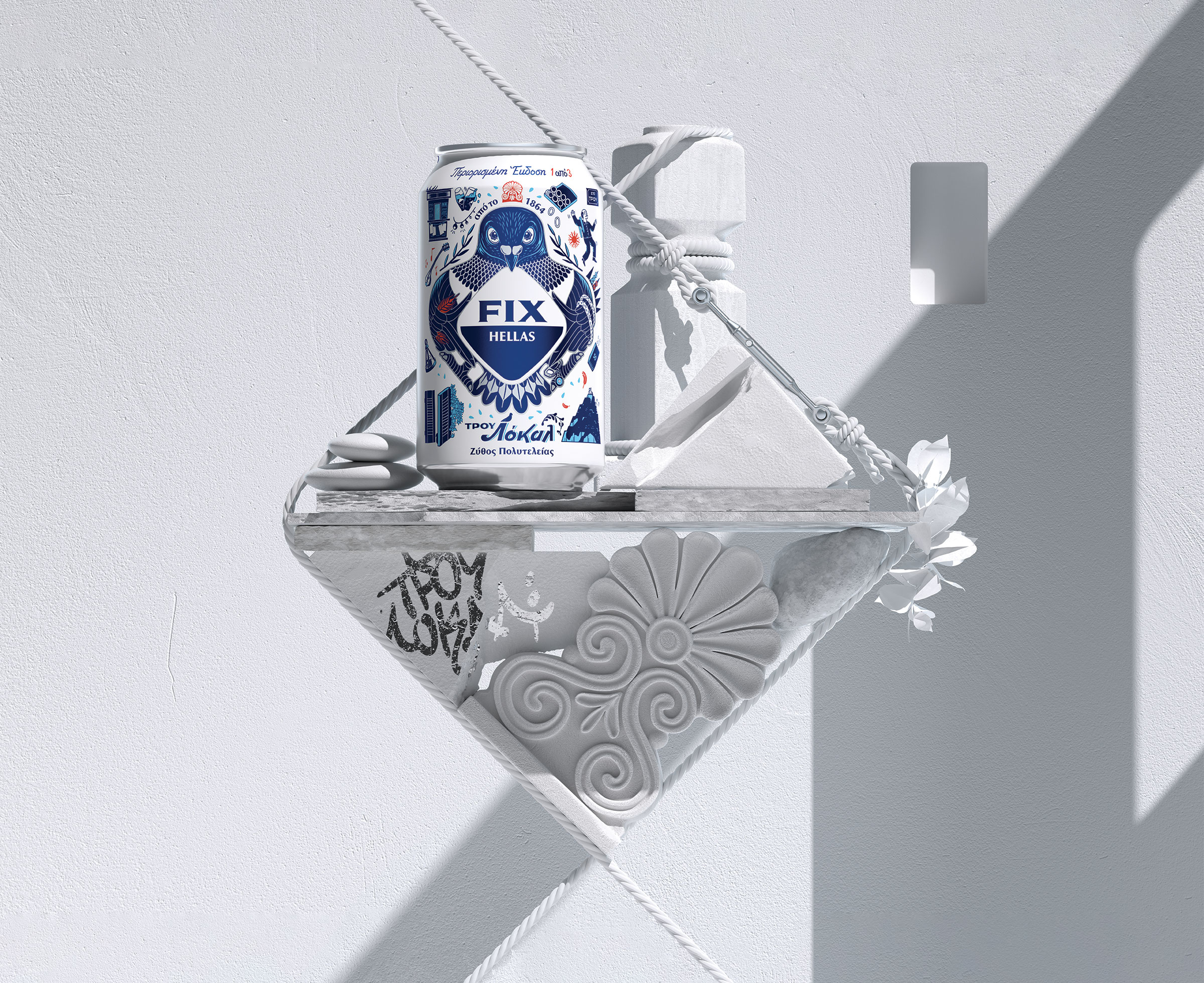
Press Kit
Unlock Locality
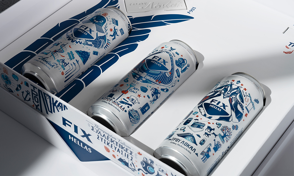
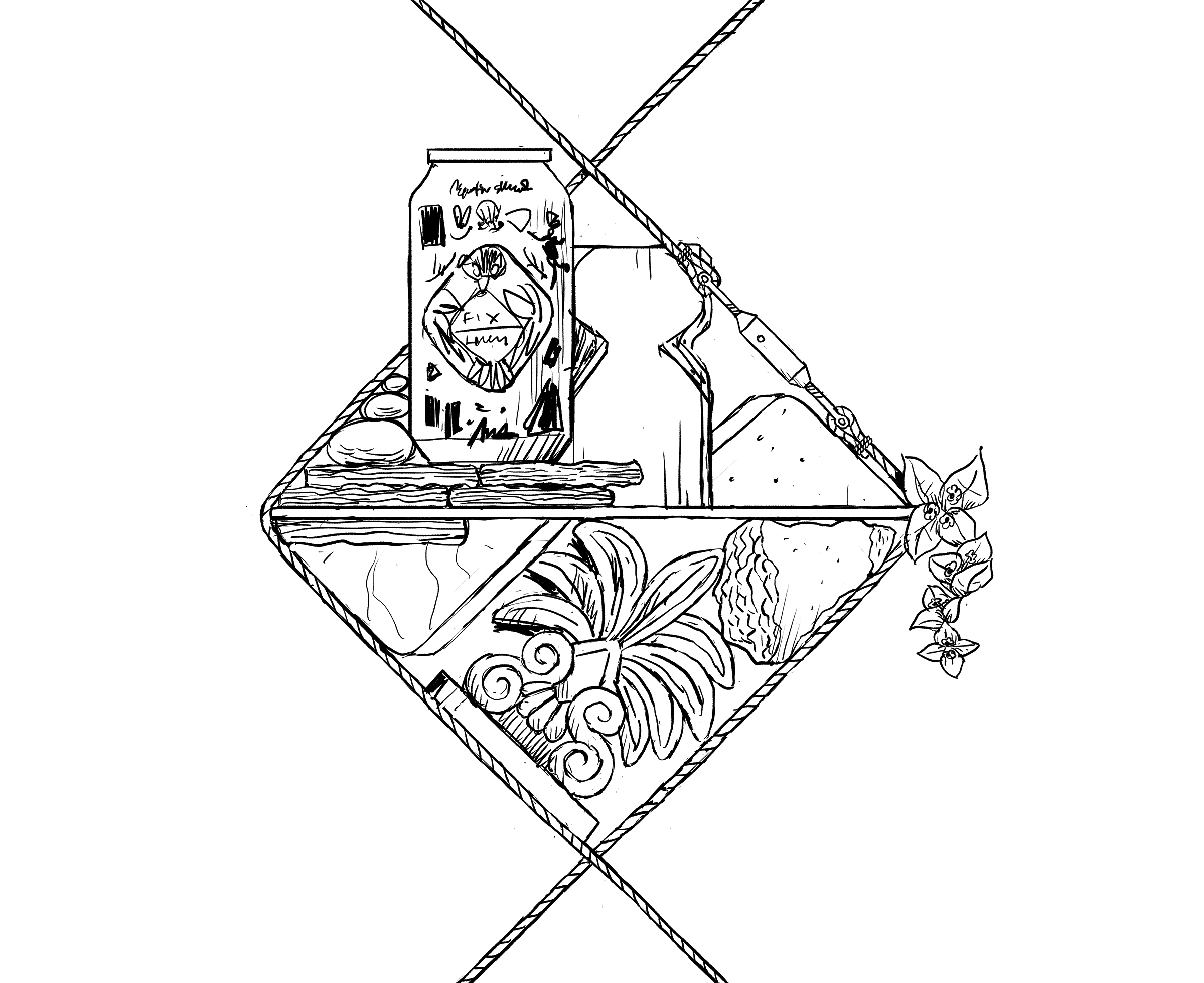
As a part of the new brand world, we created the press kit for the
TRUE LOCAL campaign.
We formed a custom-made kit in the shape of the rhombus, in order to further enhance the experience that the receiver will get.


Discover full study on your desktop
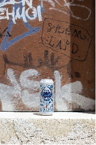
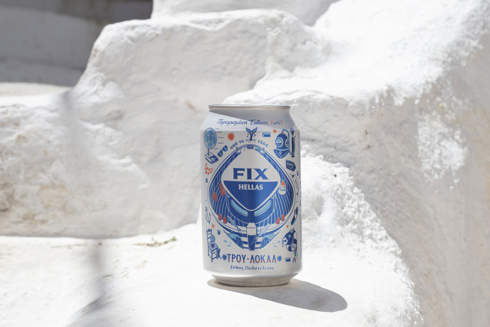
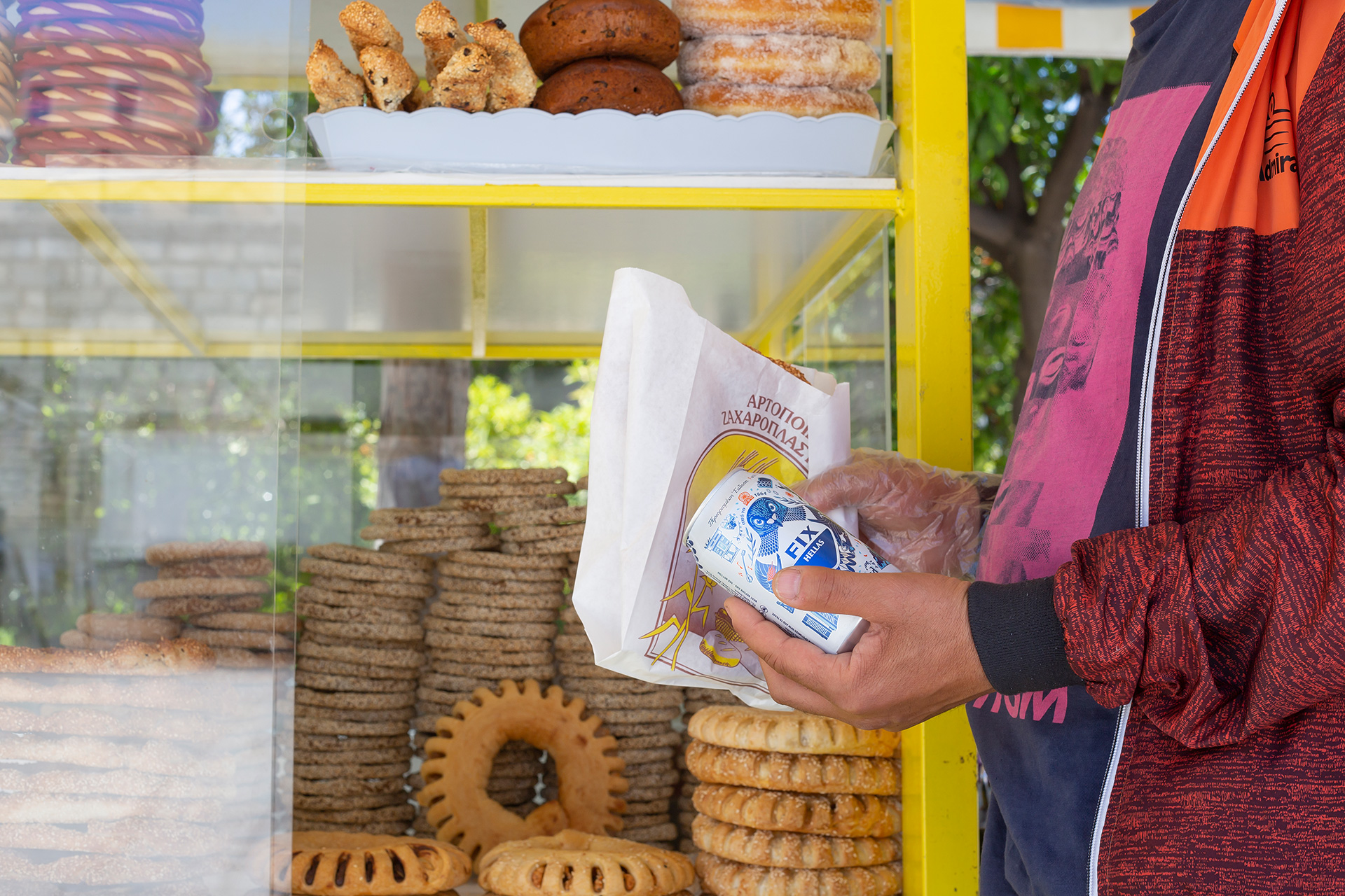
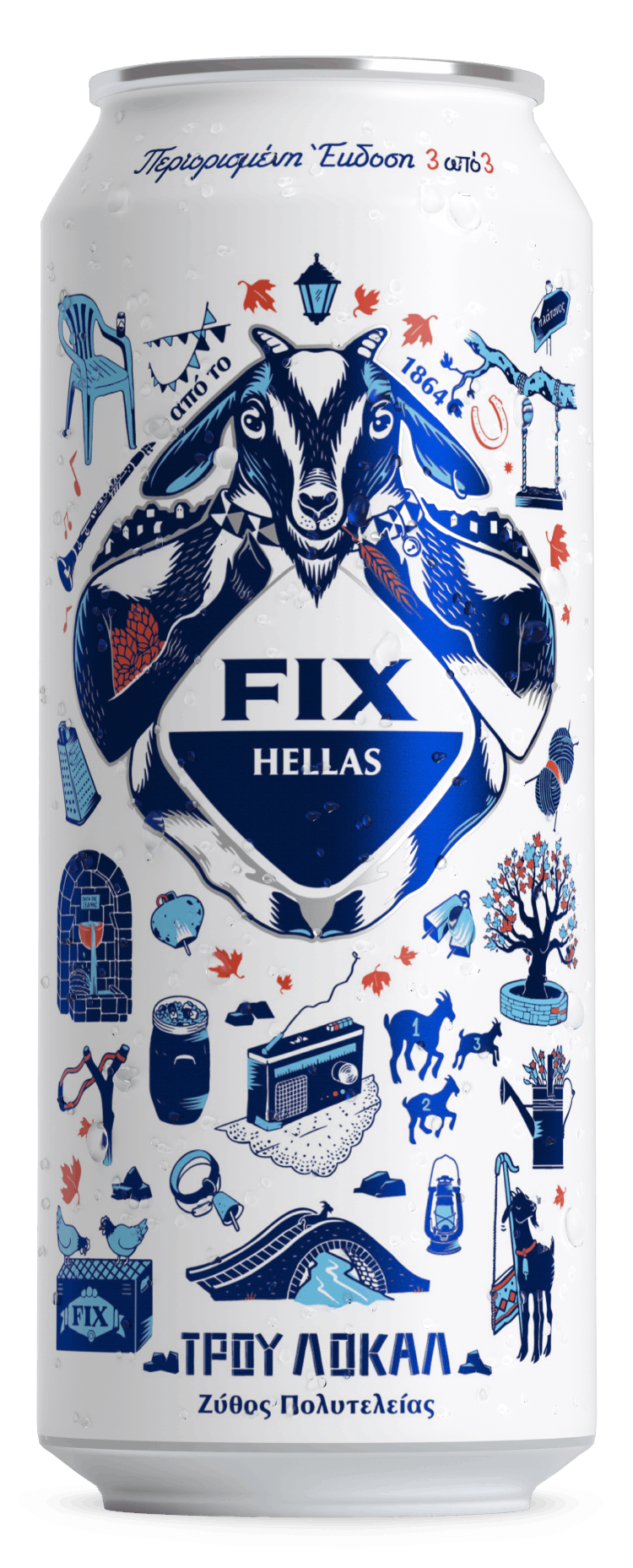
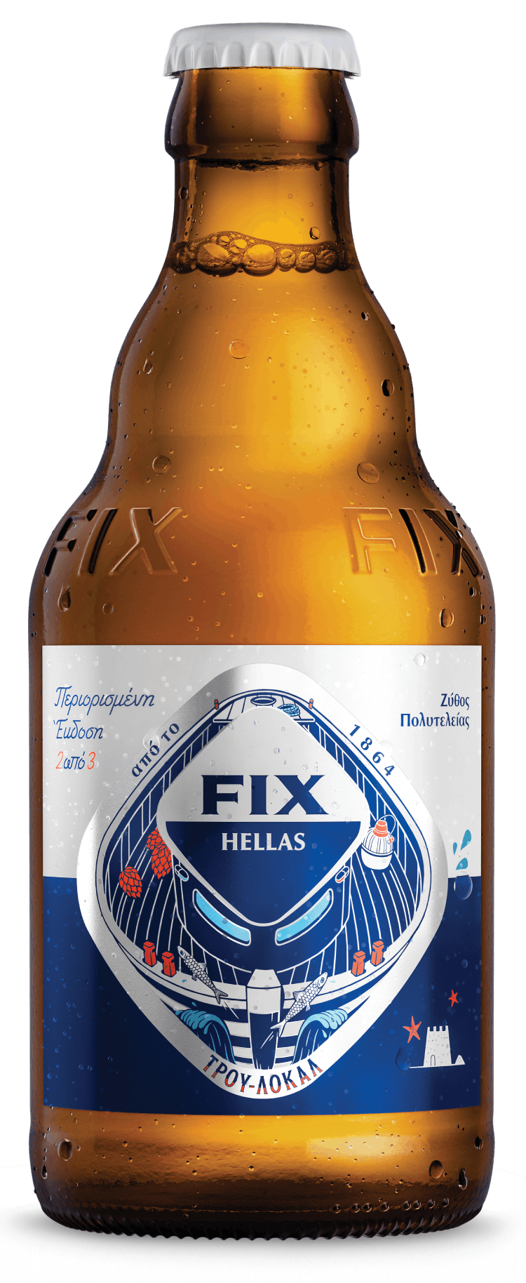
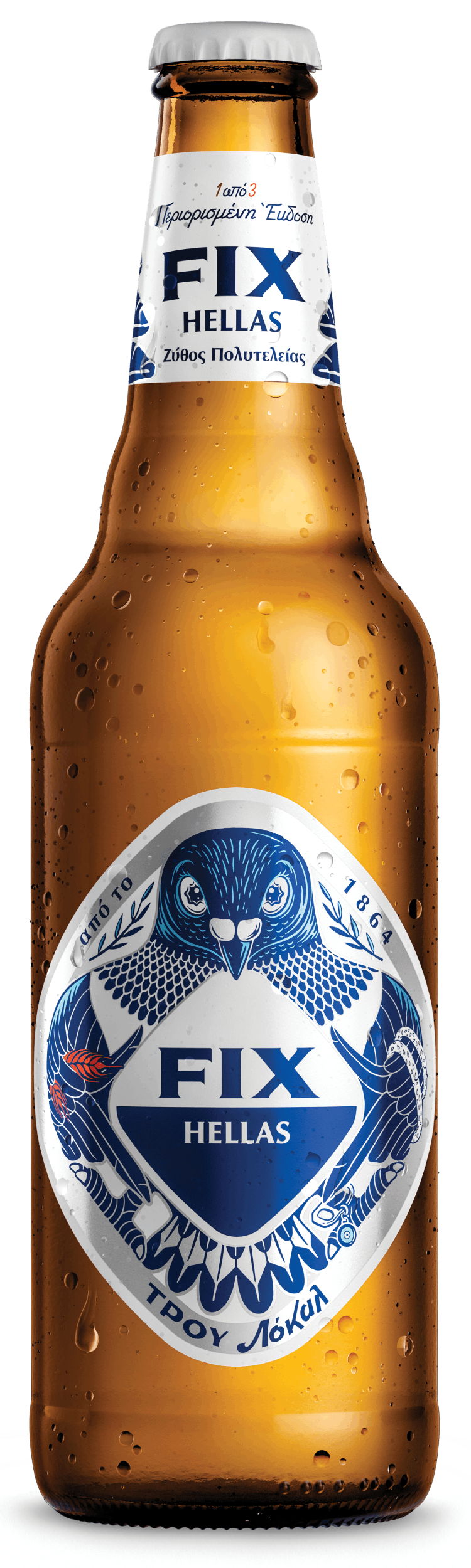
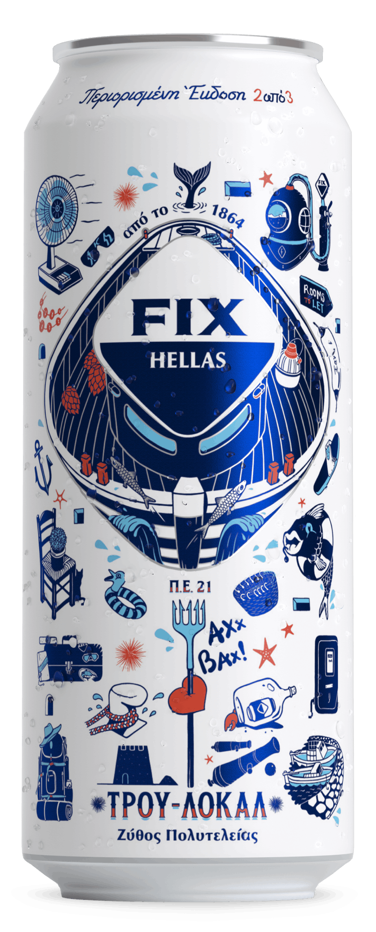
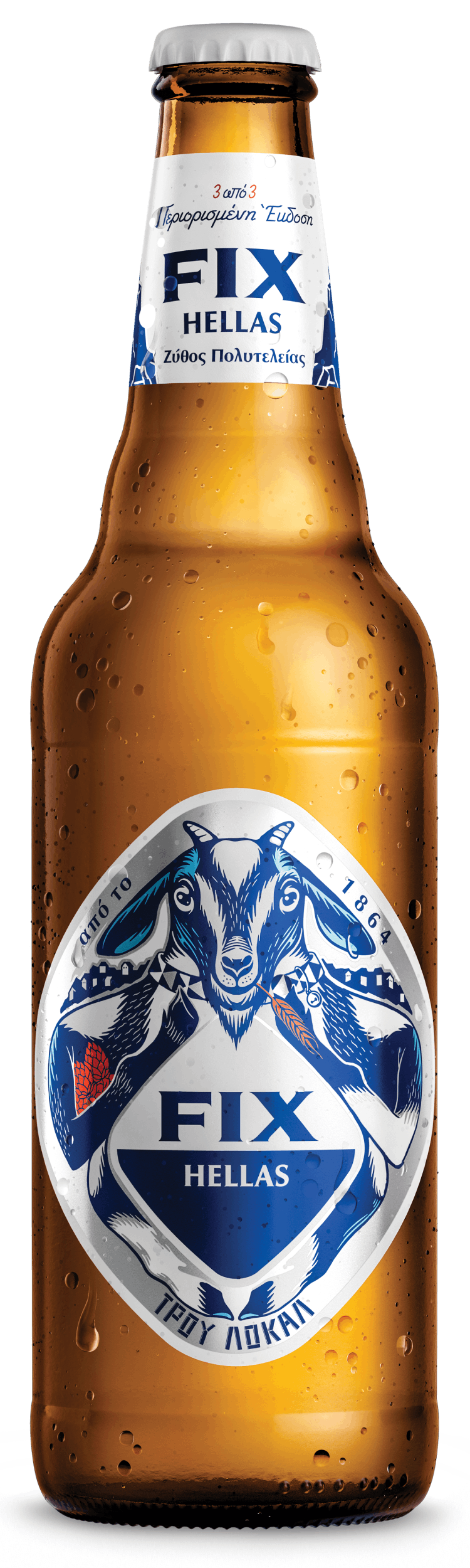
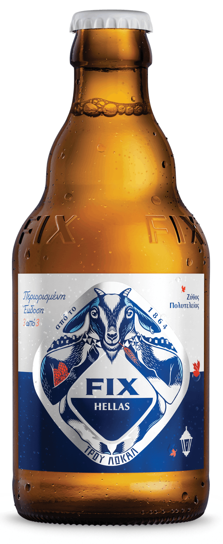
Fix Hellas is the first Greek beer and that makes it a vital part of the Greek culture. It is a symbol of togetherness, as it is present at any gathering, regardless of whether it’s large or small and scheduled or a spontaneous one. It makes sense that a brand that is so emblematic needs to always find new ways to communicate with young audiences, while staying faithful to its roots.
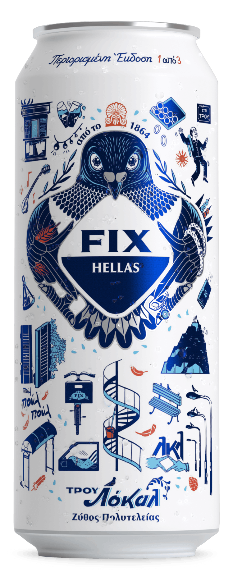
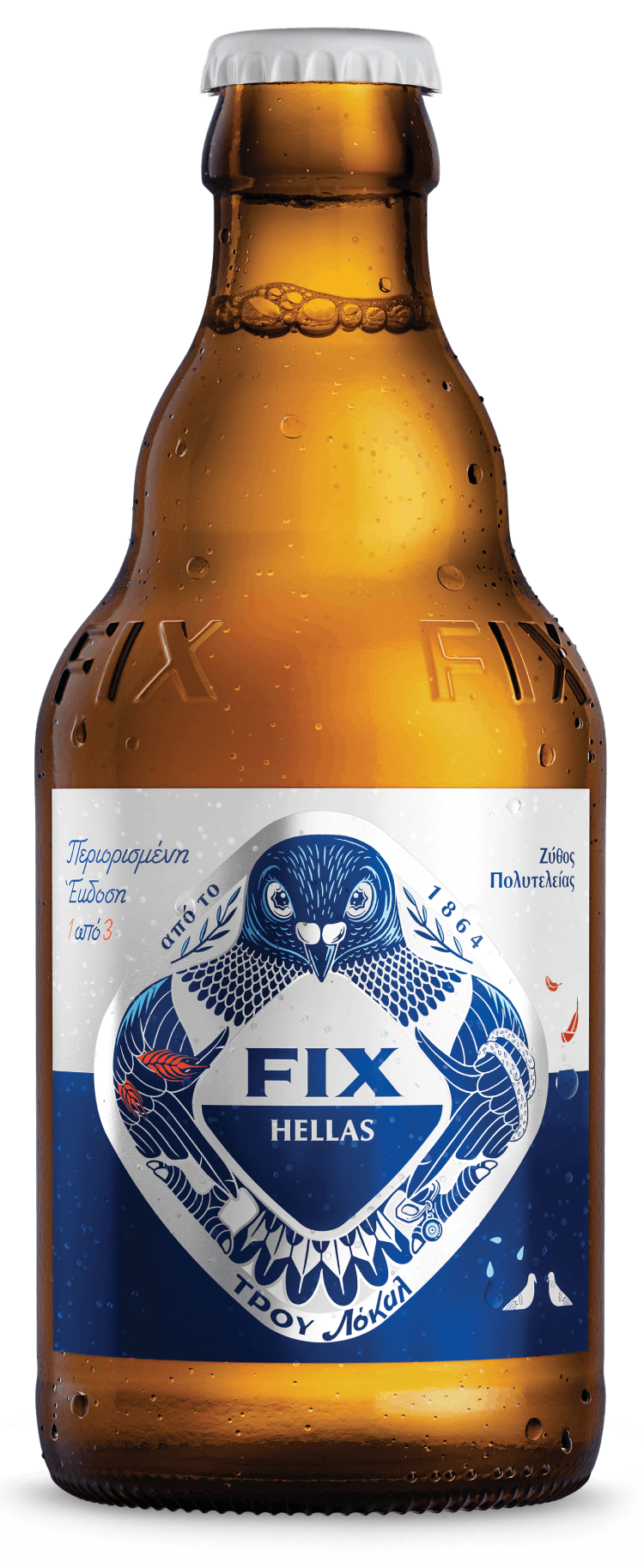
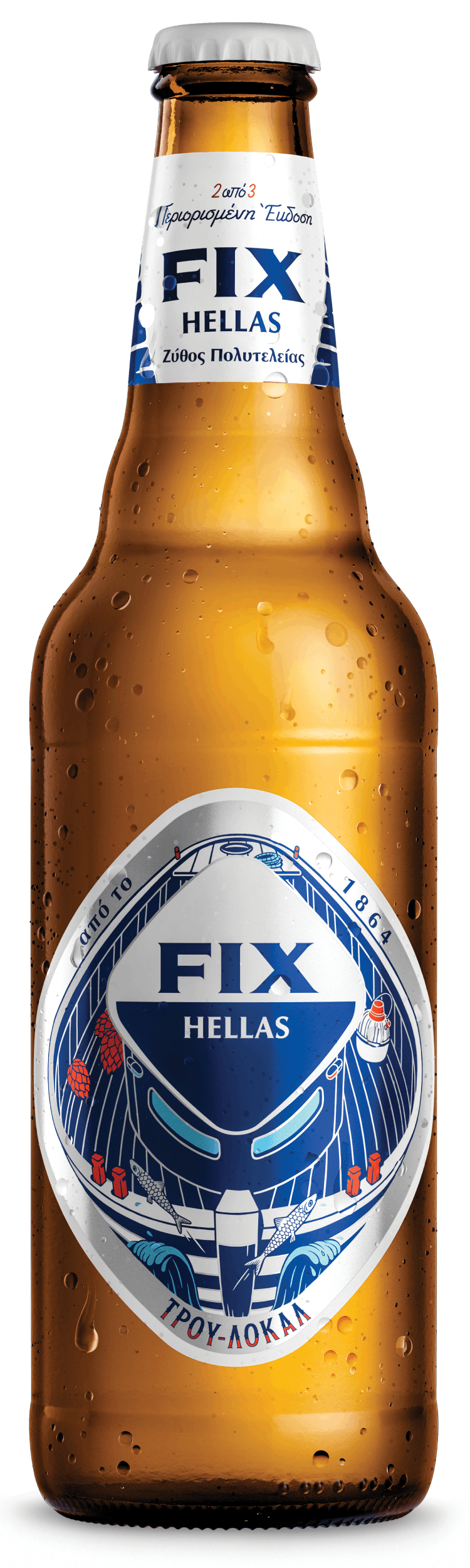
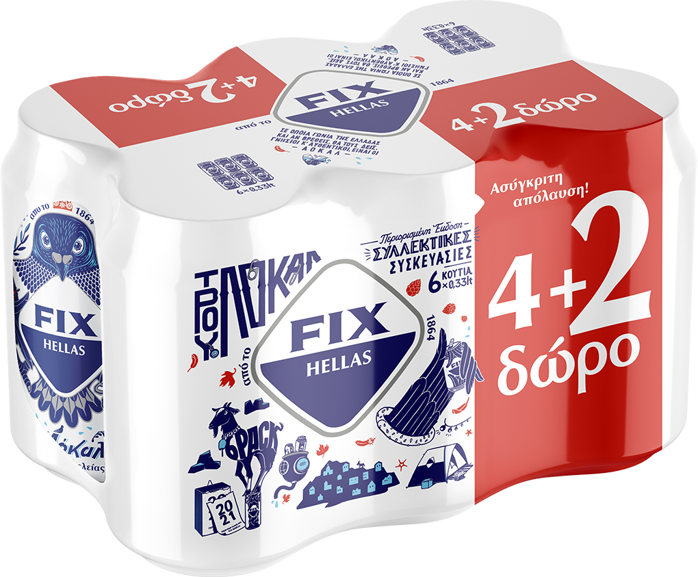
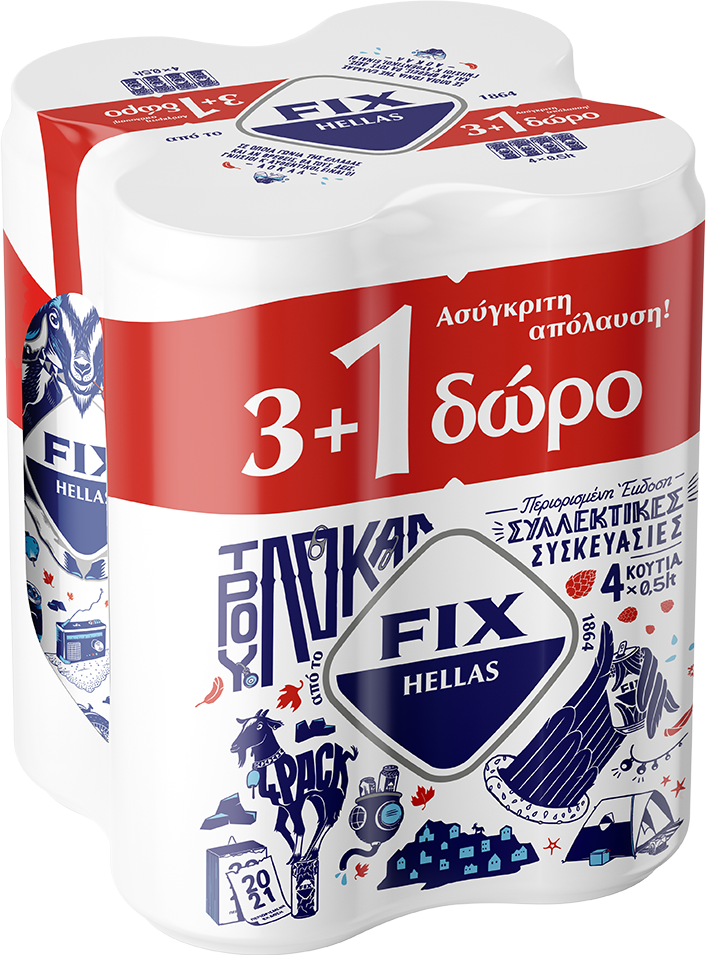
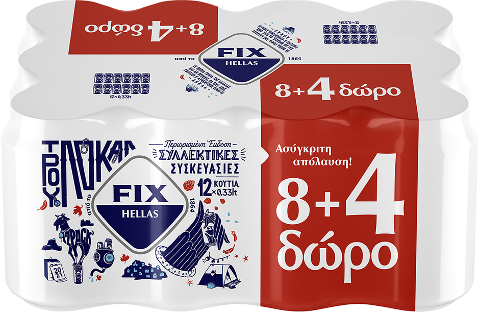
As we were asked to design its new limited series of collectible packages in a way that unlocks the communication with a younger audience, our source of inspiration was the unlimited Greek terrain, which led us to discover the hidden locals of each area. Locality is the equivalent of authenticity.
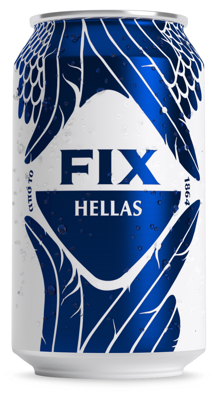
It’s where you’ll find the elements that define the culture of a place; not those you’ll encounter in postcards or tourist guides, but spots and activities that are known only to natives. The color palette of FIX Hellas is maintained with small variations. The blue color is redefined and the same happened with the white, which turned into matt in order to offer a sense of uniqueness to the packaging. Cyan and terracotta were added to the palette, as these are colors you can meet in the Greek terrain.
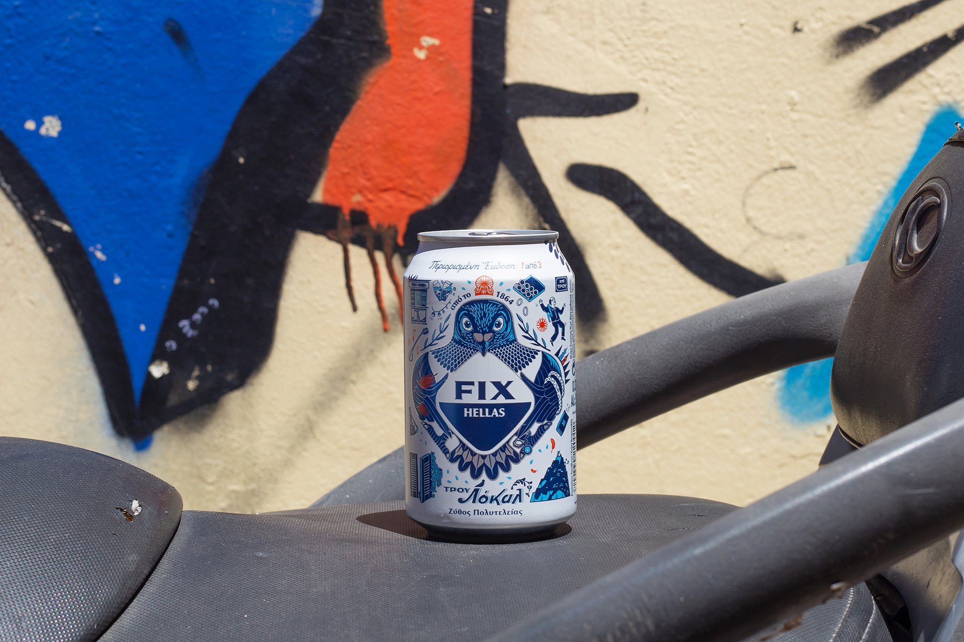
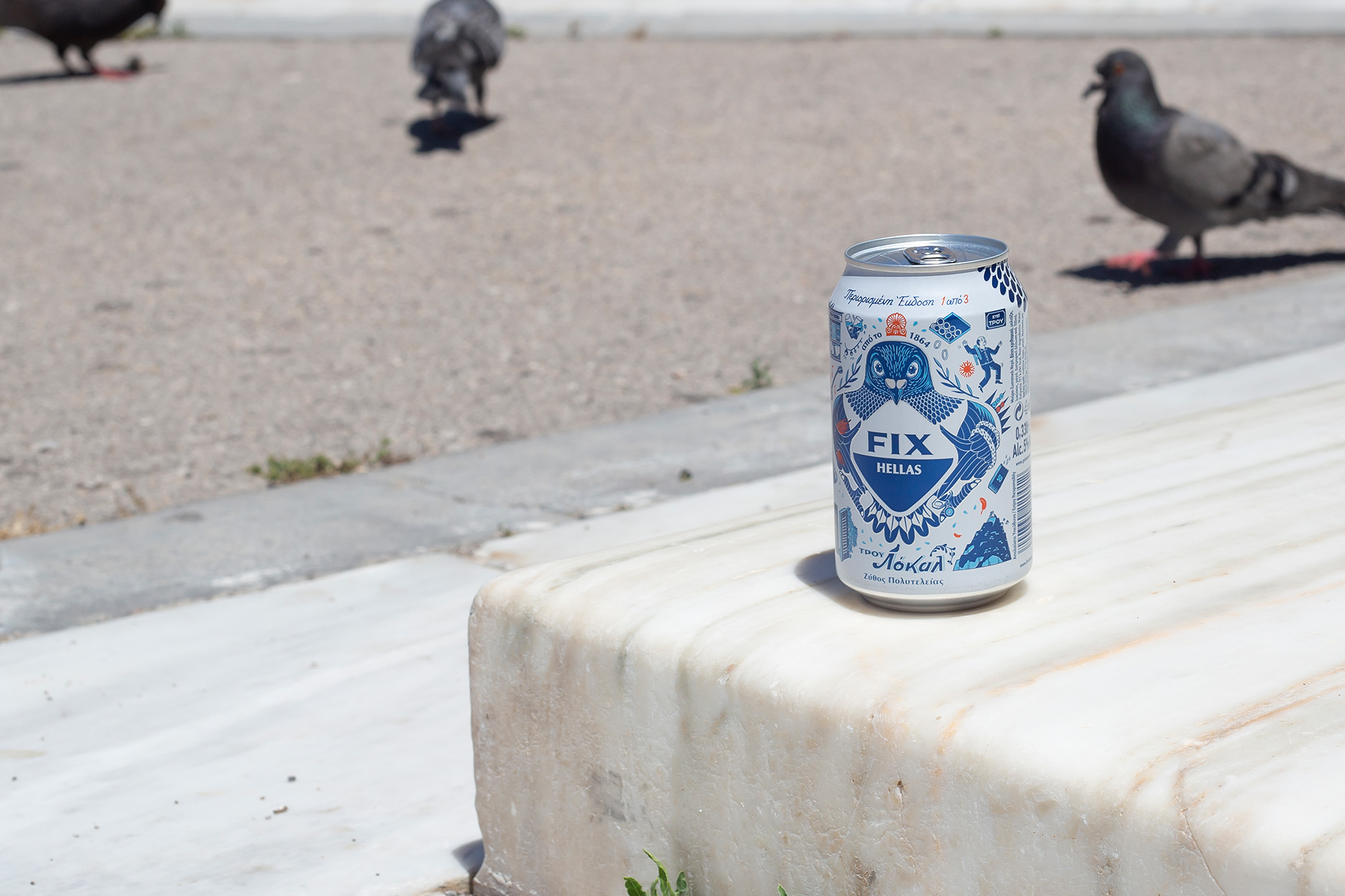
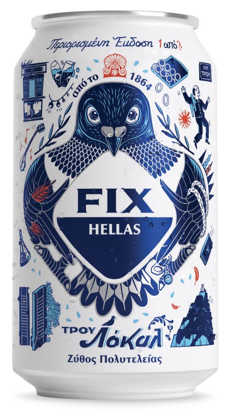
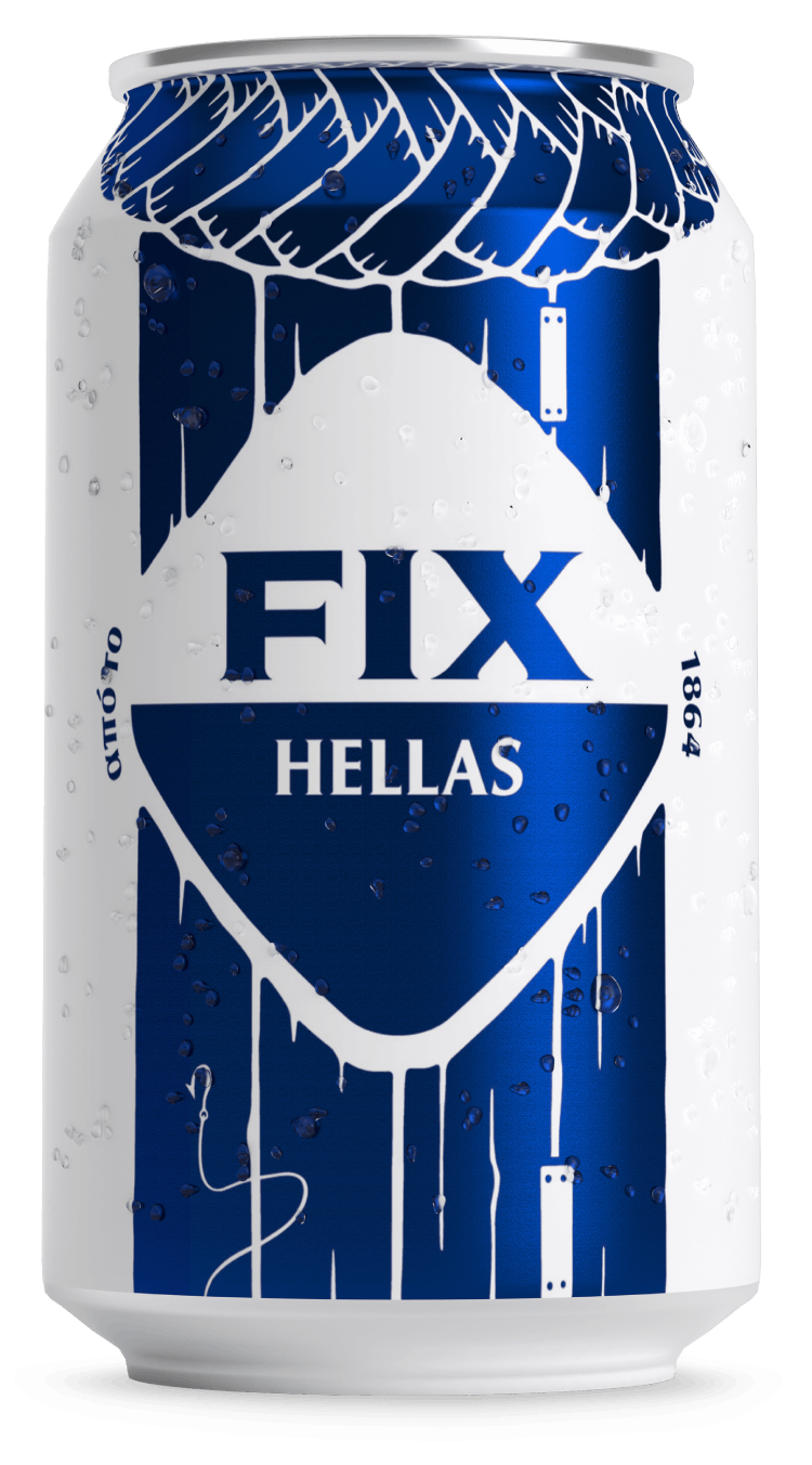
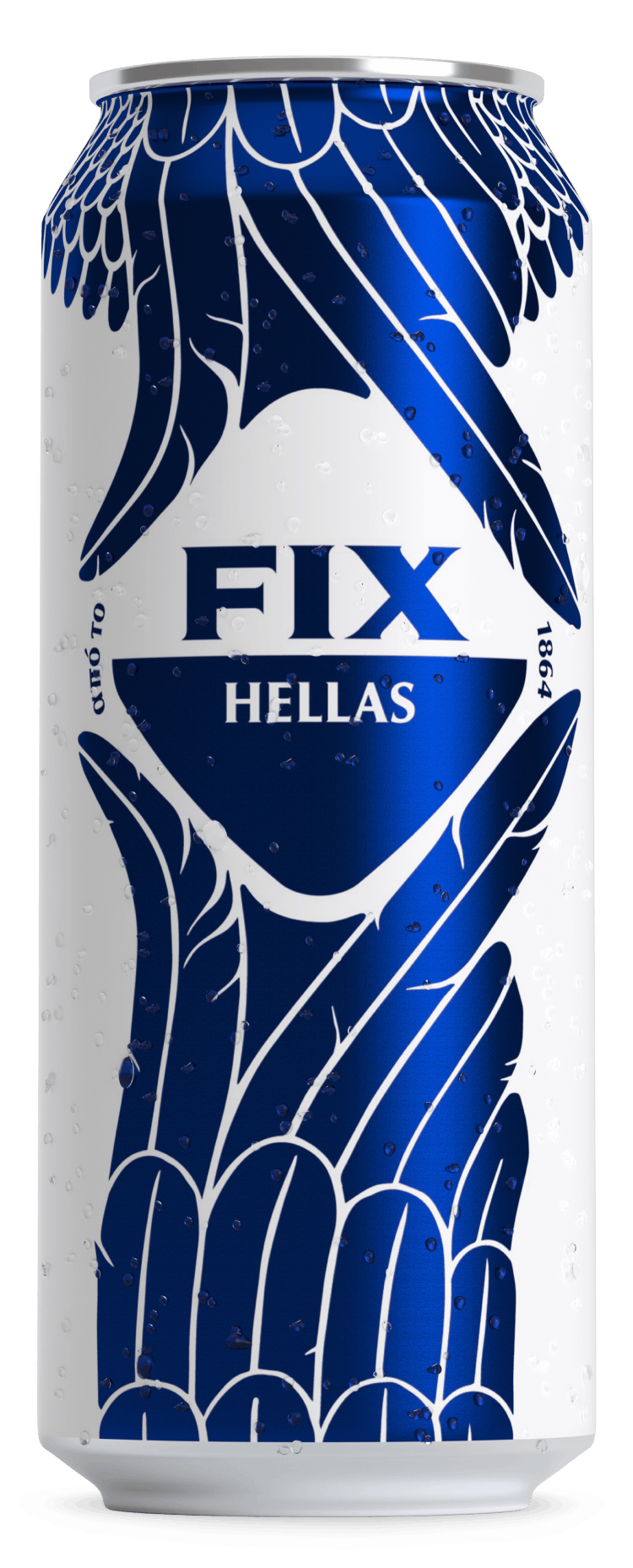
At the heart of the concrete jungle, where the city never sleeps, people are in a constant state of moving. They run to catch the bus, they form new friendships, and they fall in and out of love. All this is going on under the watchful eye of the true local of the city, the one who knows every little street and every hip spot: that is what the pigeon is all about.
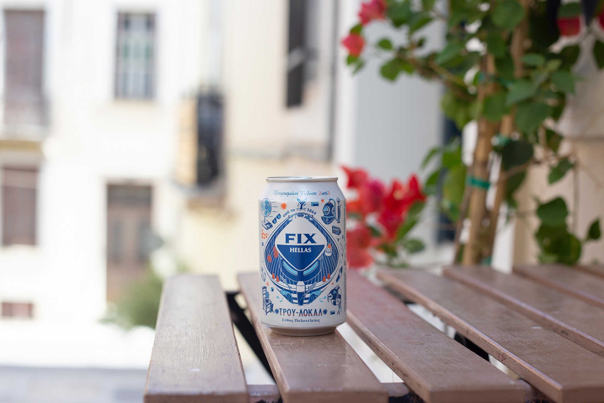
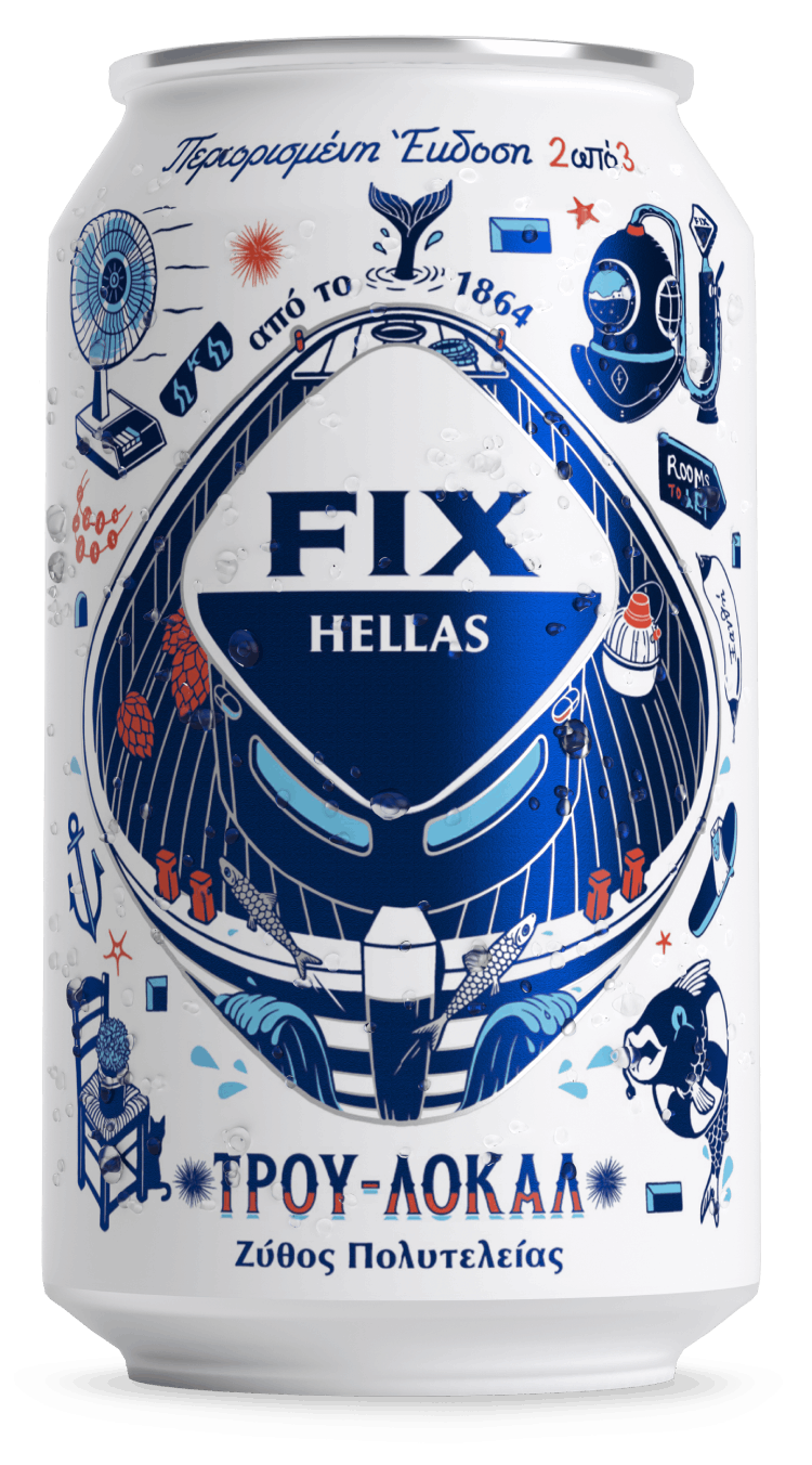
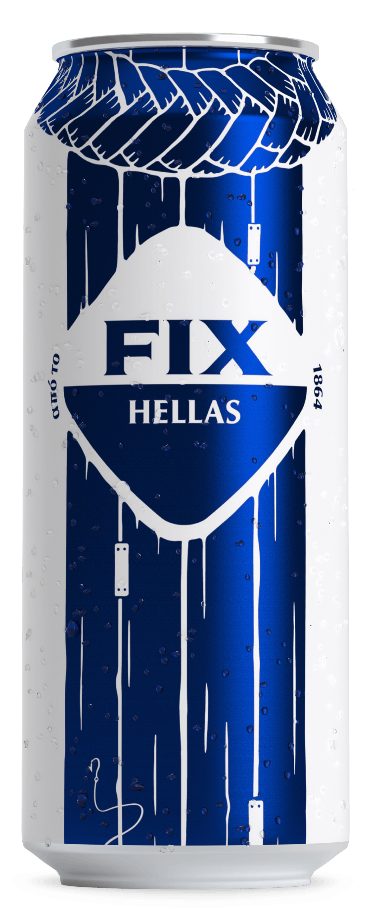
At an island under the hot August sun, the friendships that were formed during the winter are creating memories that will stay with them forever. New summer flings are happening on the boat to the most deserted beaches of the island. The boat knows every single passage to the island’s best spots, being the connective tissue between our dreams of an unforgettable summer trip and their fulfillment.
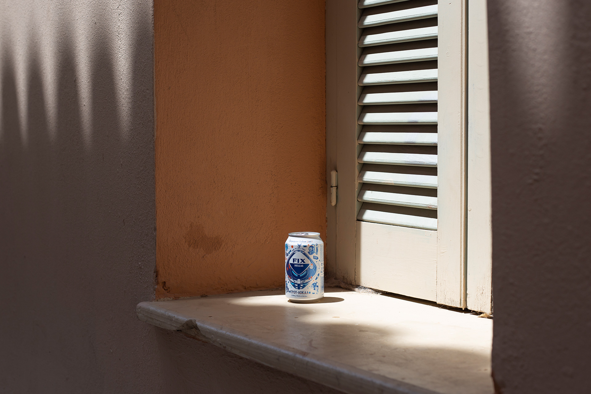
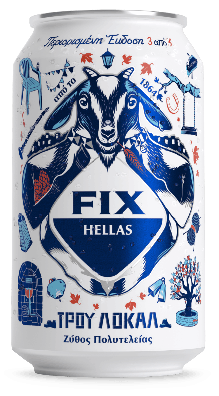
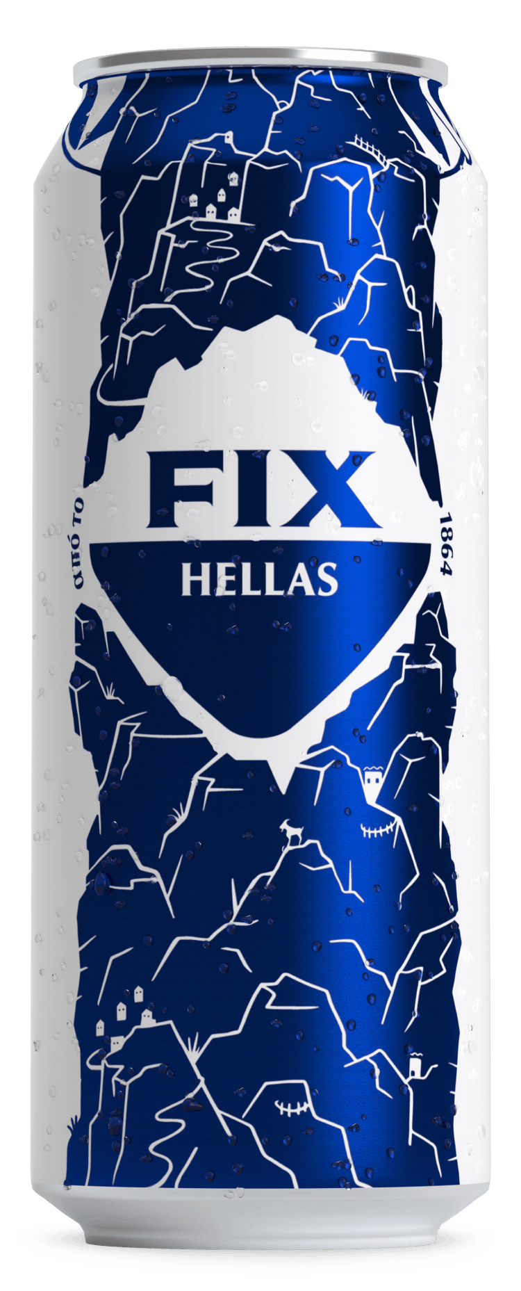
At the endless Greek countryside, in the rough and uneven slopes you can hear the sounds of joy from festivities in villages. This is where the local will get together with the visitor, the grandpa with his grandsons, the traditional type with the alternative one. If you get lost, don’t worry: just follow the goat. That is the true local of the outdoors, knowing every secret path that leads to the best festivals.
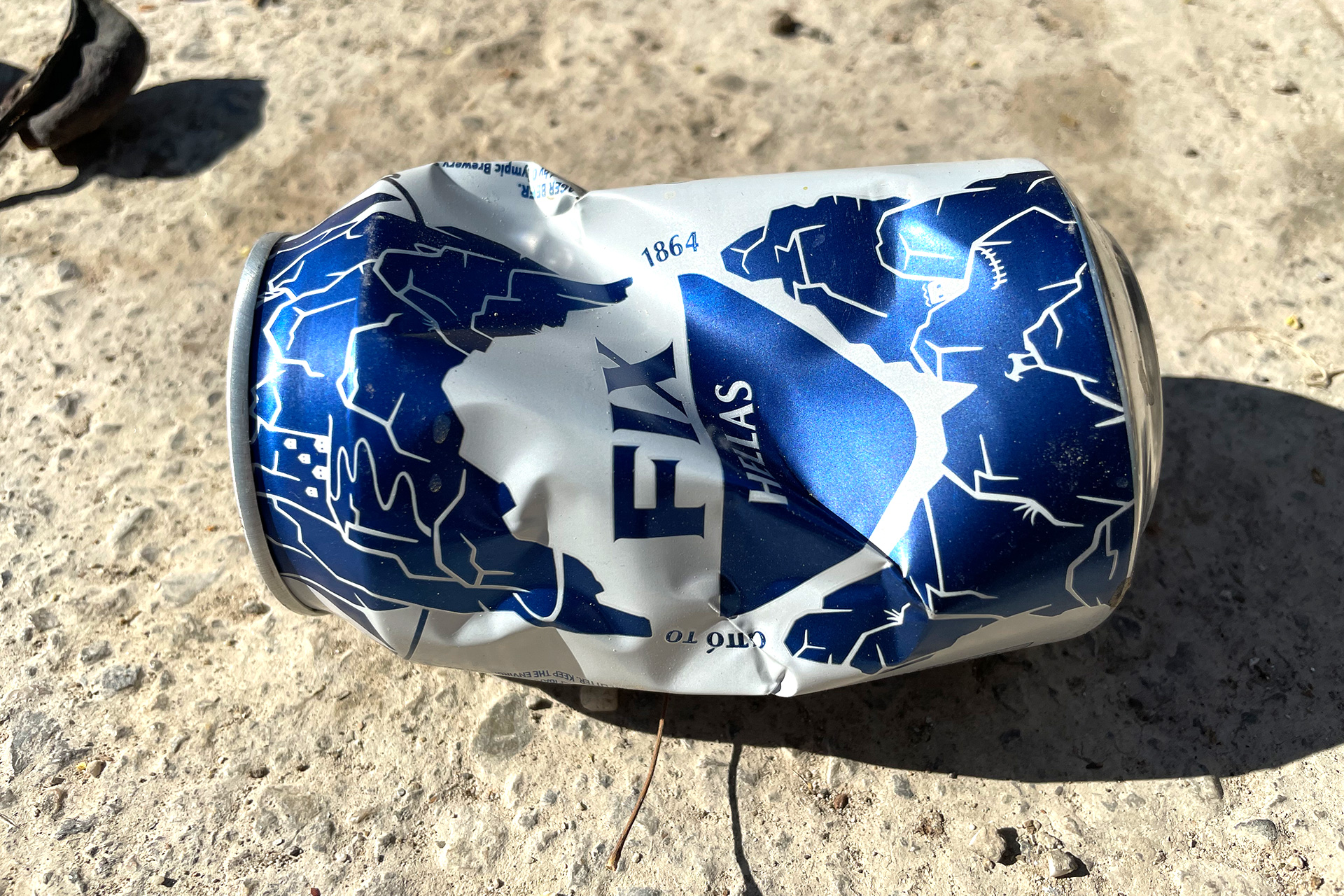
The illustrations stand out for their boldness, narrating small and fun stories of hidden locality that are depicted differently to each side of the cans.
A new iconographic language is being created, becoming a distinctive way of communication that is so here and now for an ever-young generation.
The world that is built around them maintains the brand’s values, while playing with the commerciality in a fun & irreverent way, just like an authentic local leaves aside stereotypes and keeps the essence.
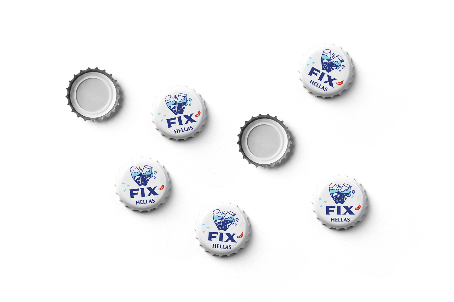
 Bottles 500ml


Unlock Locality
As a part of the new brand world, we created the press kit for the
TRUE LOCAL campaign.
We formed a custom-made kit in the shape of the rhombus, in order to further enhance the experience that the receiver will get.
Unlock Locality
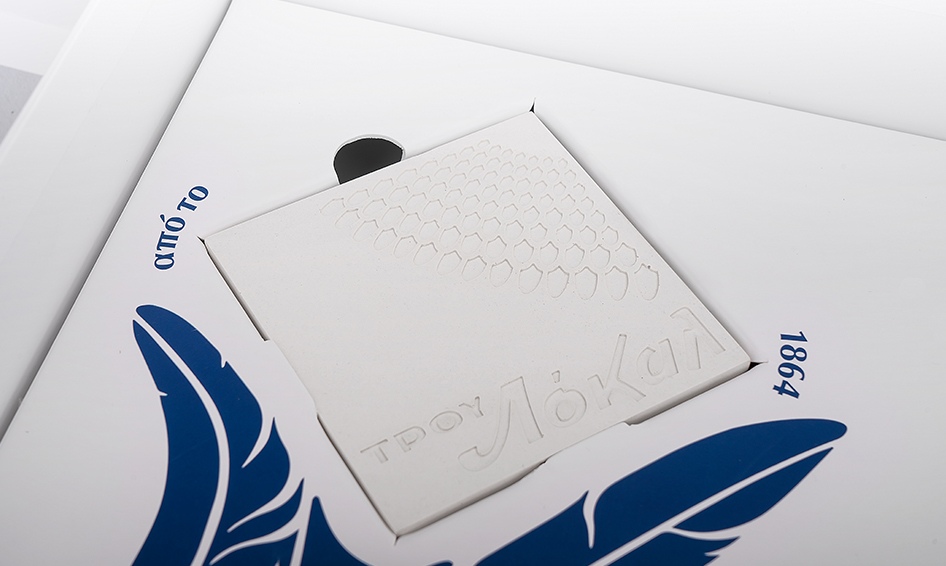
We also created the coaster that can be found inside the kit, made specifically to be support the most authentic moments of the day.
Unlock Locality
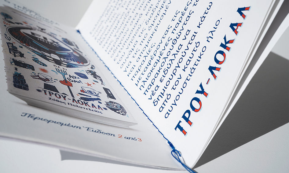
Additionally, we designed the brochure explaining the TRUE LOCAL concept to the world, both in words and images.
We also designed the shrink-wrap for the multipack packaging that winks playfully to the audience, in a way that stands out in the market.
We are a group of creatives with expertise in different skills, providing innovative alternatives beyond the predictable.
Numbers in our agency remain consciously small, while a solid network of professionals complements our work.
Every single project can be monitored at any stage before its completion, in a flexible and effective manner.
Designers communicate directly with clients, taking their needs into account and helping them gain their share in the domestic and international market.
Drop us a line.
We're looking forward to speaking with you.