Everyday treasures
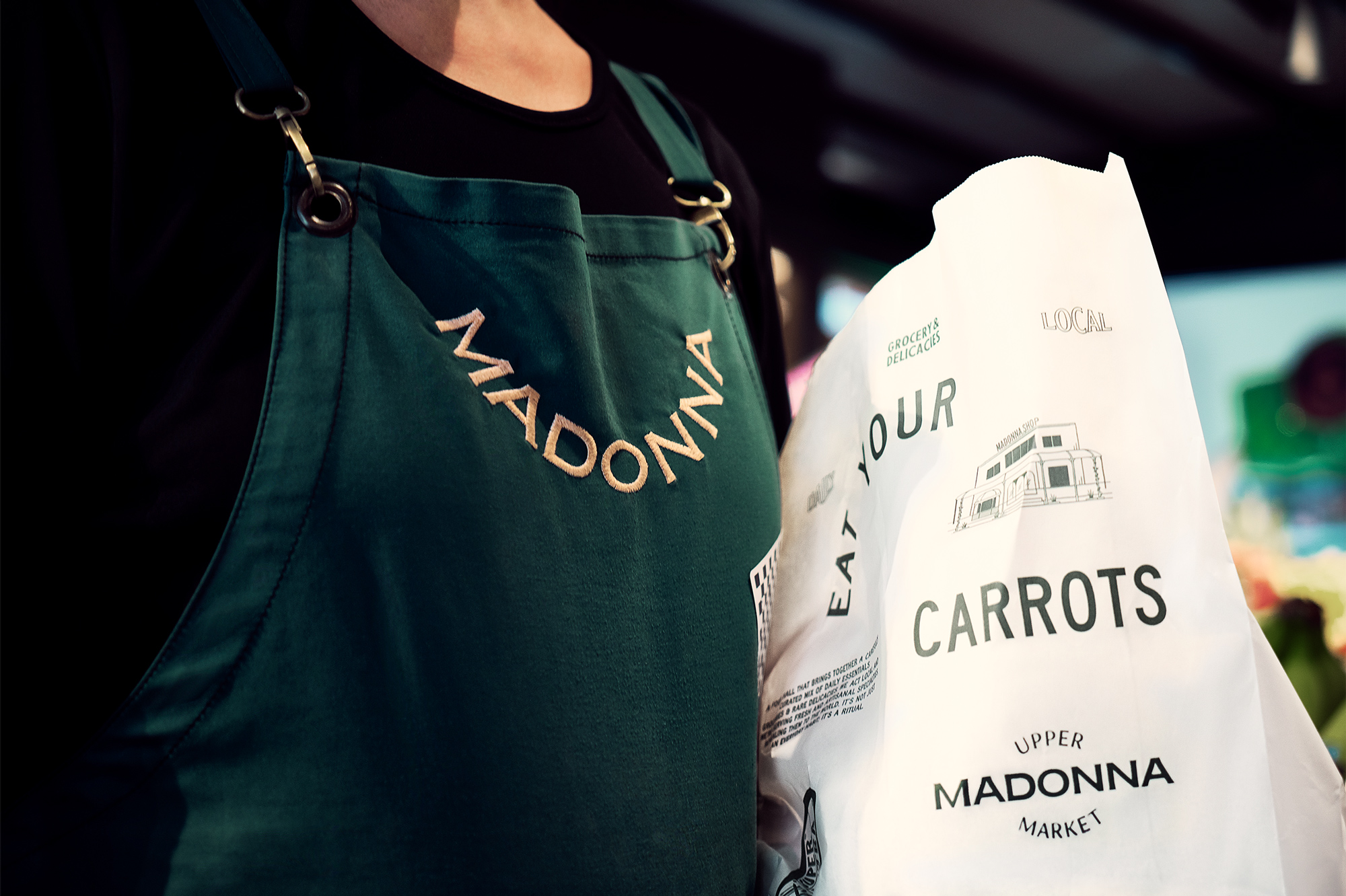
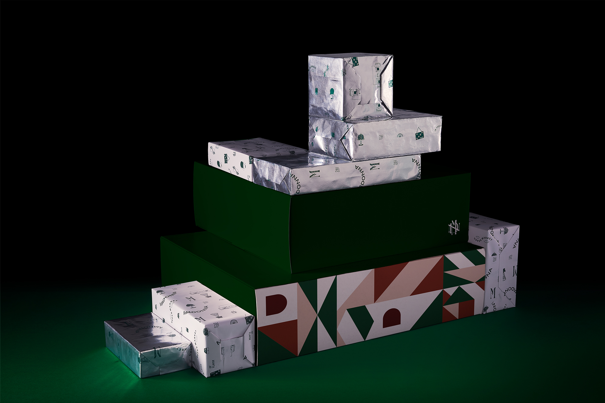
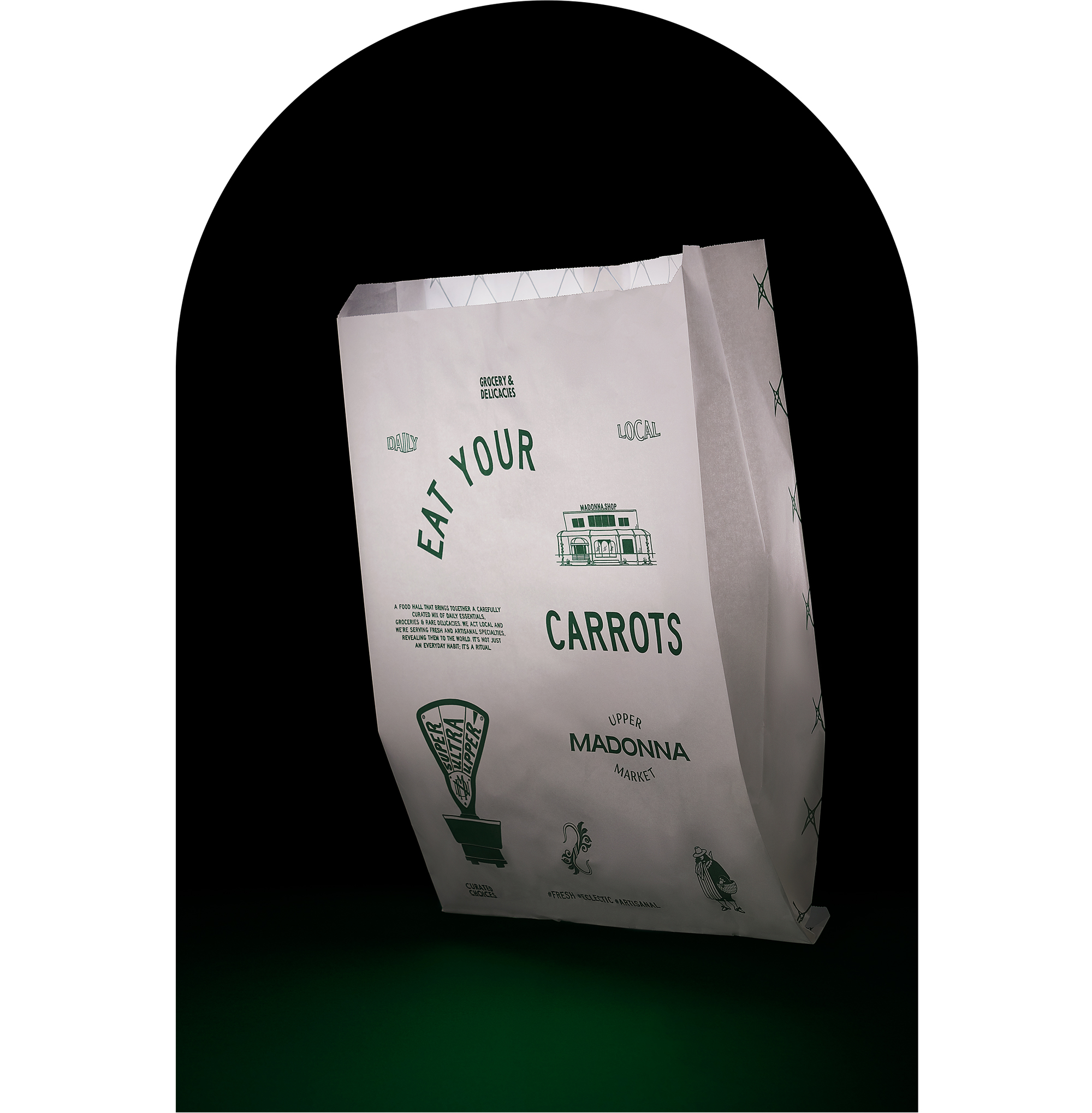
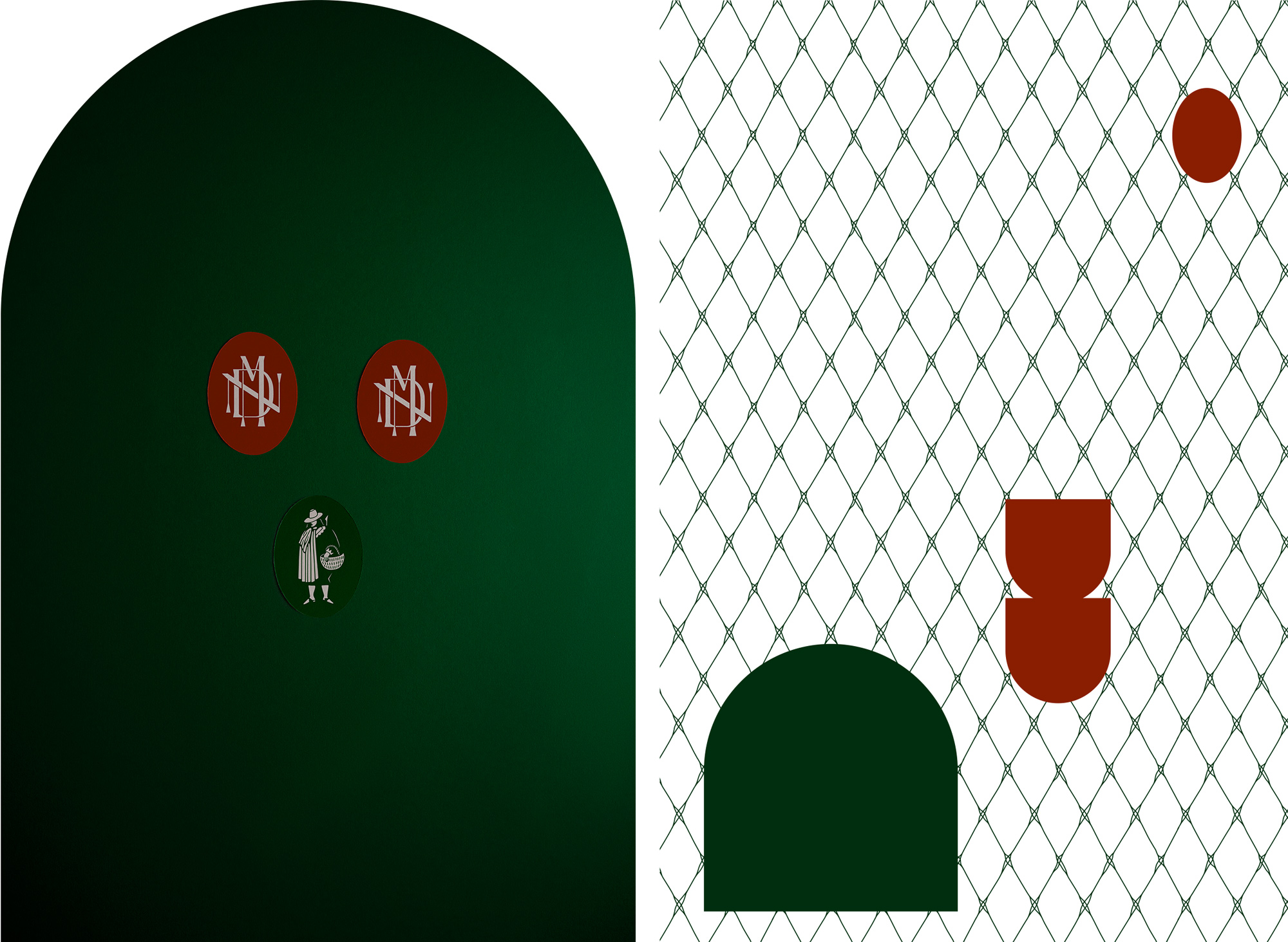
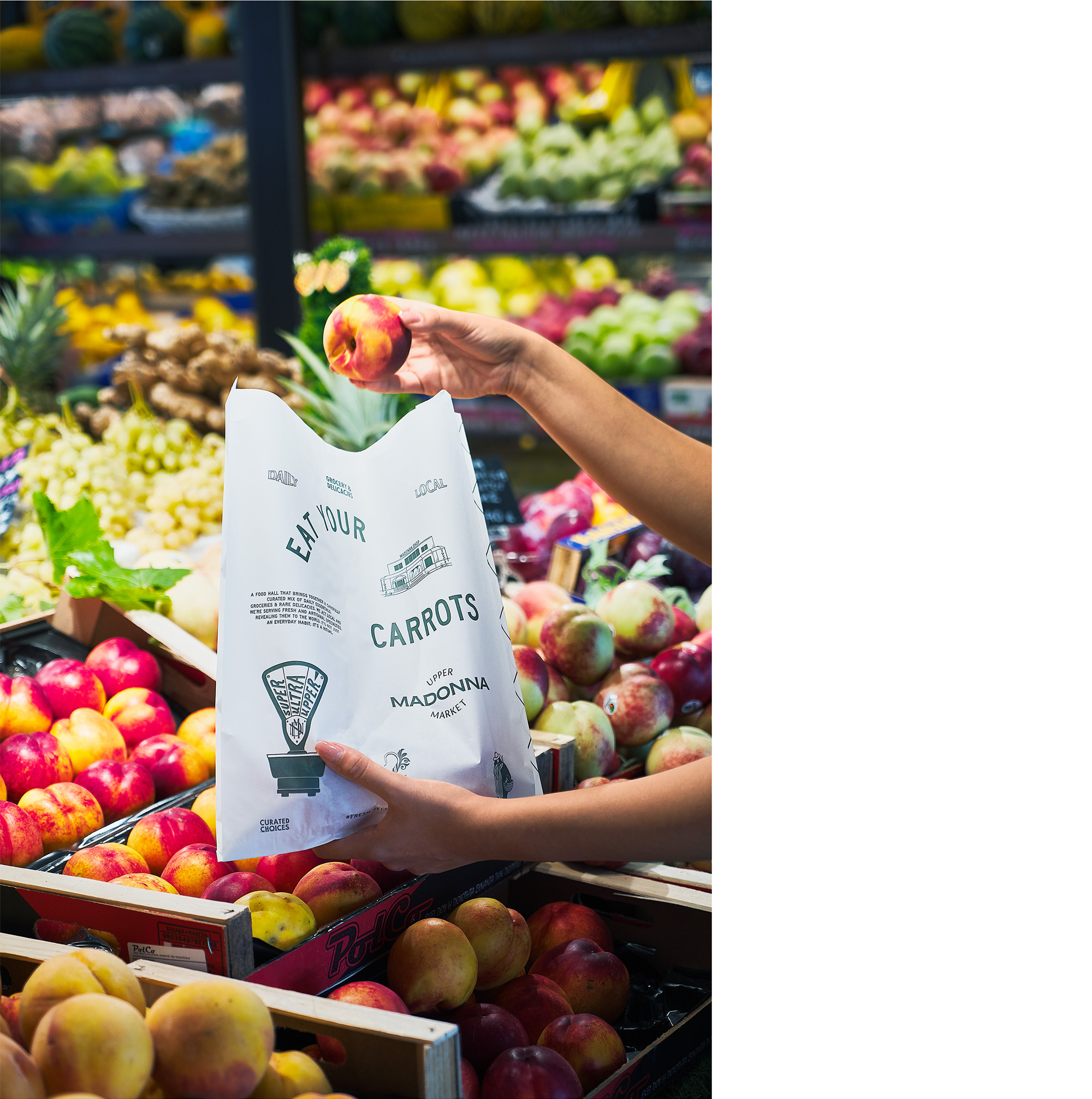
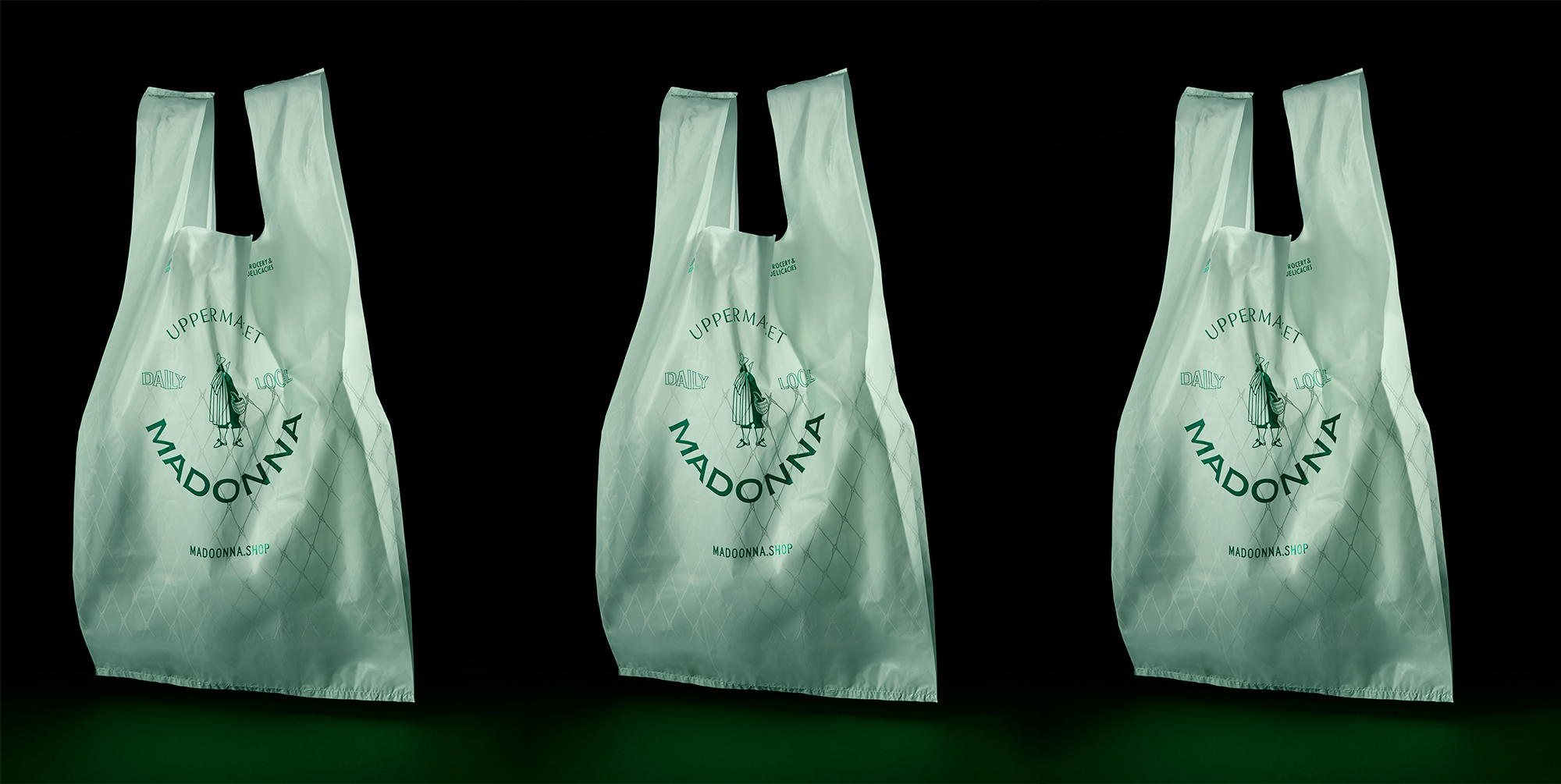
We were asked to design the visual identity for a new culinary multiplex in the northern suburbs of Athens with sophisticated aesthetics and an authentic Tuscan aura, placing it beyond the culture of an everyday supermarket.
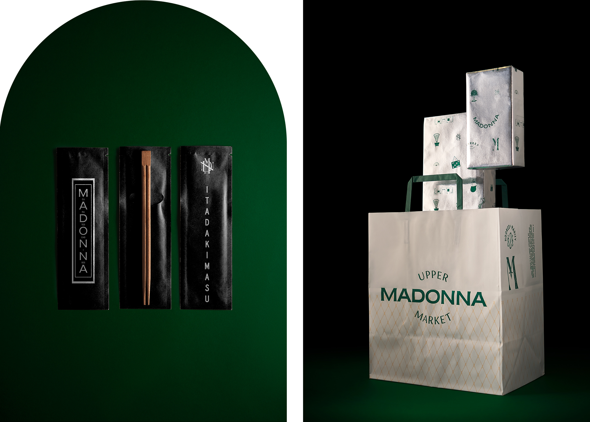
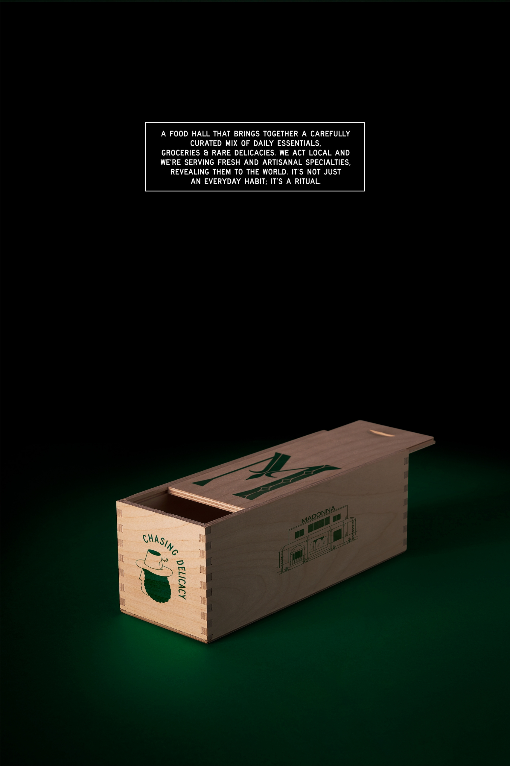
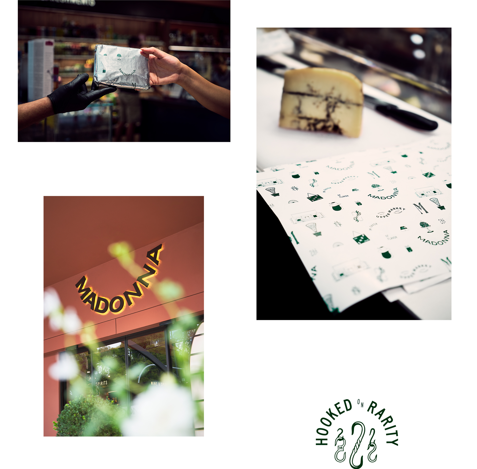
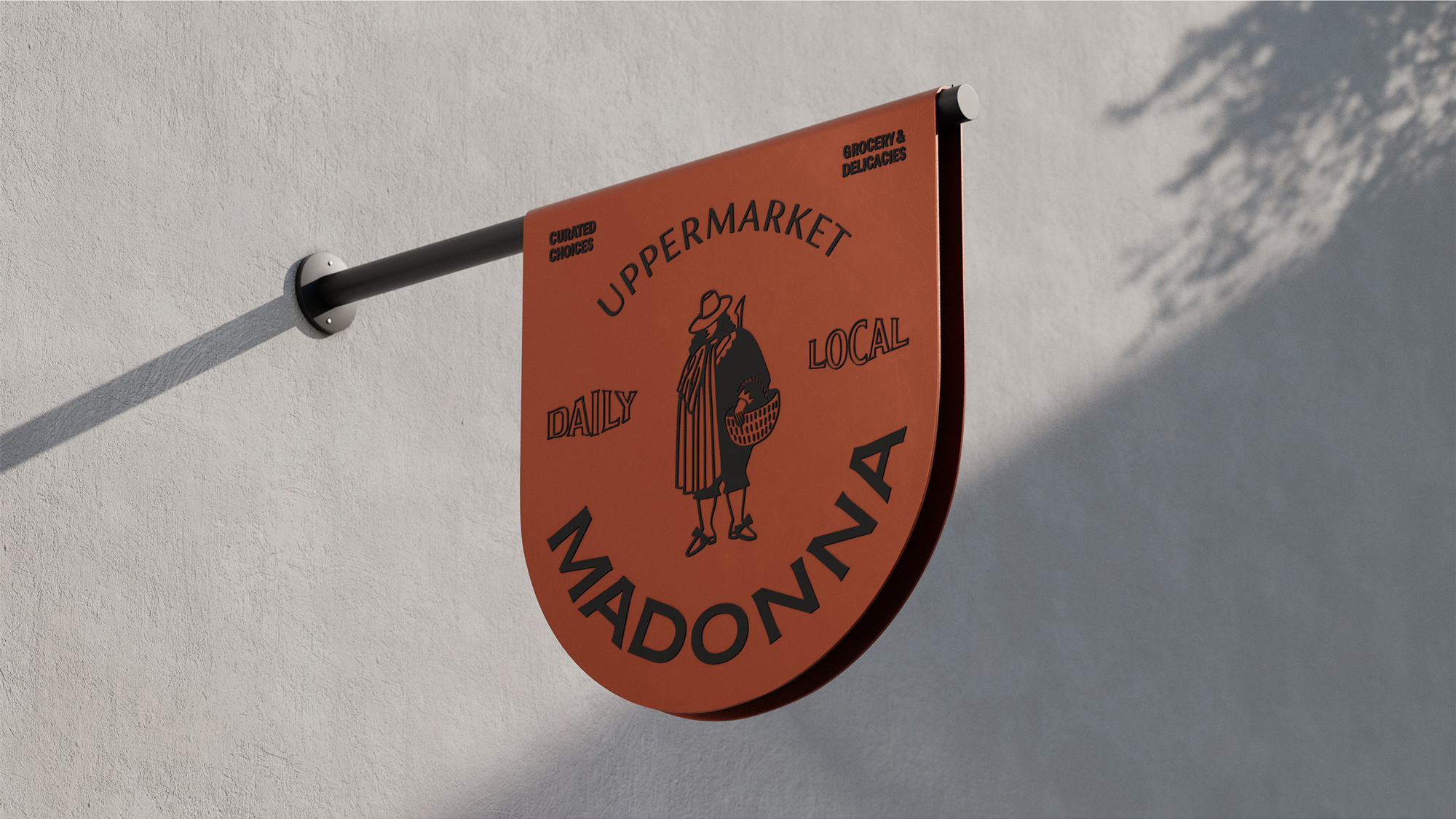
Following its gourmet nature, we developed the name “Madonna”. A name referring to the 'trifola d'Alba Madonna' white truffle, a rare, almost sacred, high-quality delicacy of the Italian North, but also a reference to Troufa Bread & Chocolate its “sibling” bakery that stands right next to it ("troufa" stands for truffle in Greek). Responding to the concept of a premium marketplace and given the superior quality of the products offered we created the tagline "uppermarket".
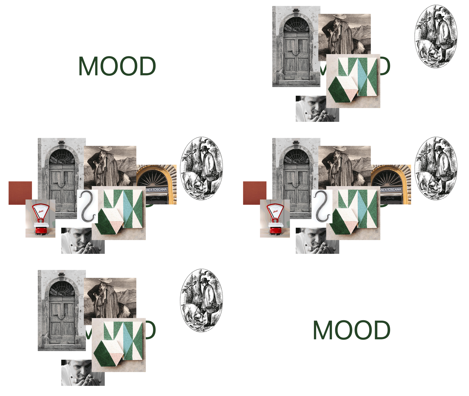
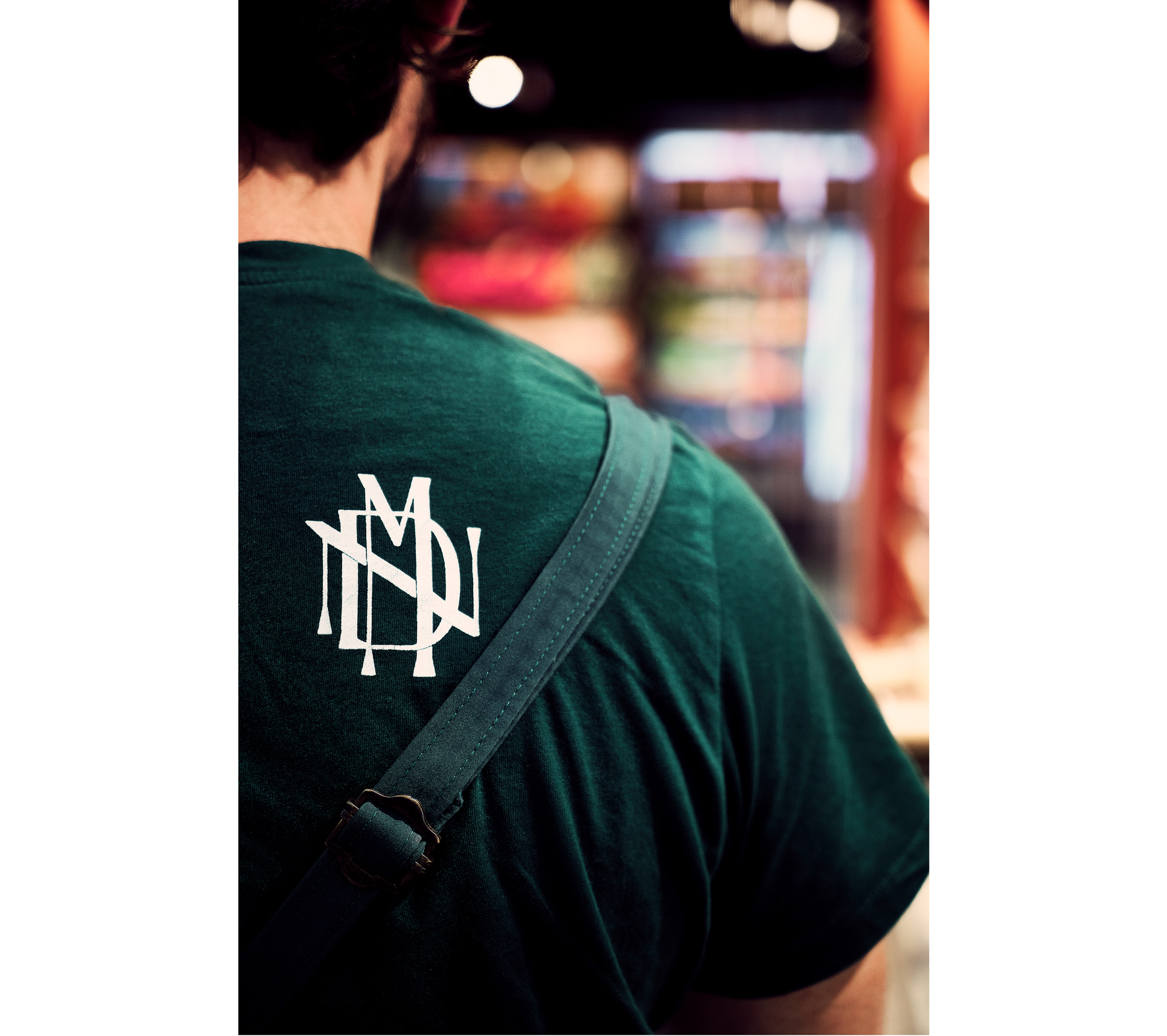
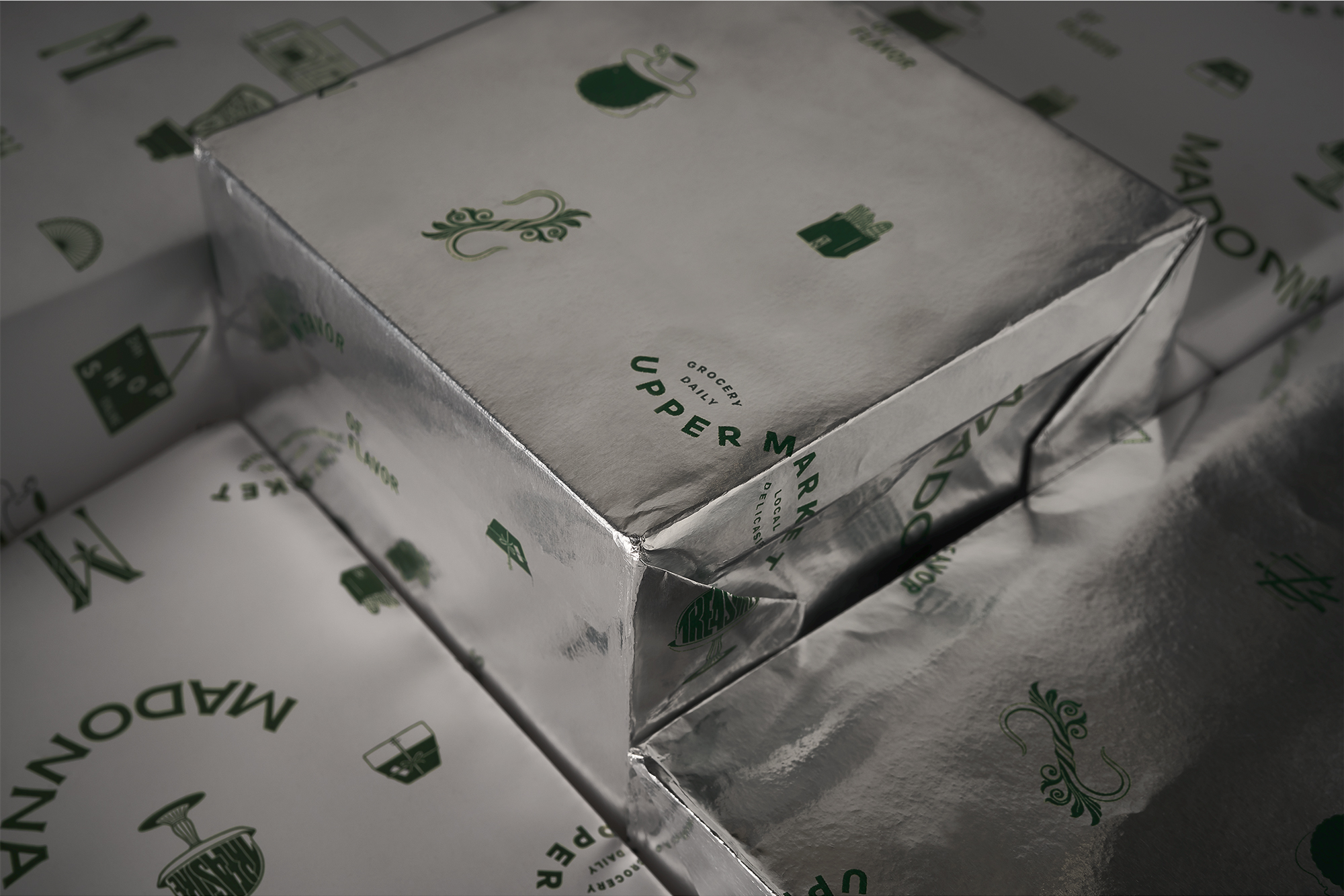
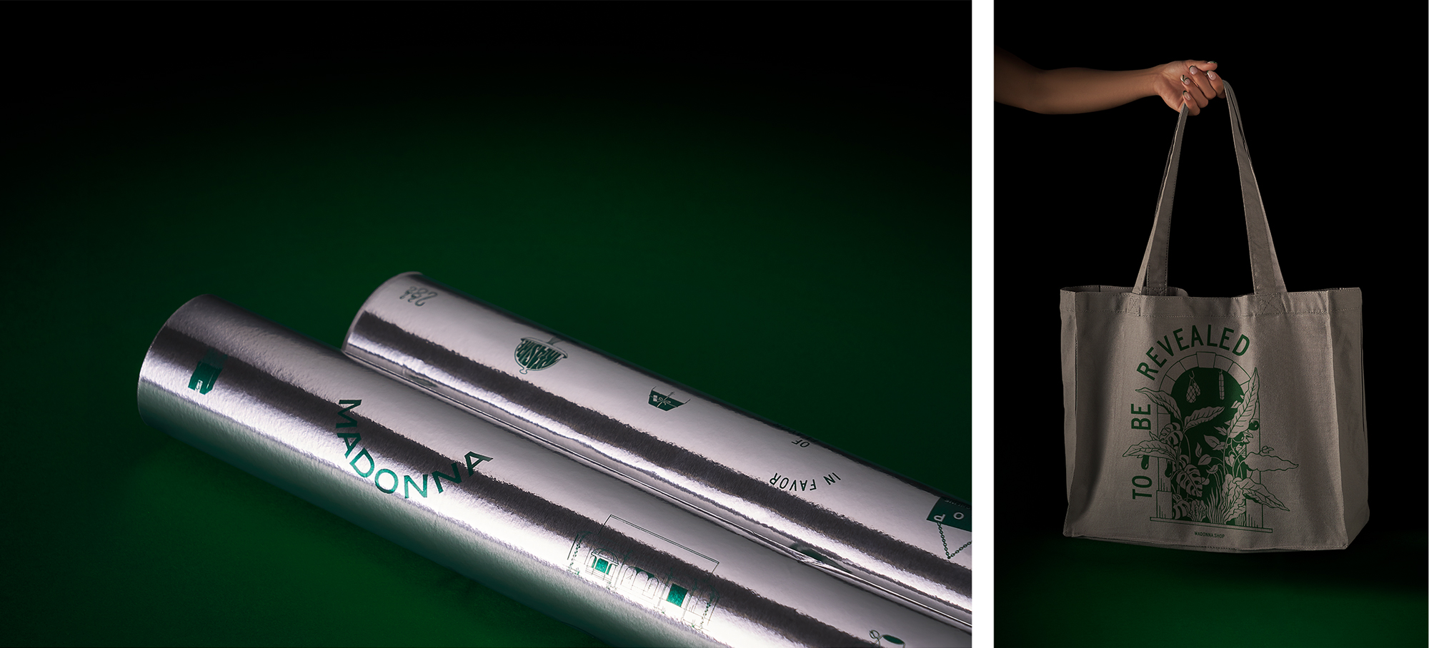
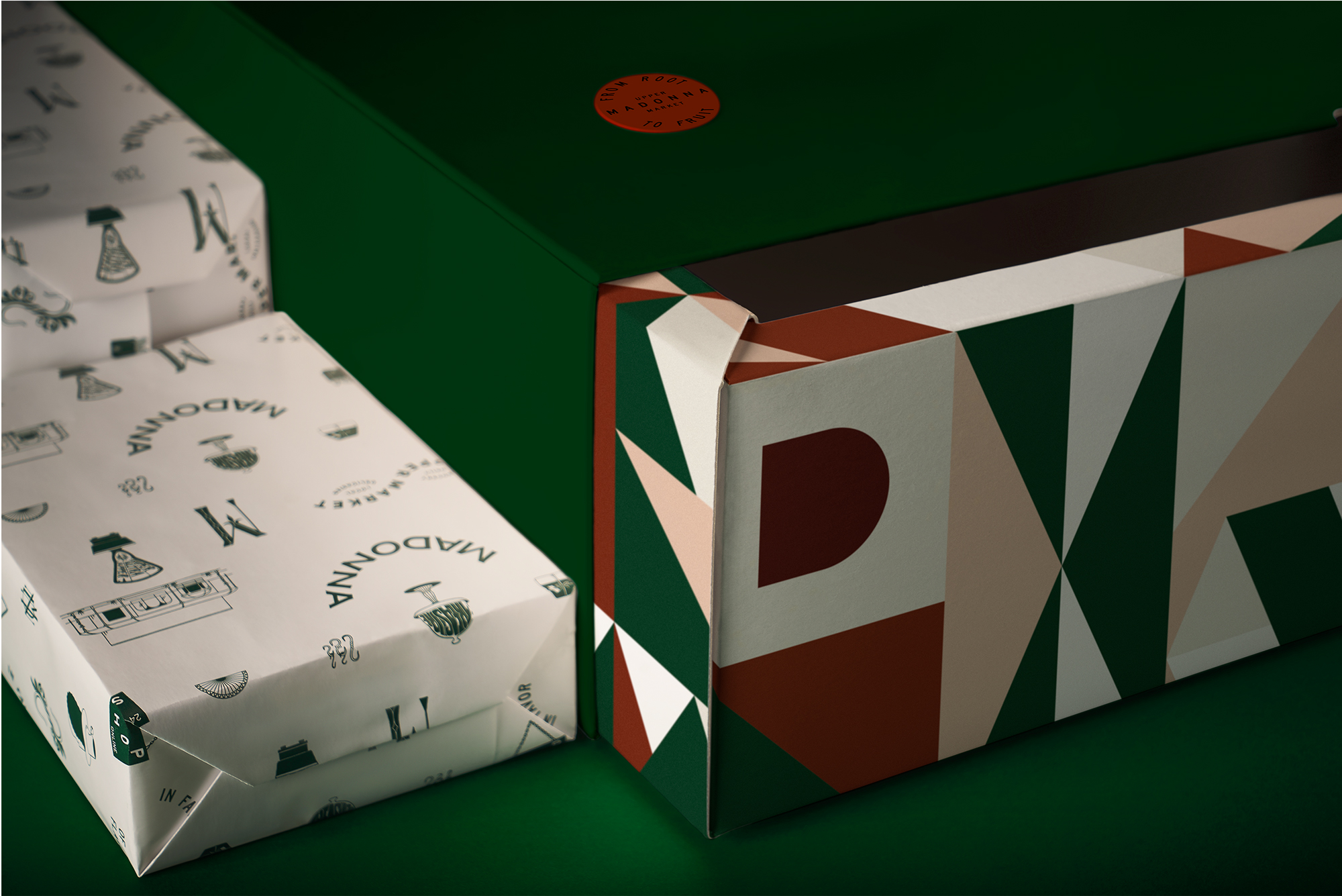
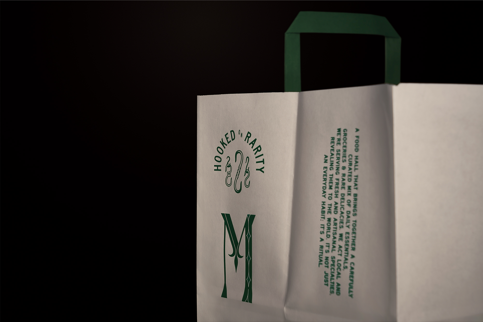
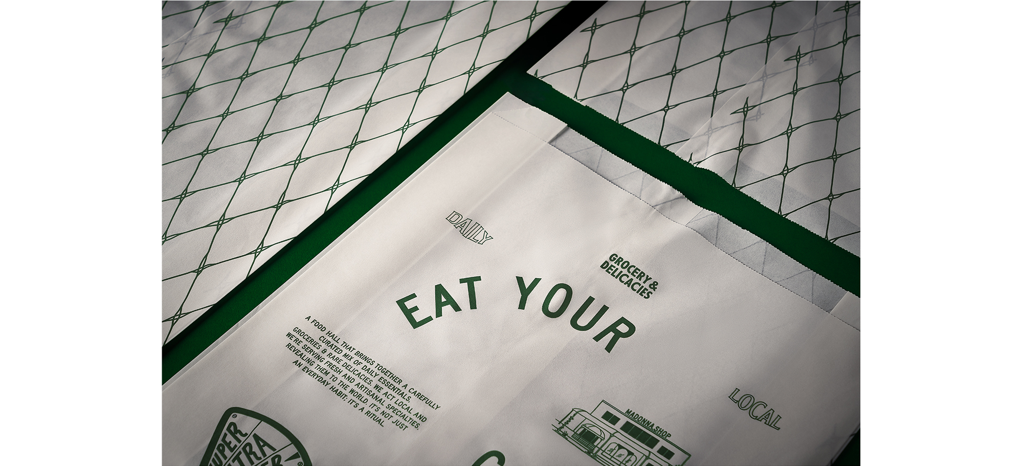
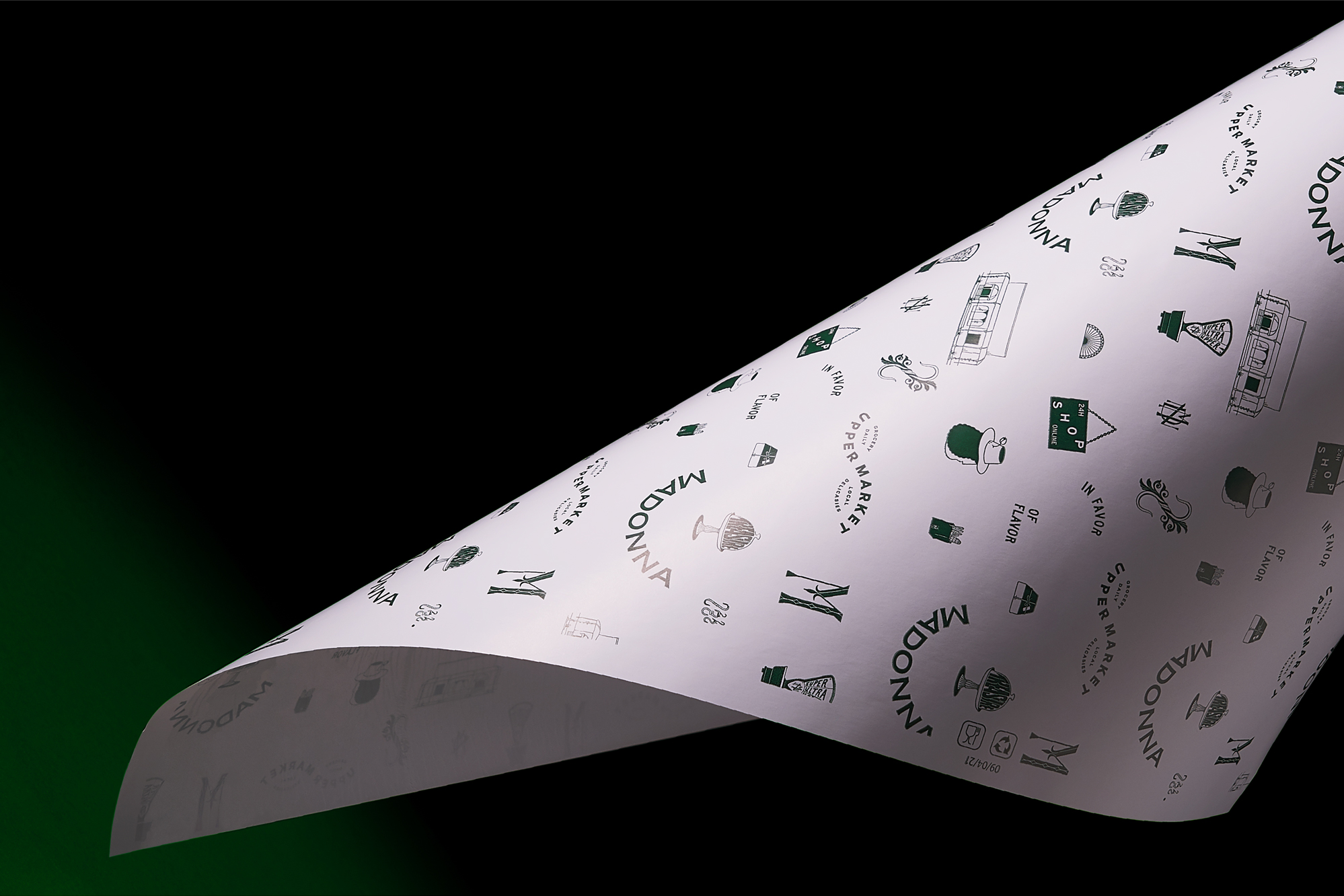
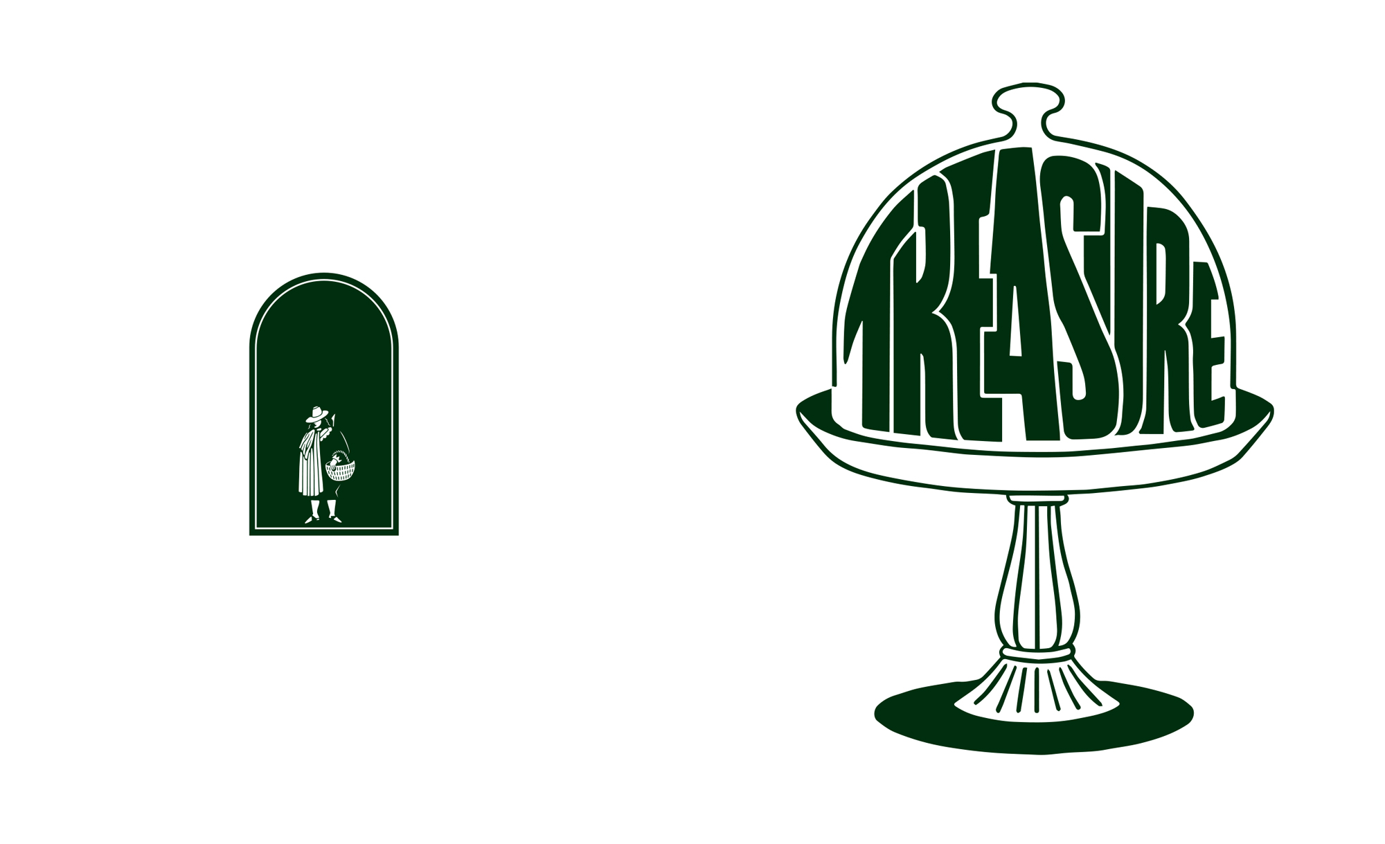
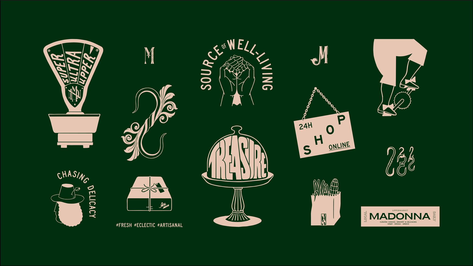
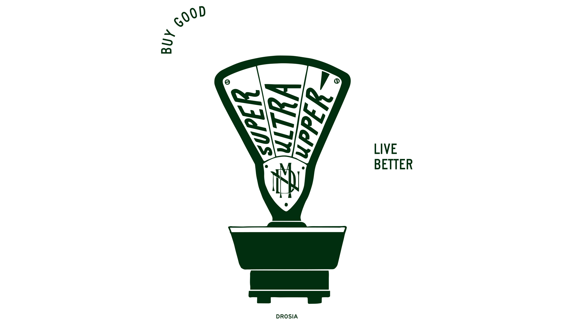
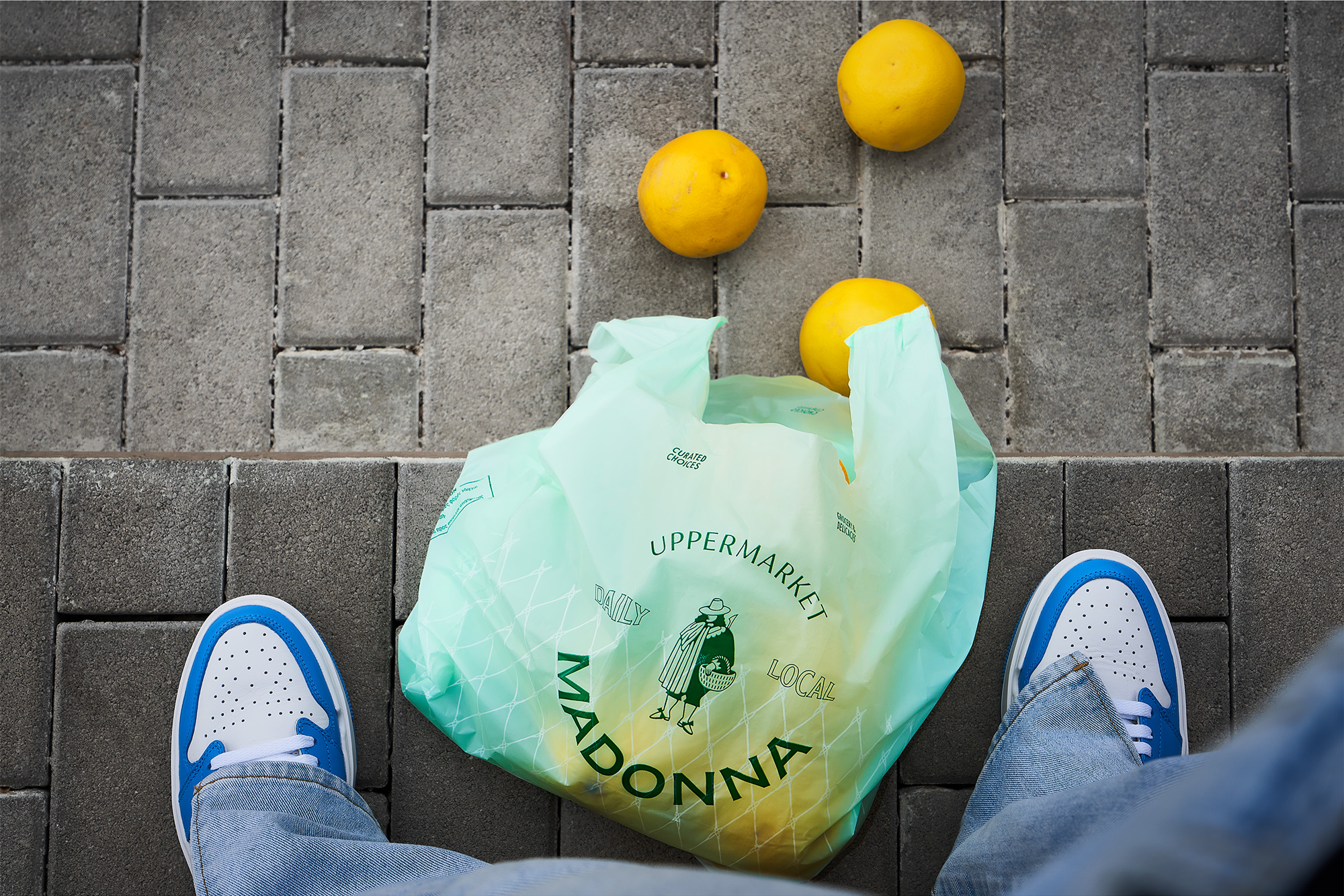
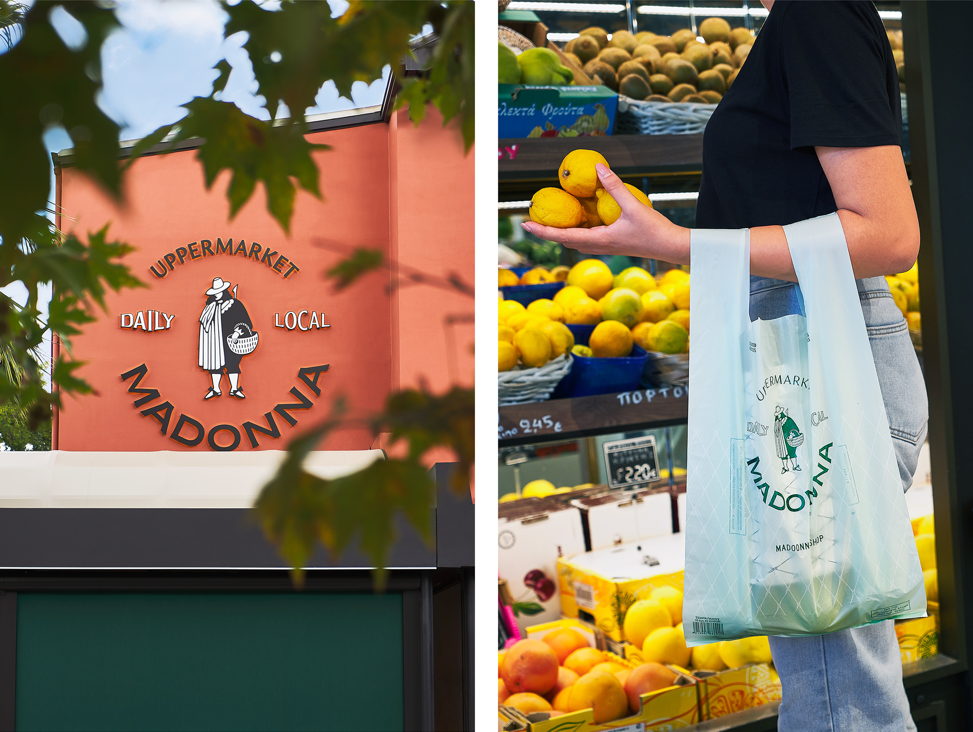
The representation of a truffle hunter on the logotype system continues the naming storytelling acting as a necessary metaphor for the brand story, i.e. the careful selection of culinary treasures offered by Madonna, while the typographic system developed, echoes the typography that can be found in old grocery stores.
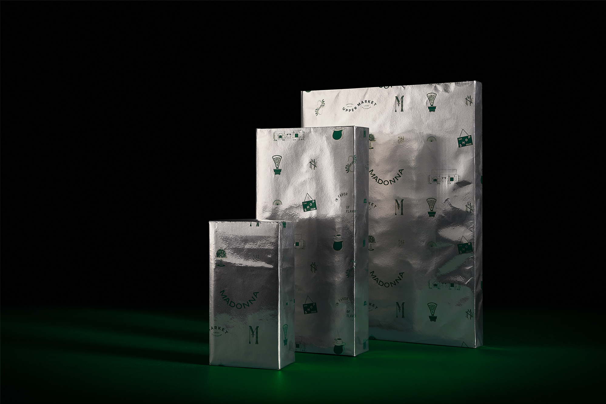
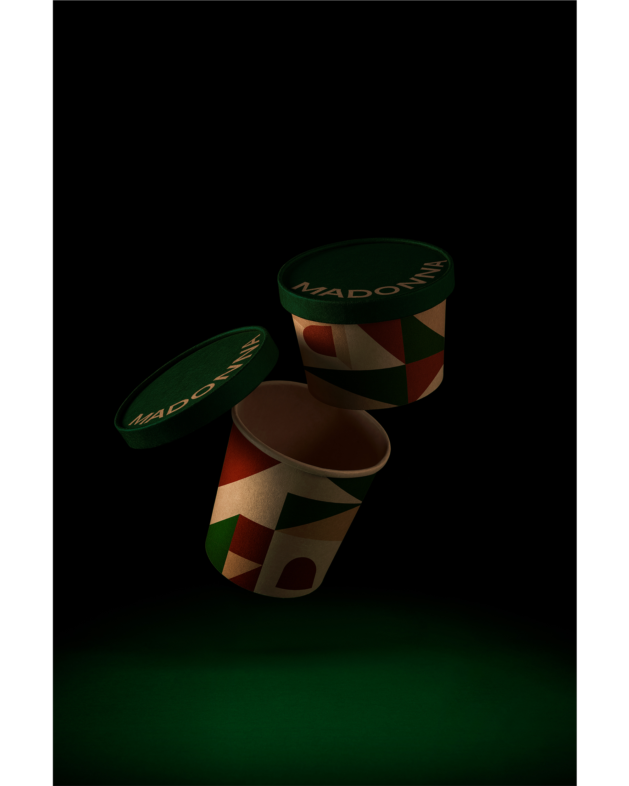
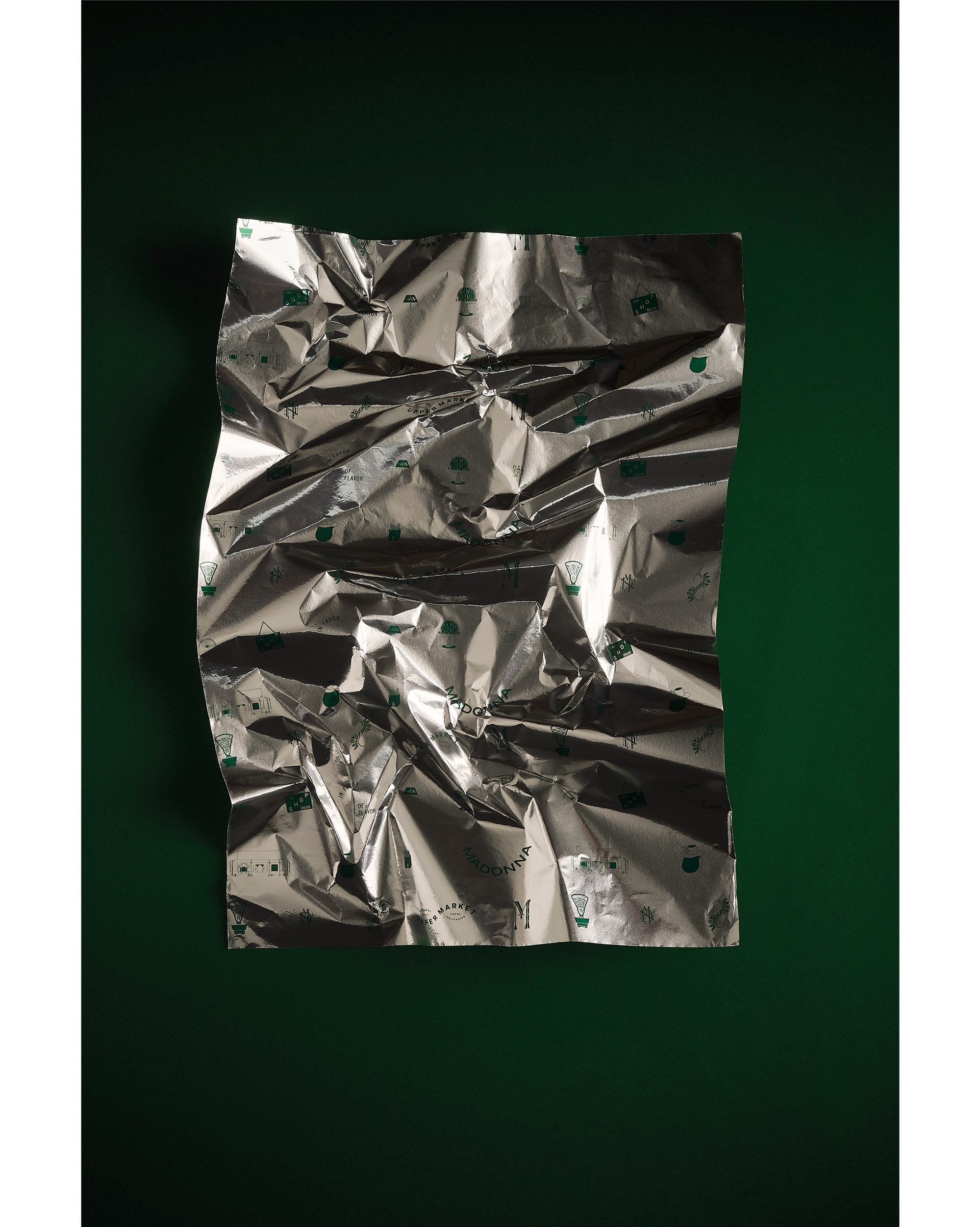
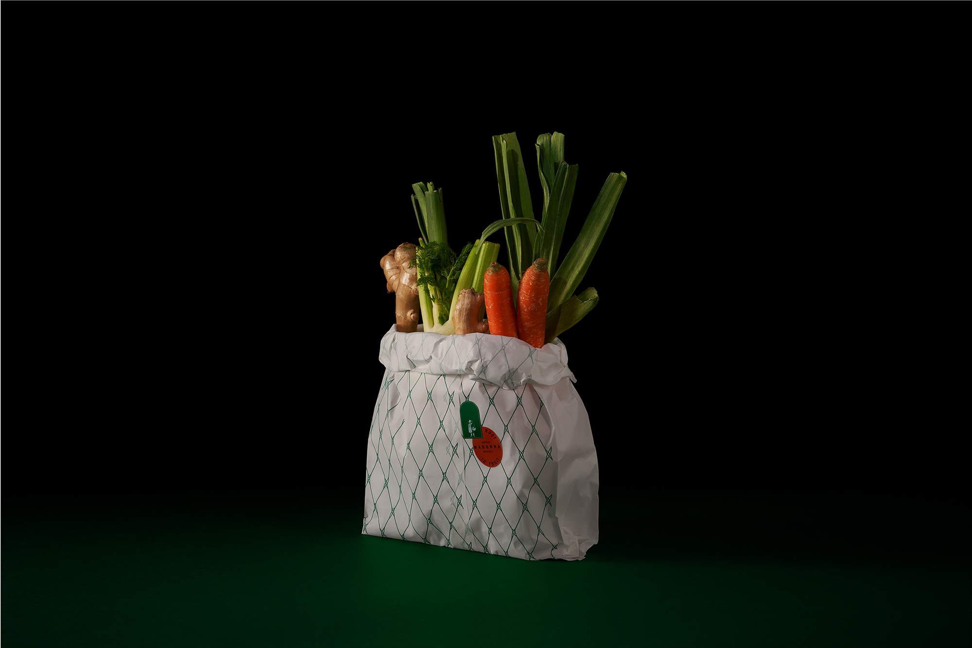
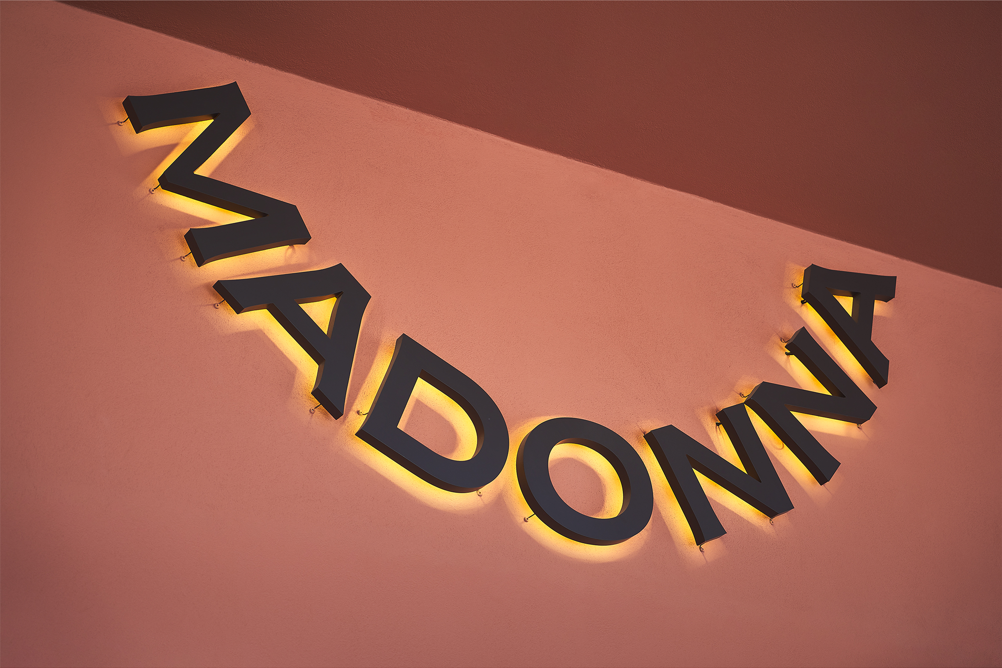
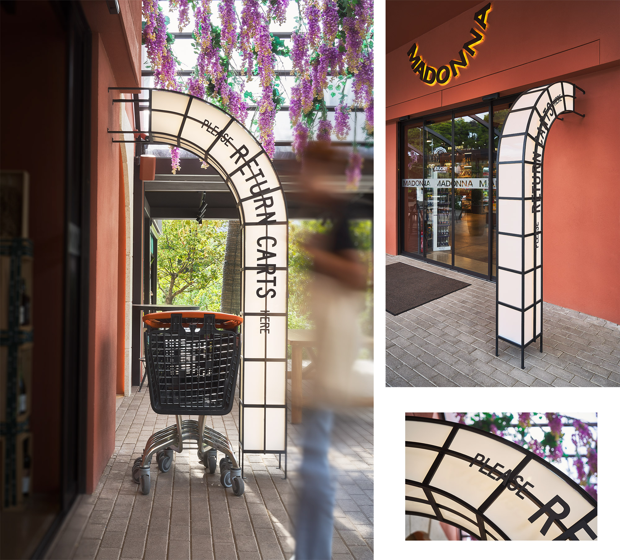
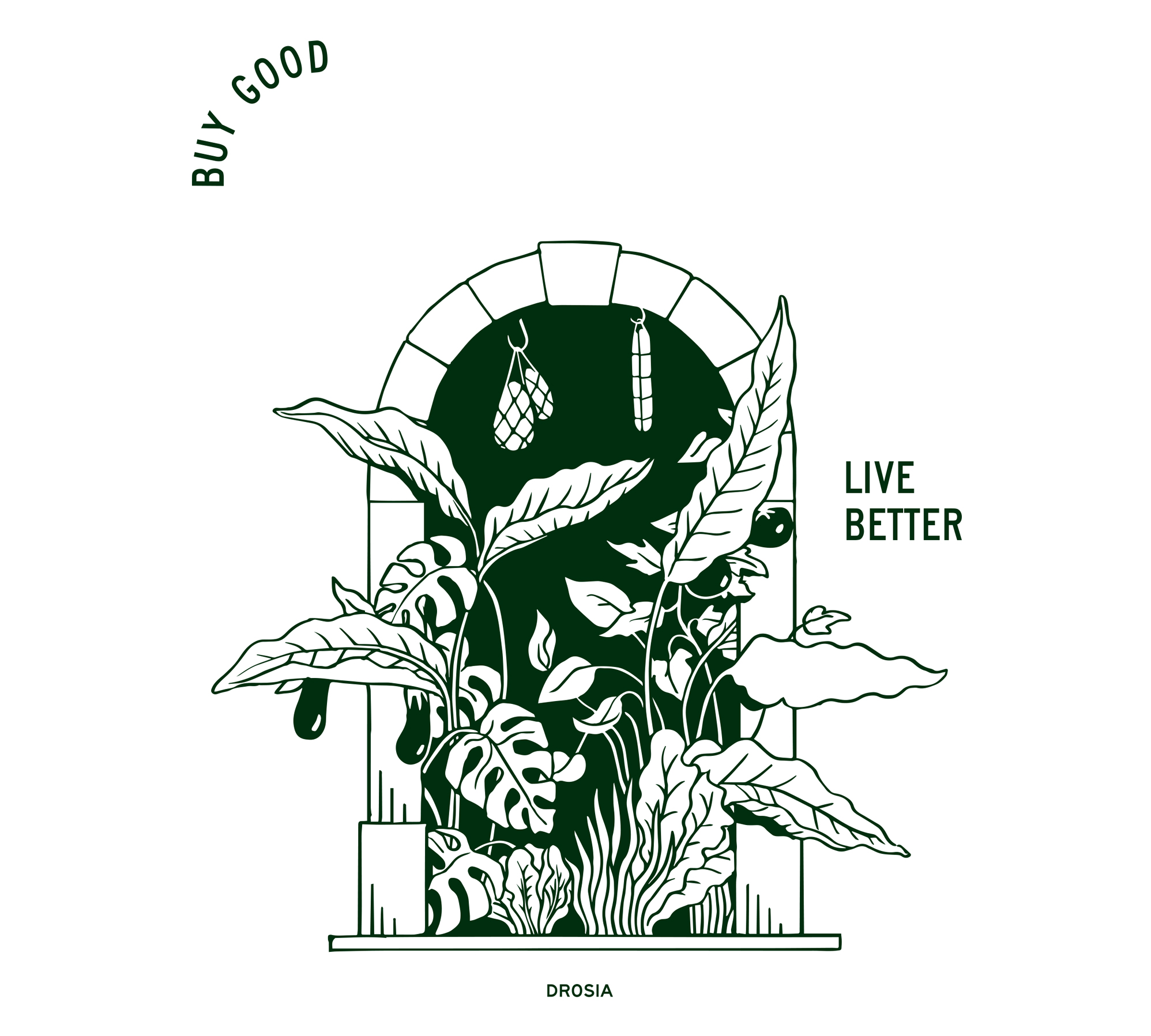
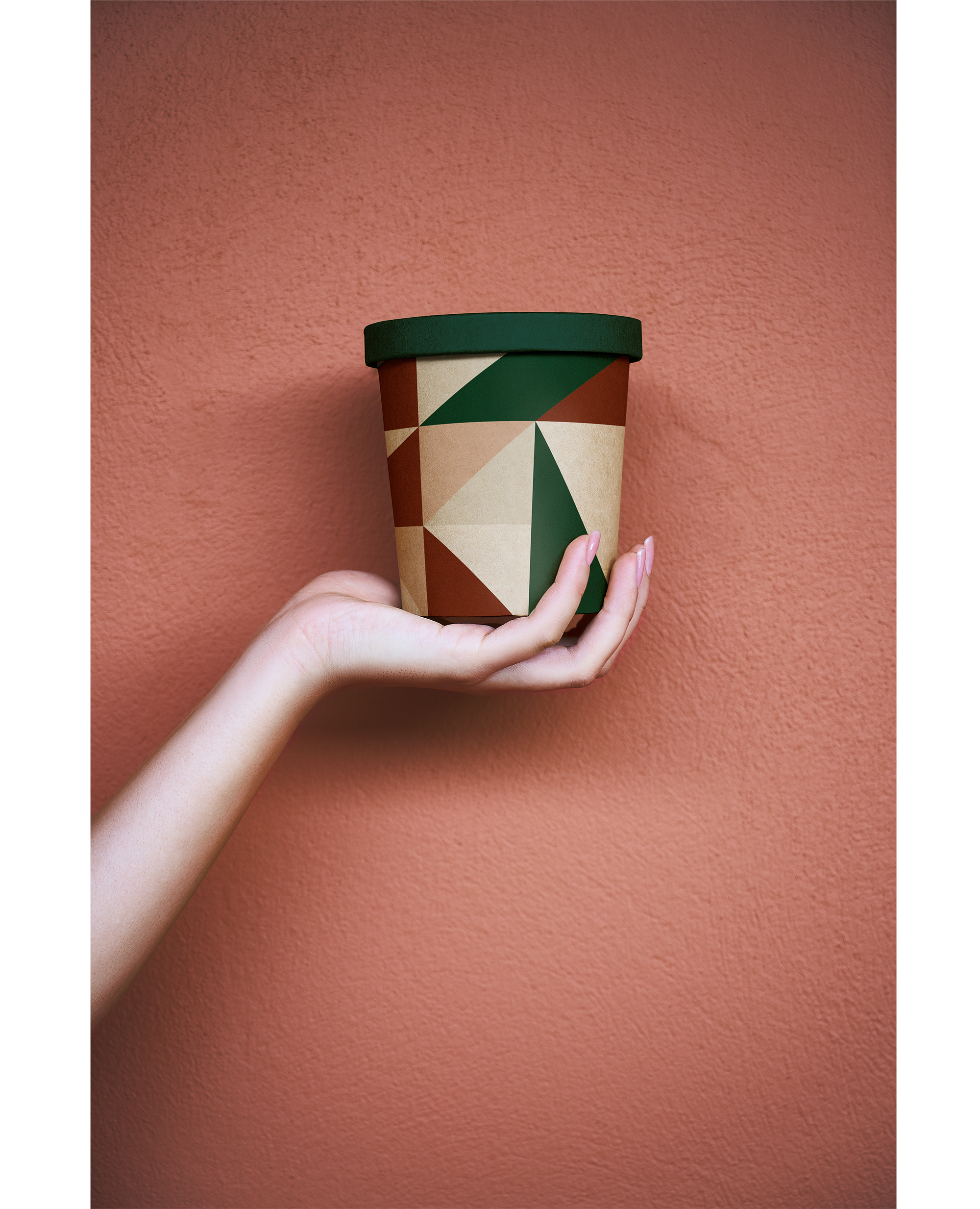
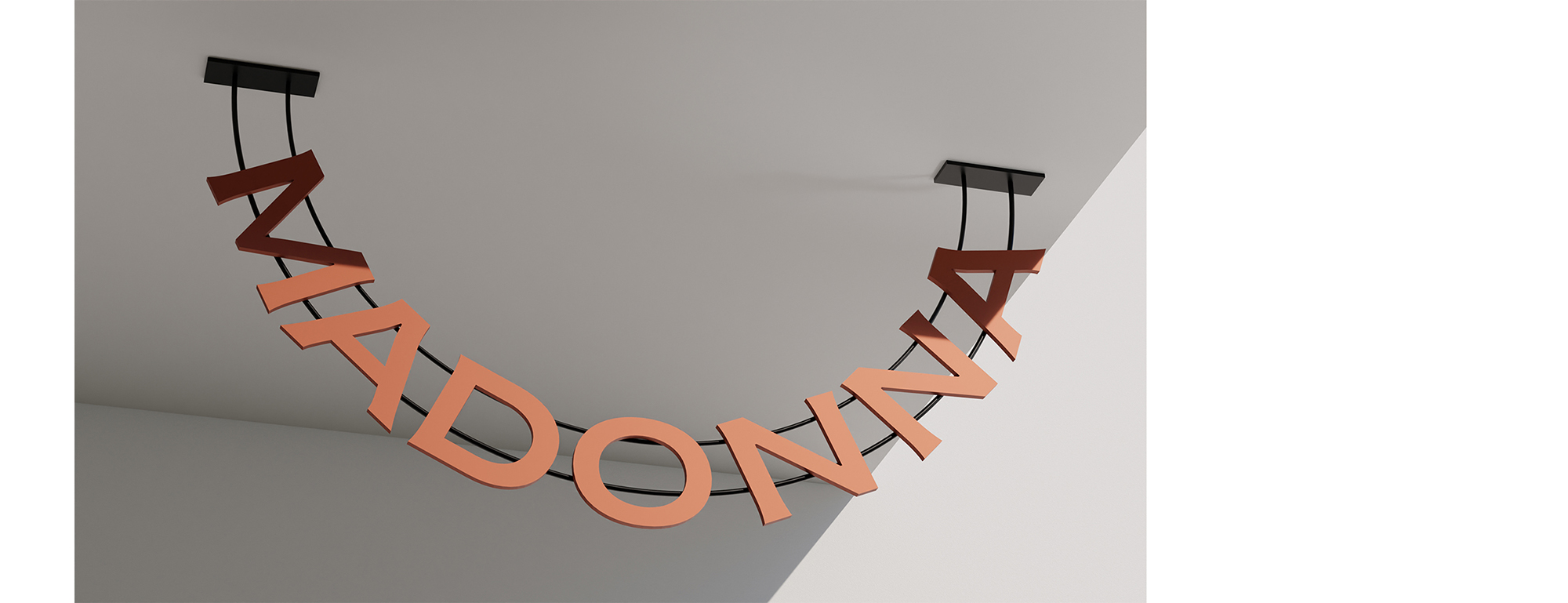
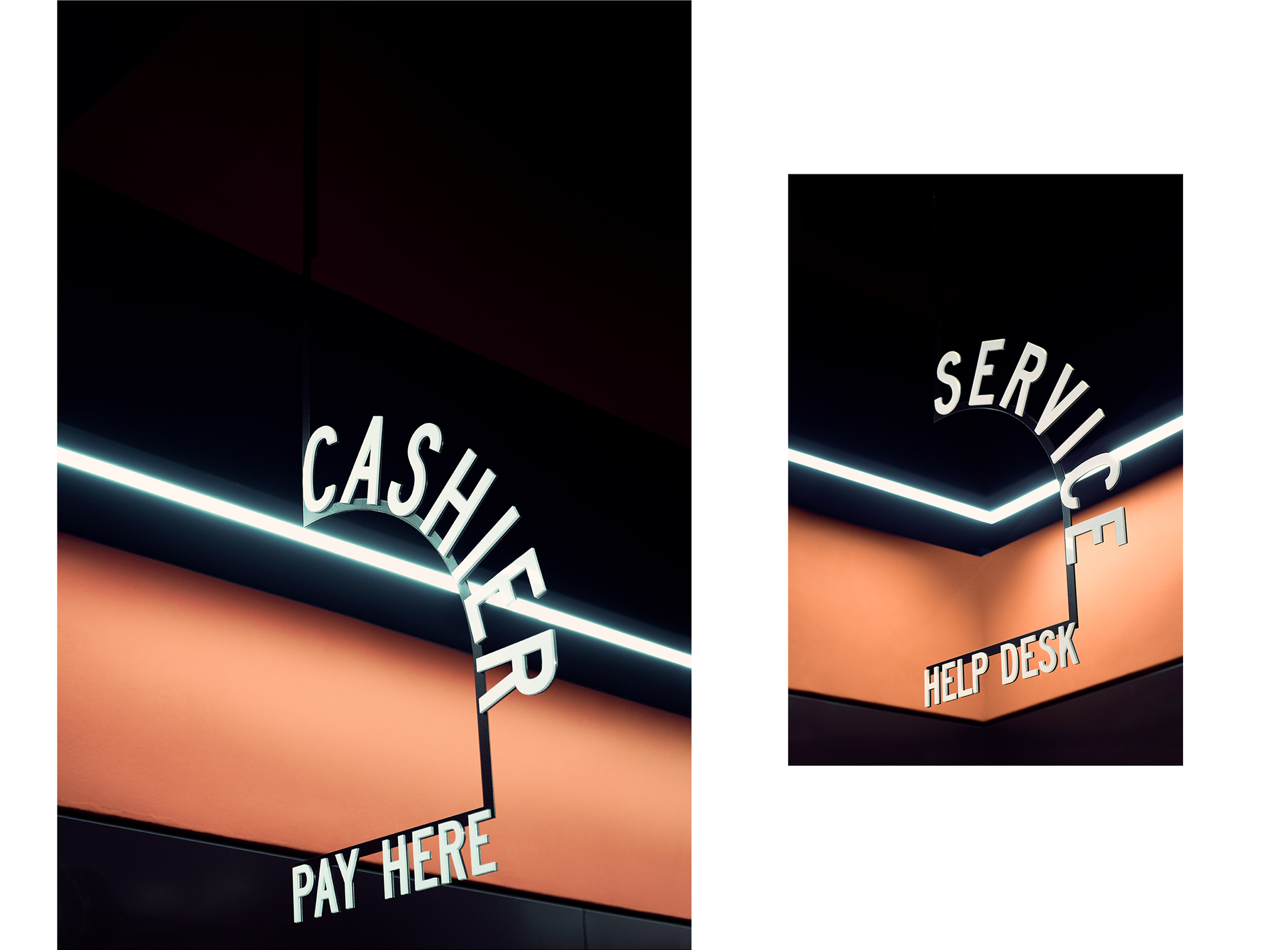
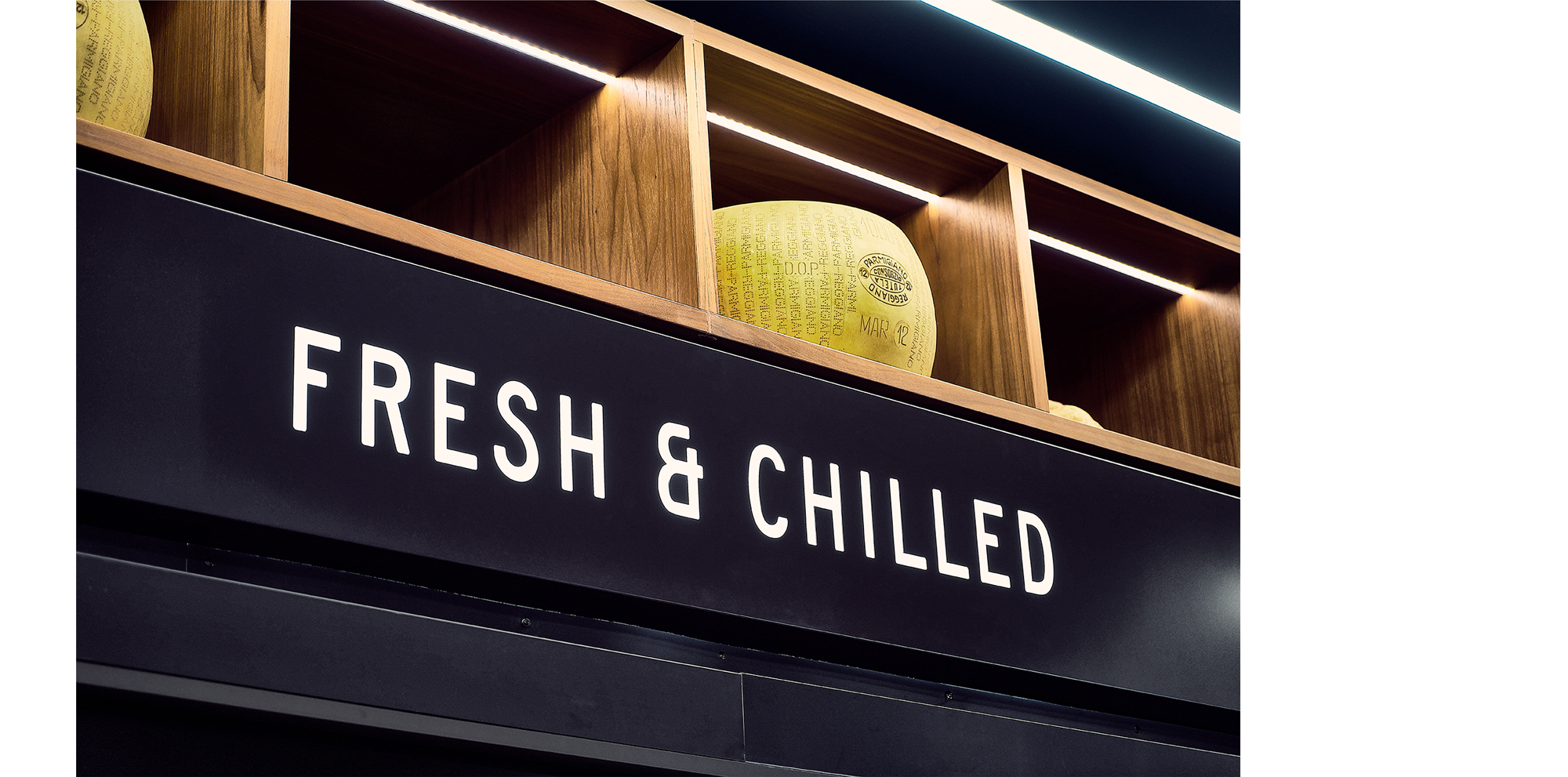
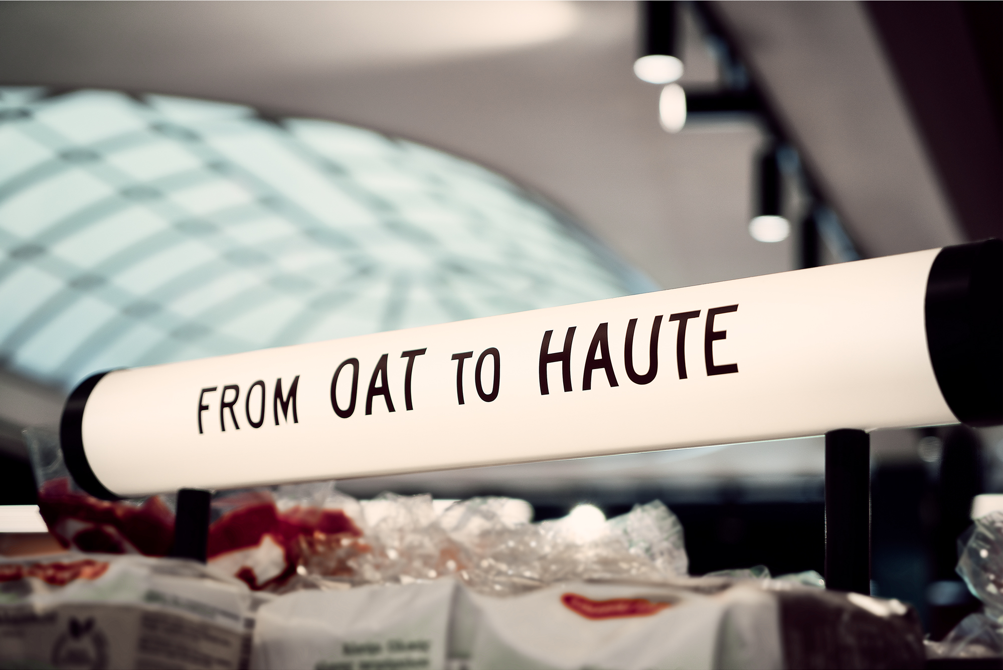
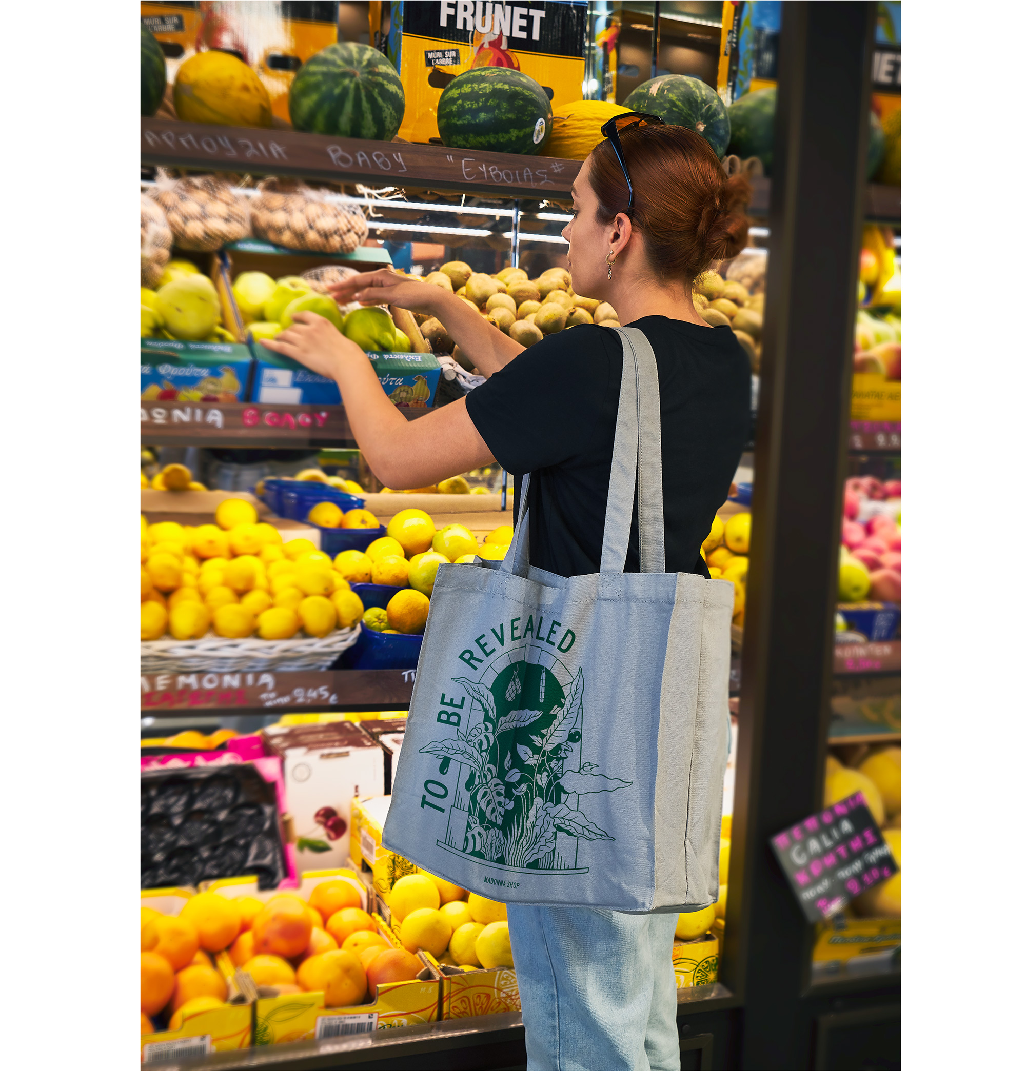
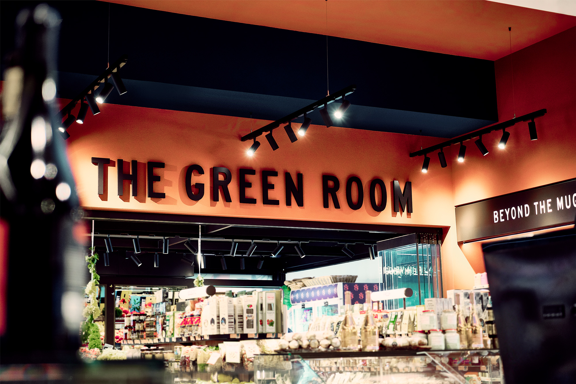
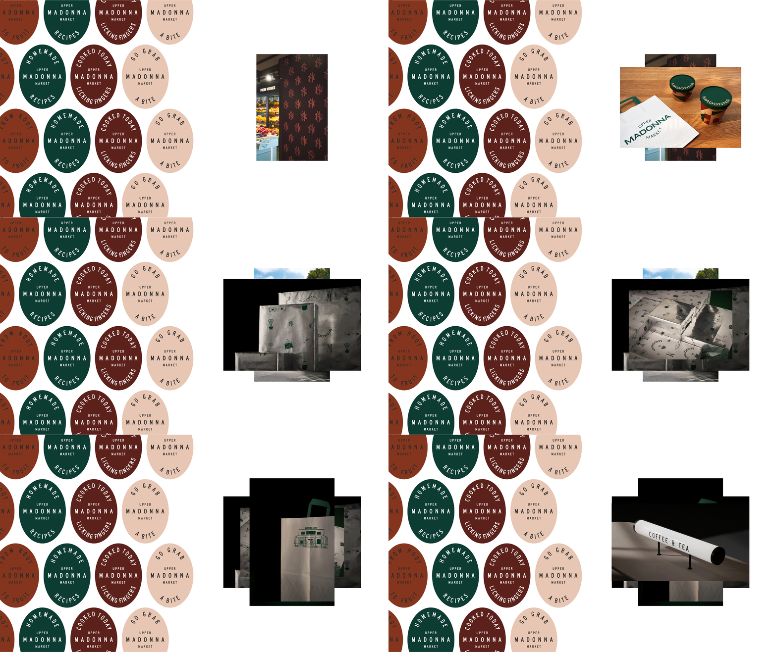
We also designed the exterior signage of the store, alongside the directional system for the interior, consisting of autonomous and different interest spaces. Combining illustrations, ideas, and words we created a visual system that adapts to each segment's packages communicating the brand’s values.




We focus on branding and design with purpose. We produce every project with passion, achieving expressive, bold and innovative communication.
STUDIO
We help brands empower their vision through meaningful design solutions.
We are a group of creatives with expertise in different skills, providing innovative alternatives beyond the predictable.
Numbers in our agency remain consciously small, while a solid network of professionals complements our work.
Every single project can be monitored at any stage before its completion, in a flexible and effective manner.
Designers communicate directly with clients, taking their needs into account and helping them gain their share in the domestic and international market.
Drop us a line.
We're looking forward to speaking with you.
Distinctions ___
Branding ___
Creative direction
Logotype
Visual identity
Packaging design
Naming
Printing material design
Signance & Enviroment
Logotype
Visual identity
Packaging design
Naming
Printing material design
Signance & Enviroment
Digital ___
Website
E-commerce
Application
Content development
E-commerce
Application
Content development
Production ___
Photography
Print process
Supervision
Print process
Supervision
-
Publications ___
-
Responsive LogoSandu Publishing, 2018
-
Monocle, Issue 109Monocle, 2017-18
-
Slanted #30 - AthensSlanted Publishers, 2017
-
Regional Product PackagingImages Publishing, 2017
-
BRANDLife: Concept Stores & Pop-upsVictionary, 2017
-
Los Logos 8Gestalten, 2016
-
Clothing Packaging DesignImages Publishing, 2016
-
Takeaway Food Packaging NowImages Publishing, 2016
-
Logo ParadeSandu Publishing, 2016
-
Gallery magazineChois publishing, 2015
-
Sample. magazine2015
-
Unpack Me Again!Sandu Publishing, 2015
We shape our team. We stay nimble.
We are always on the lookout for effective and creative people. We currently have no positions or internships, but you may send us your portfolio for consideration in the future.
