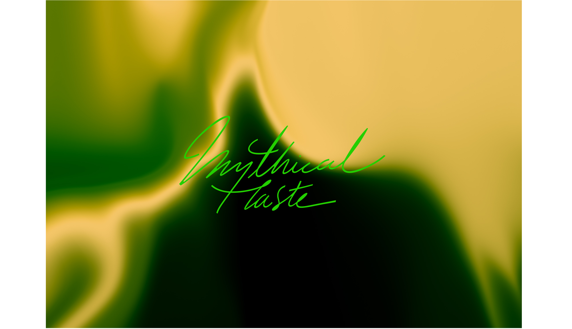
How to catch a unicorn
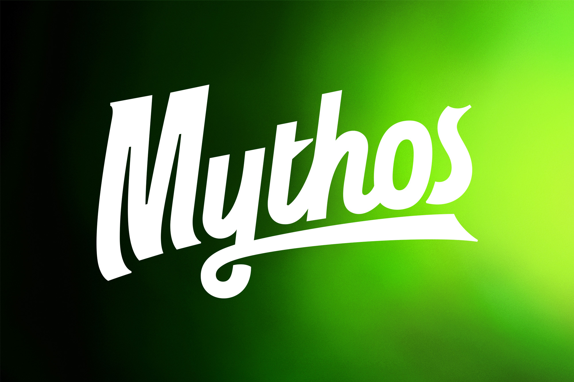
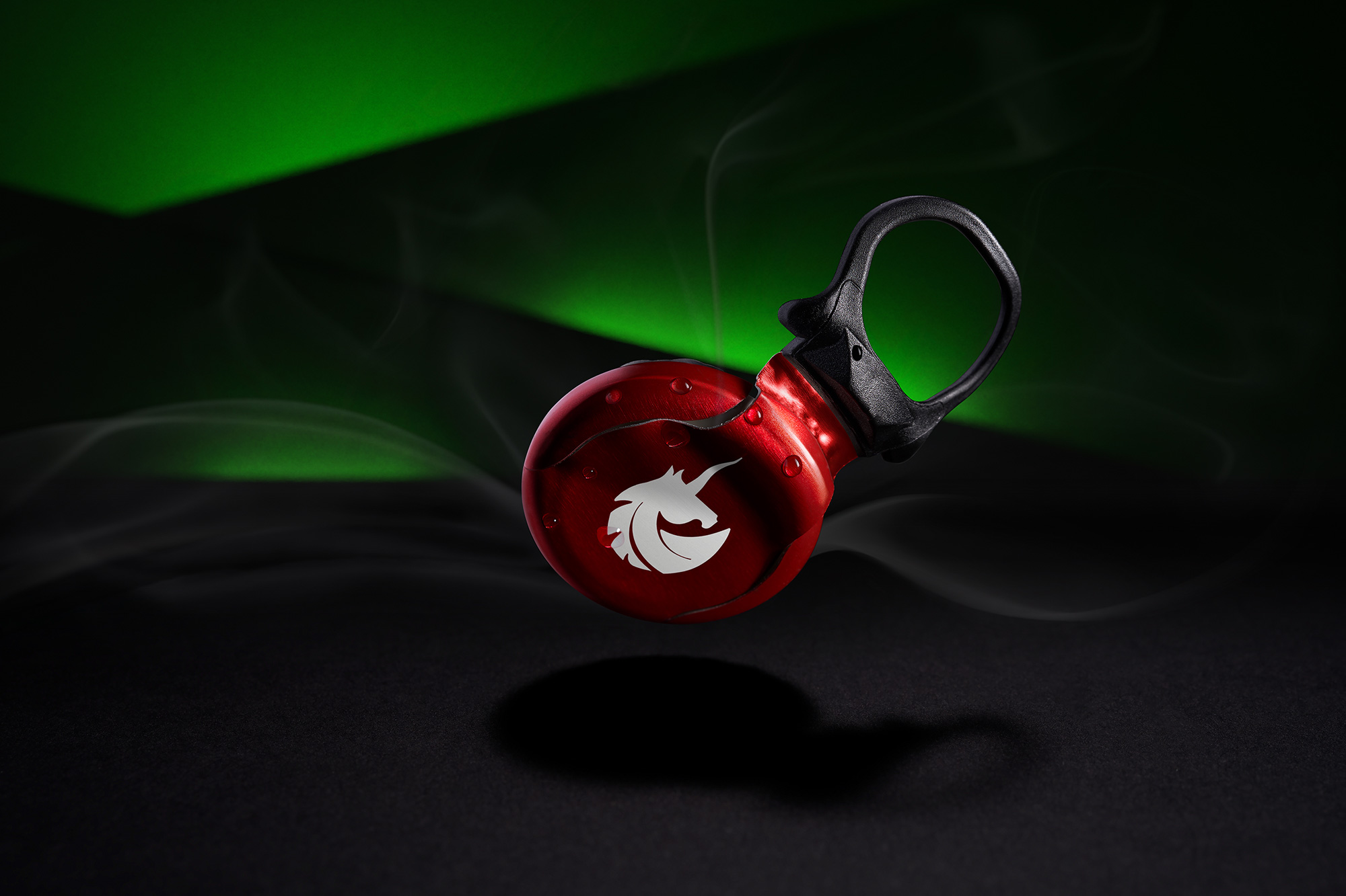
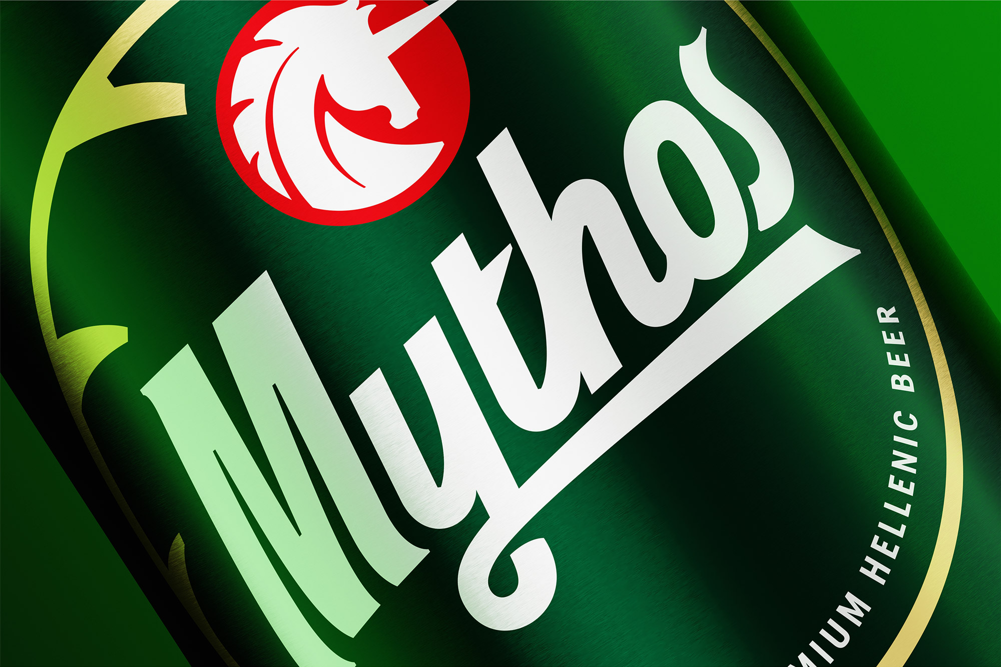
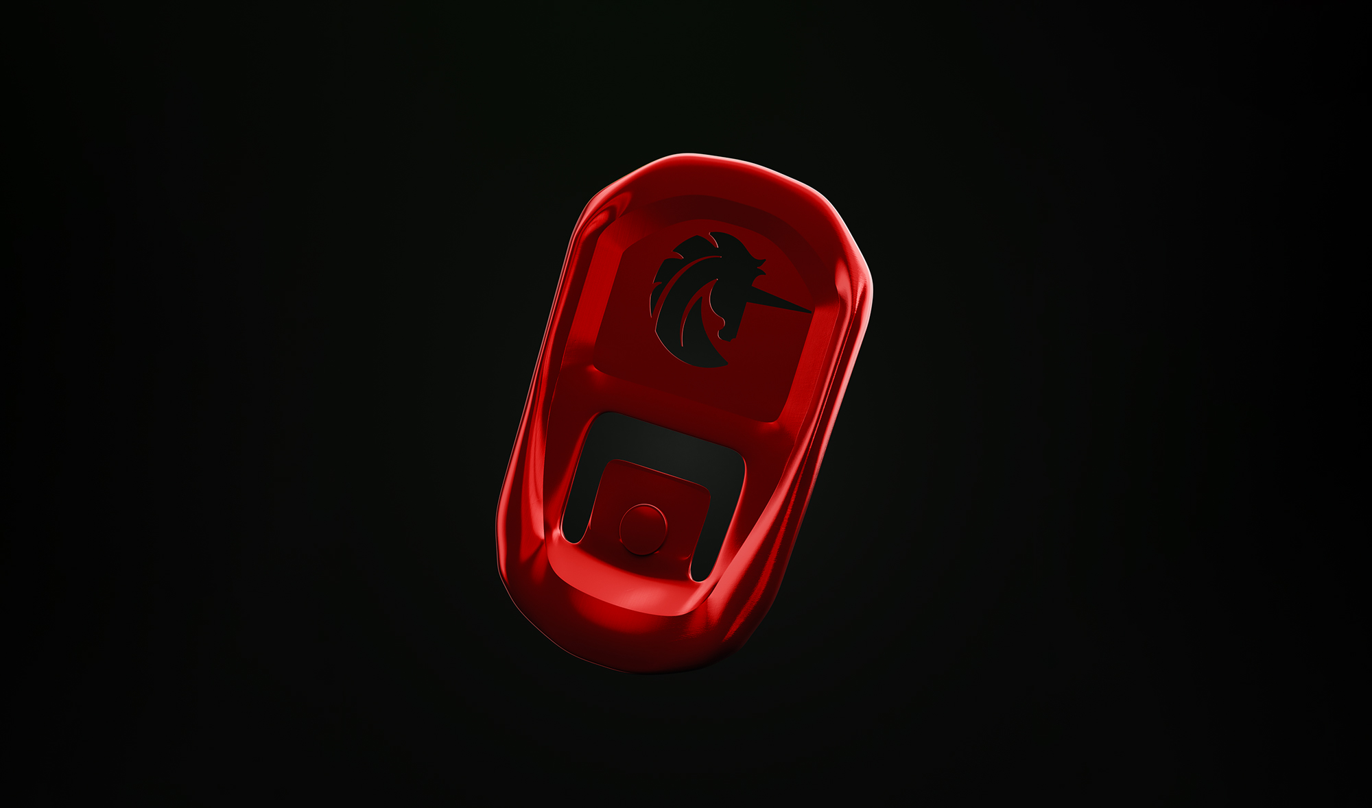
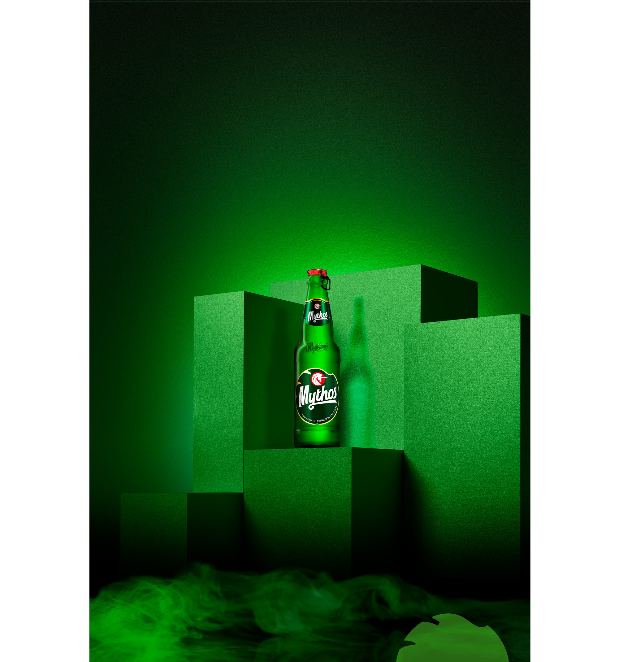
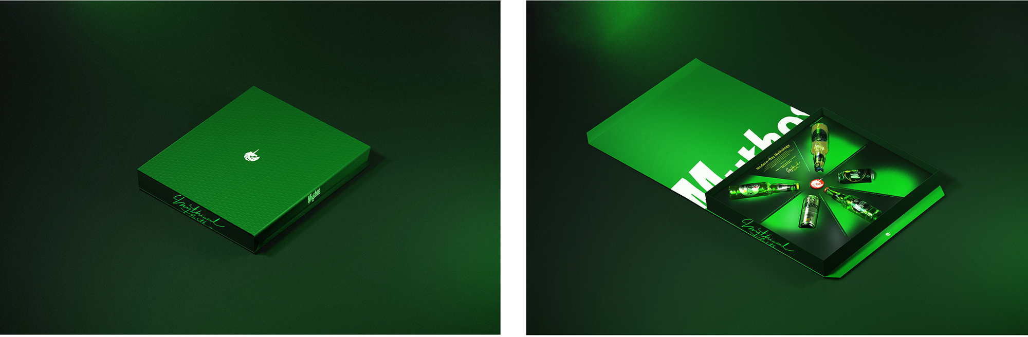
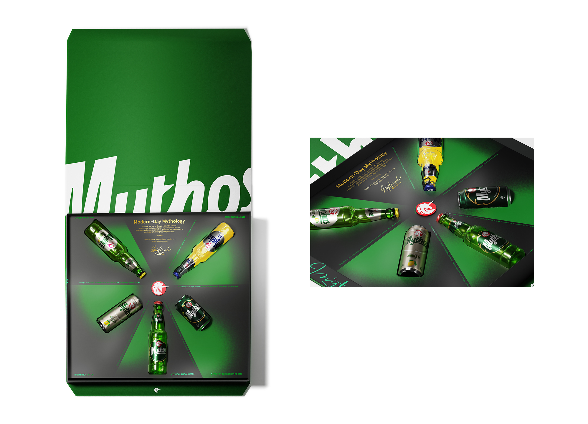
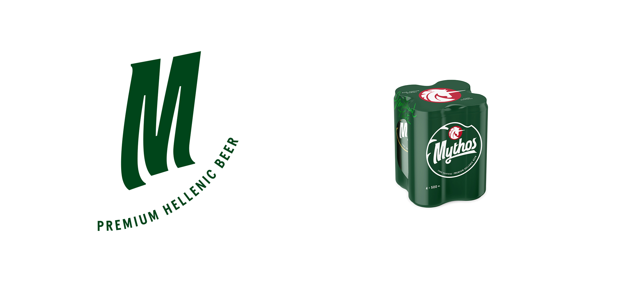
We redesigned the new brand identity of Mythos, one of the major Greek beer brands. Our design was based on the idea of visualizing the brand motto "There’s a Myth everywhere", giving the brand the opportunity to narrate their story through logo and packaging. Key element in the communication is the brand’s logotype. Our goal was to redesign the unicorn symbol in a way that conveys the brand values. The new design consists of clean lines and shapes, achieving a braver, more confident approach. In a closer look, its mane resembles sun rays, while the design on its top resembles sea waves as reference to the liquid element and Greek spirit found in the tagline “Hellenic Premium Beer”. We aimed to create a bold and unique wordmark, connecting it to the brand narrative. Echoing the notion of constant movement that governs the myth of the unicorn, the italic typography gives a sense of motion, confirming that you can't catch a unicorn no matter how hard you try.
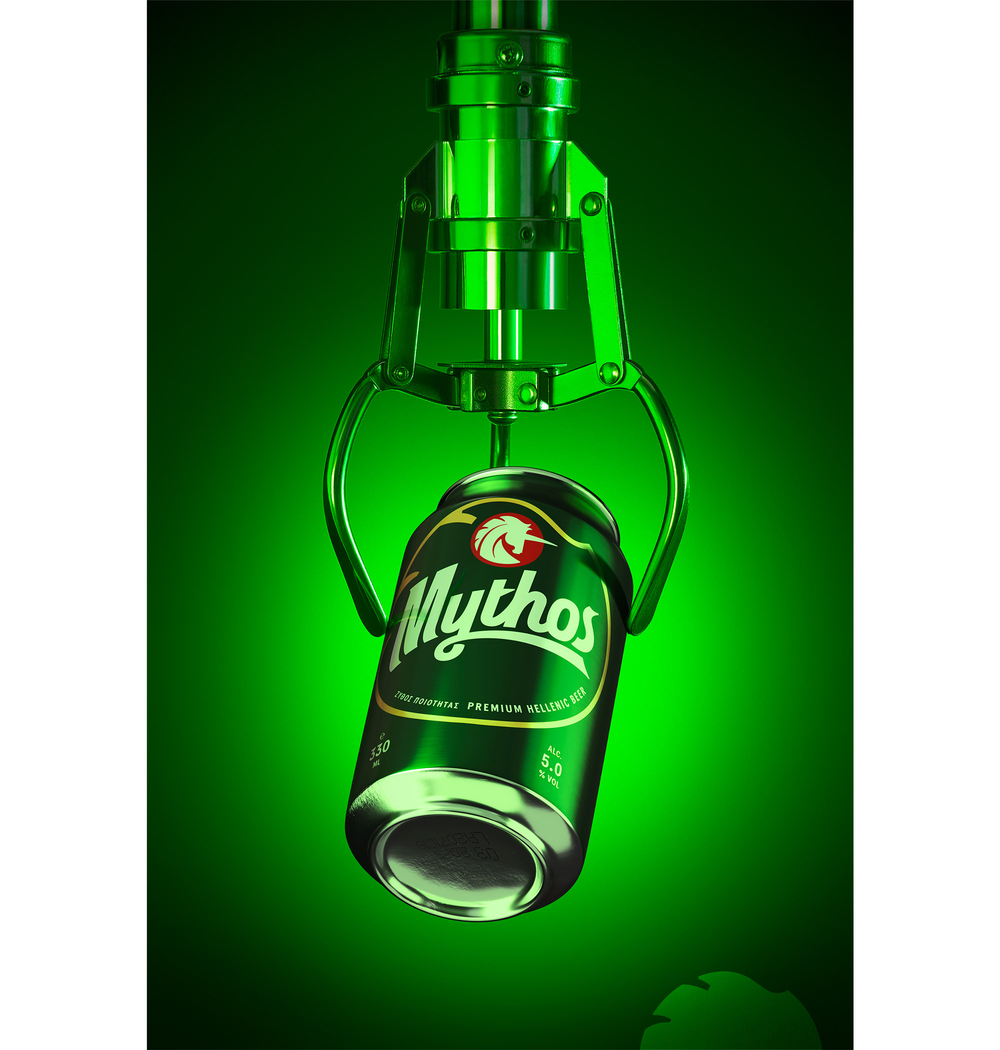
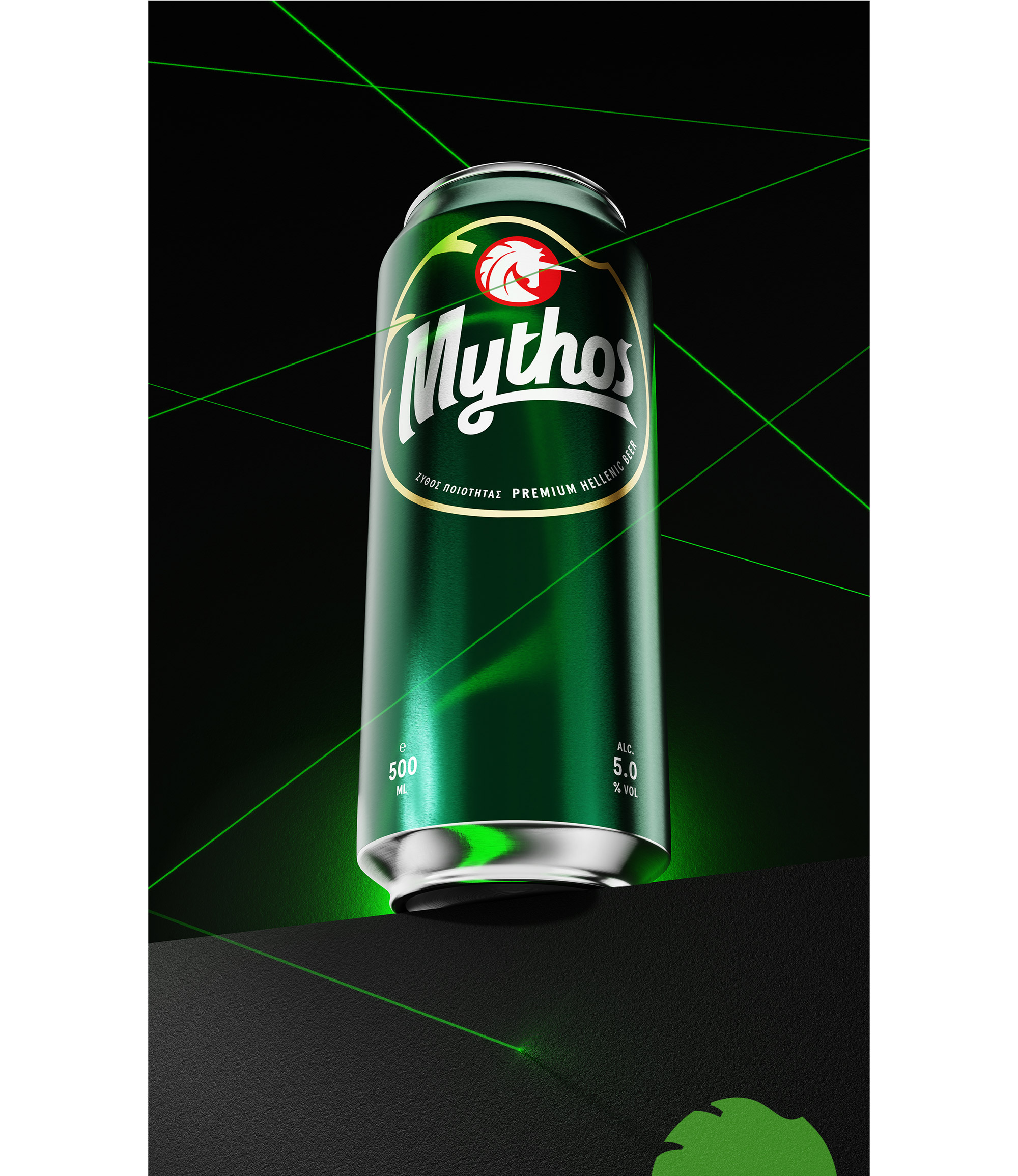
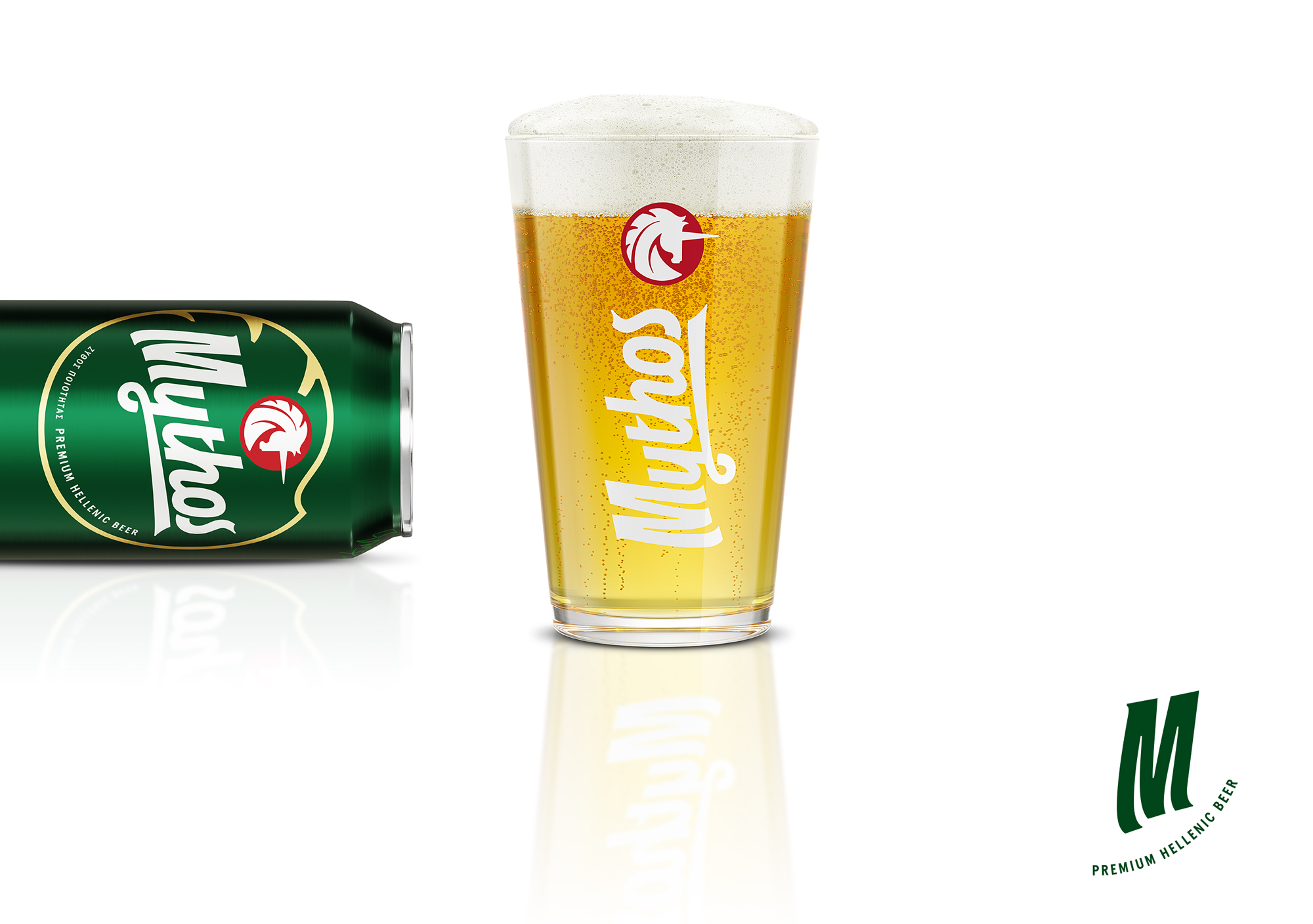
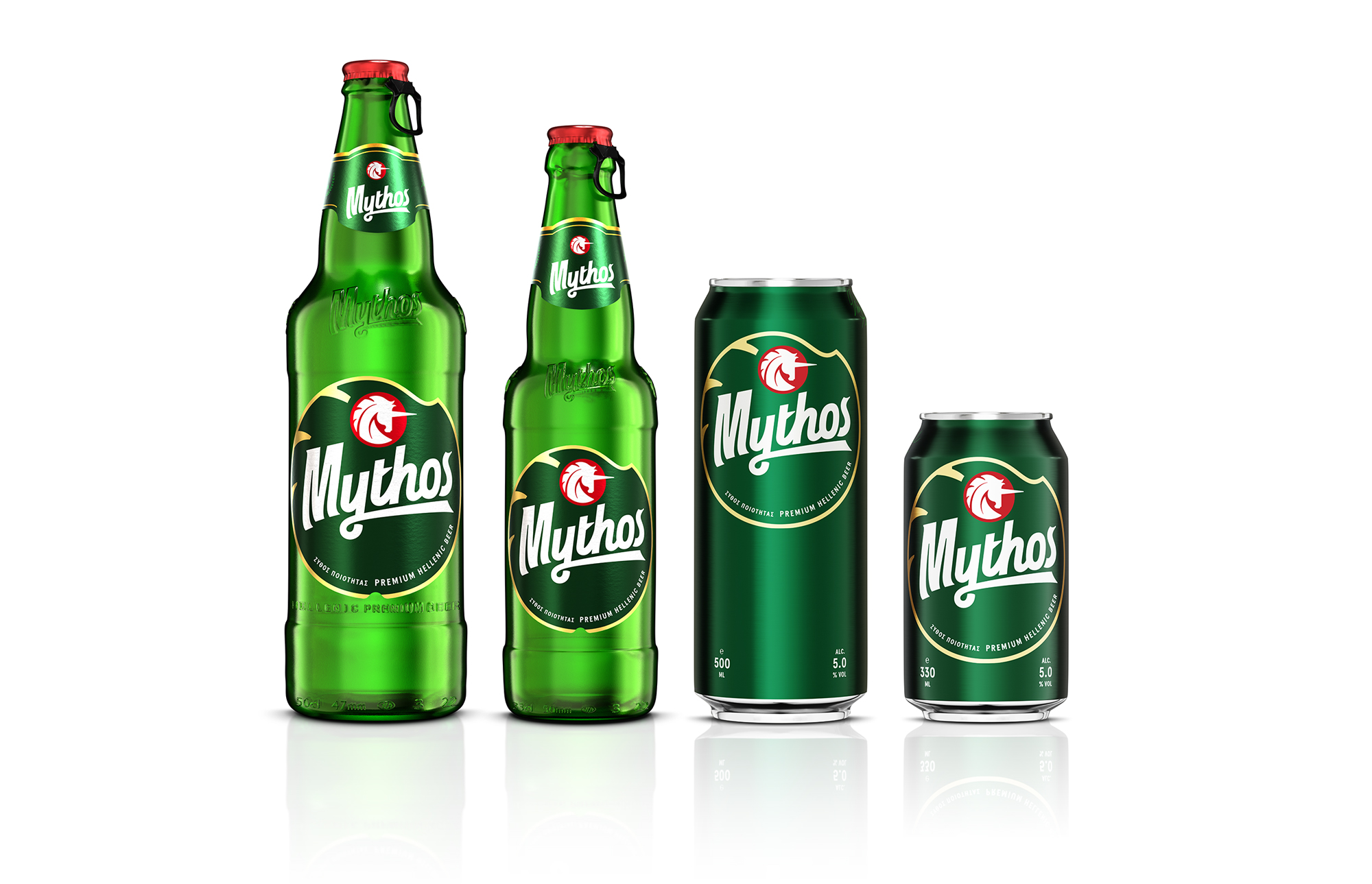
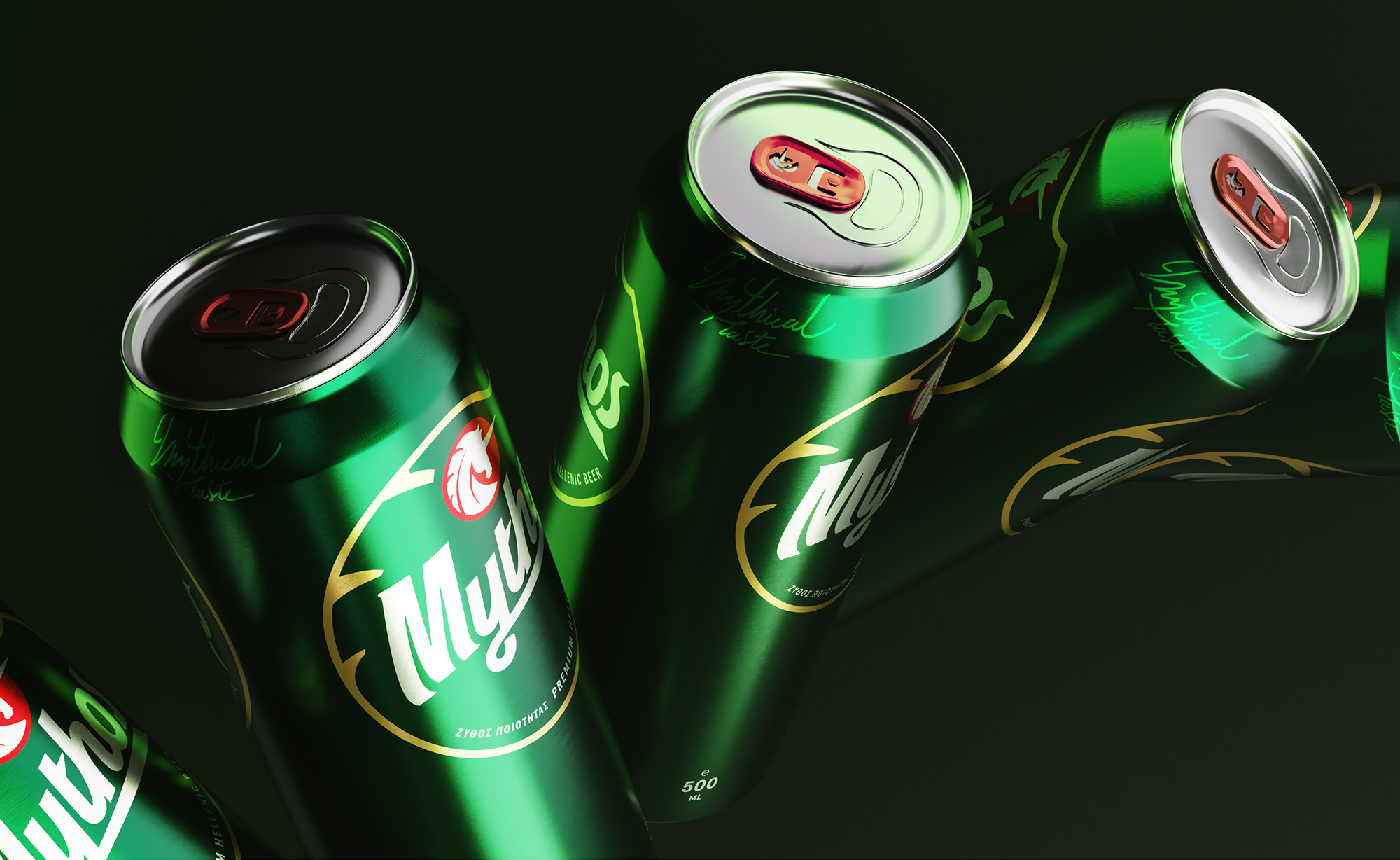
We also gave a fresh and fun mood to our design references, by incorporating morphological features of the unicorn into it. Adapting the new brand identity of Mythos beer into the packaging, aiming to achieve consistency and coherence in its image, we created an optical system that adapts to the communication needs per container. The logo size on the containers remains constant while all the informative texts acquire an organized structure, occupying a specific place, helping the dialogue with the consumers. The creation of a unique label die-cut which can also be applied to the cans as a graphic element was deemed necessary. The uniqueness of the identity was enhanced, while unnecessary information and talkative design elements were dropped, achieving a refreshed image supporting the brand's storytelling.

We focus on branding and design with purpose. We produce every project with passion, achieving expressive, bold and innovative communication.
STUDIO
We help brands empower their vision through meaningful design solutions.
We are a group of creatives with expertise in different skills, providing innovative alternatives beyond the predictable.
Numbers in our agency remain consciously small, while a solid network of professionals complements our work.
Every single project can be monitored at any stage before its completion, in a flexible and effective manner.
Designers communicate directly with clients, taking their needs into account and helping them gain their share in the domestic and international market.
Drop us a line.
We're looking forward to speaking with you.
Distinctions ___


Branding ___
Creative direction
Logotype
Visual identity
Packaging design
Naming
Printing material design
Signance & Enviroment
Logotype
Visual identity
Packaging design
Naming
Printing material design
Signance & Enviroment
Digital ___
Website
E-commerce
Application
Content development
E-commerce
Application
Content development
Production ___
Photography
Print process
Supervision
Print process
Supervision
-
Publications ___
-
Responsive LogoSandu Publishing, 2018
-
Monocle, Issue 109Monocle, 2017-18
-
Slanted #30 - AthensSlanted Publishers, 2017
-
Regional Product PackagingImages Publishing, 2017
-
BRANDLife: Concept Stores & Pop-upsVictionary, 2017
-
Los Logos 8Gestalten, 2016
-
Clothing Packaging DesignImages Publishing, 2016
-
Takeaway Food Packaging NowImages Publishing, 2016
-
Logo ParadeSandu Publishing, 2016
-
Gallery magazineChois publishing, 2015
-
Sample. magazine2015
-
Unpack Me Again!Sandu Publishing, 2015
We shape our team. We stay nimble.
We are always on the lookout for effective and creative people. We currently have no positions or internships, but you may send us your portfolio for consideration in the future.