Developing a Cream Resort
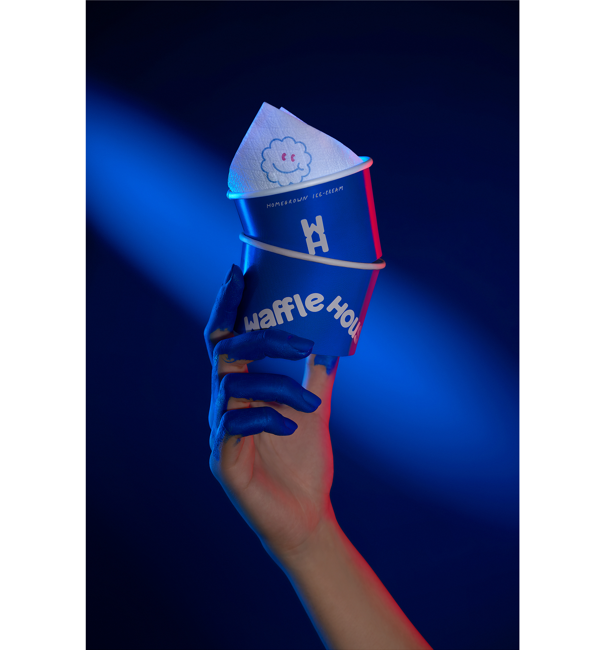
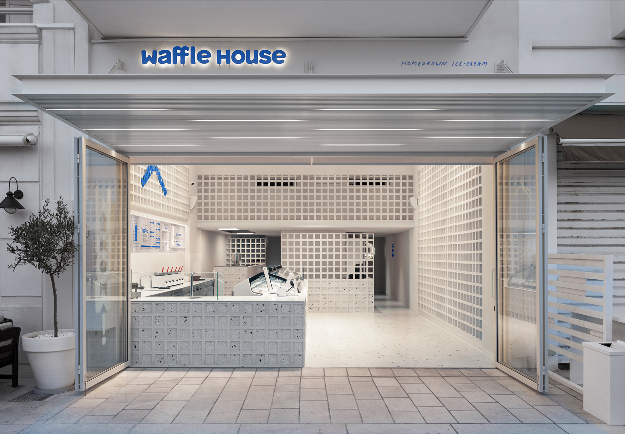
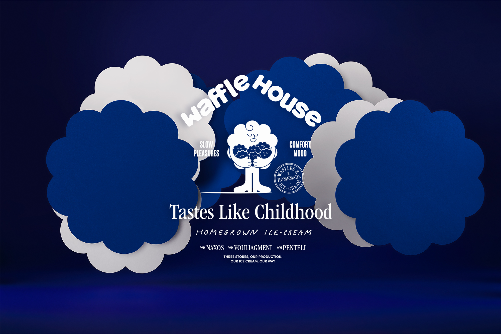
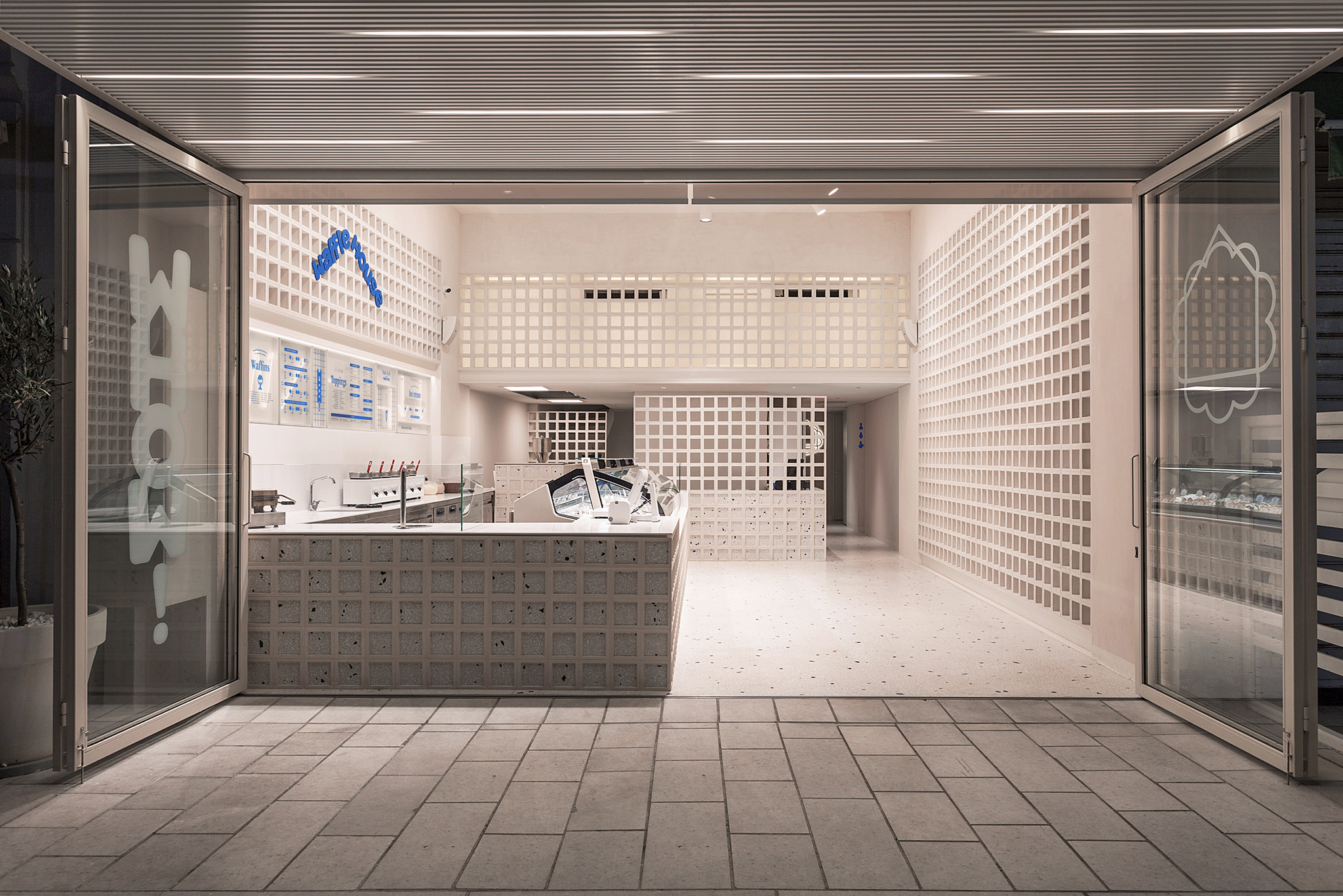
Waffle House, the brand with the most famous freshly baked waffles in Greece and the daily made ice cream, putting the concept of freshness into practice, trusted us to develop its new visual identity. Over time, Waffle House stores have evolved into meeting points for ice cream lovers, offering an authentic, taste-like-home experience.
For its lovers, ice cream is much more than a frozen treat. It has its own ritual and its enjoyment brings fulfillment, joy, and excitement. And it is certainly has to be treated not as just a summer dessert. That's why when we were tasked with the rebranding, we thought of ourselves as true lovers of homemade ice cream.
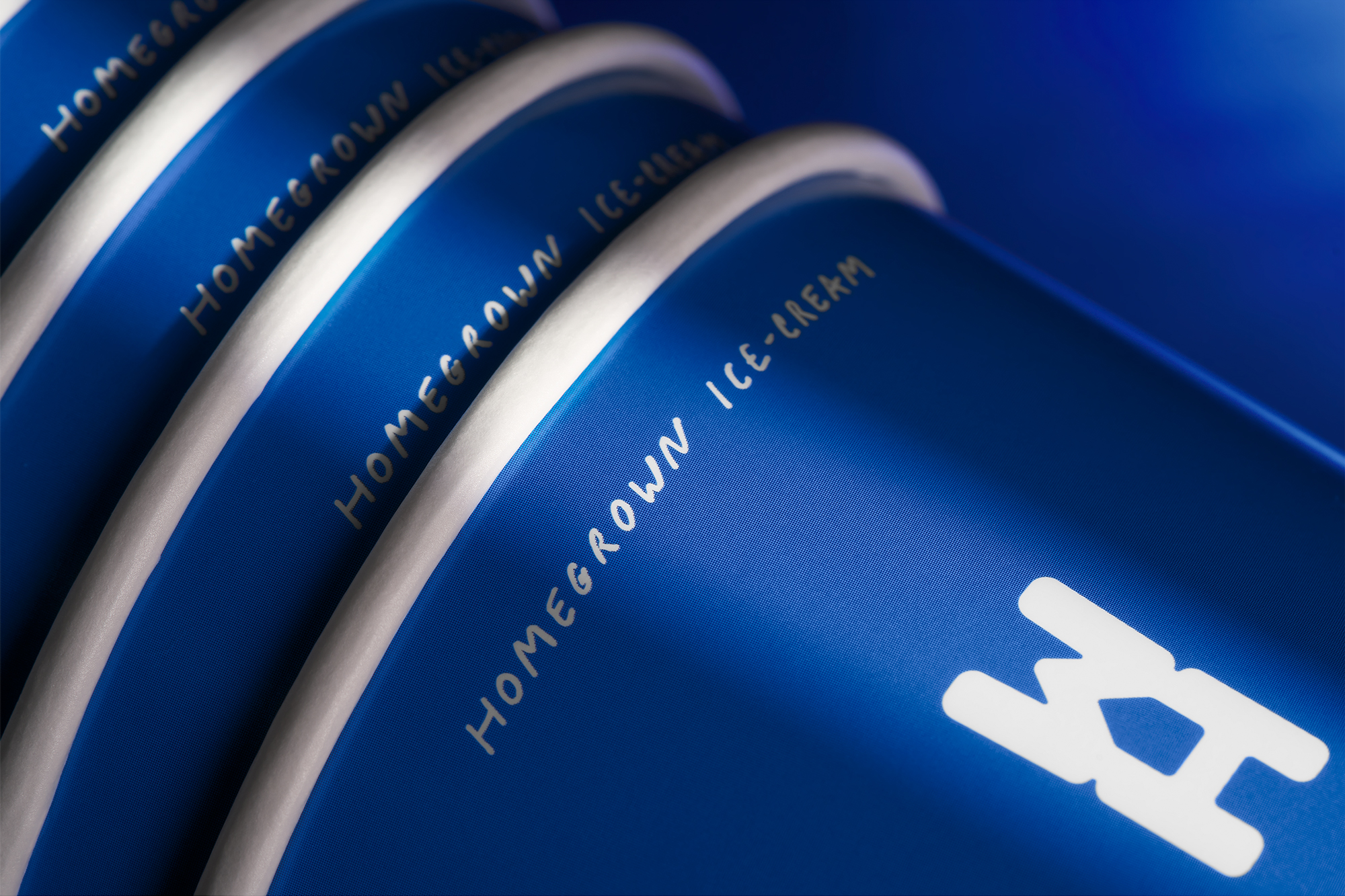
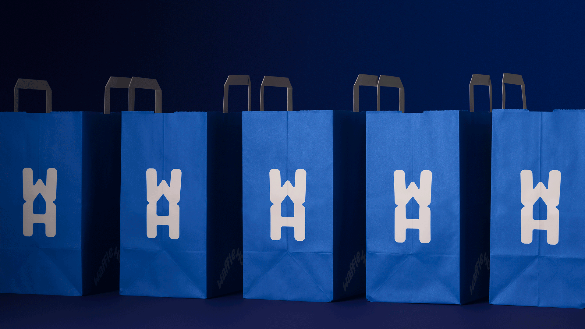
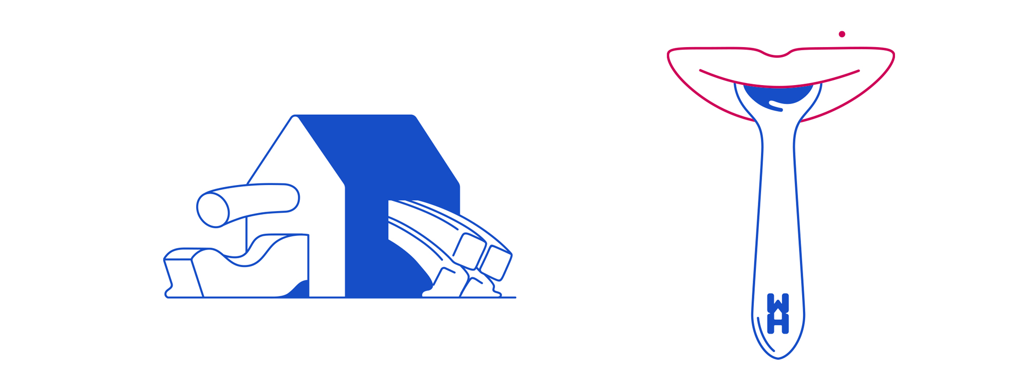
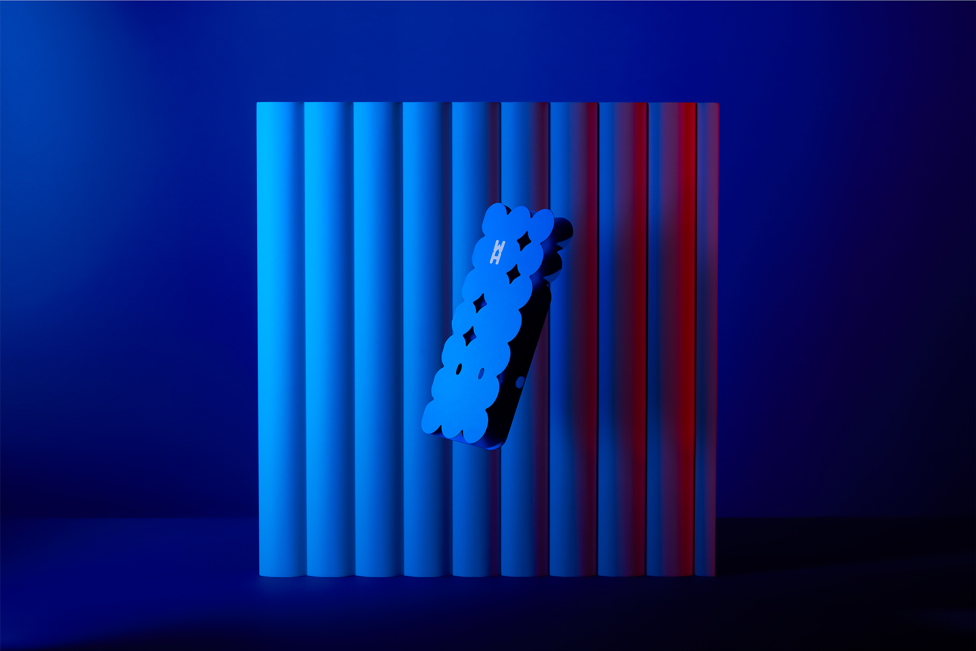
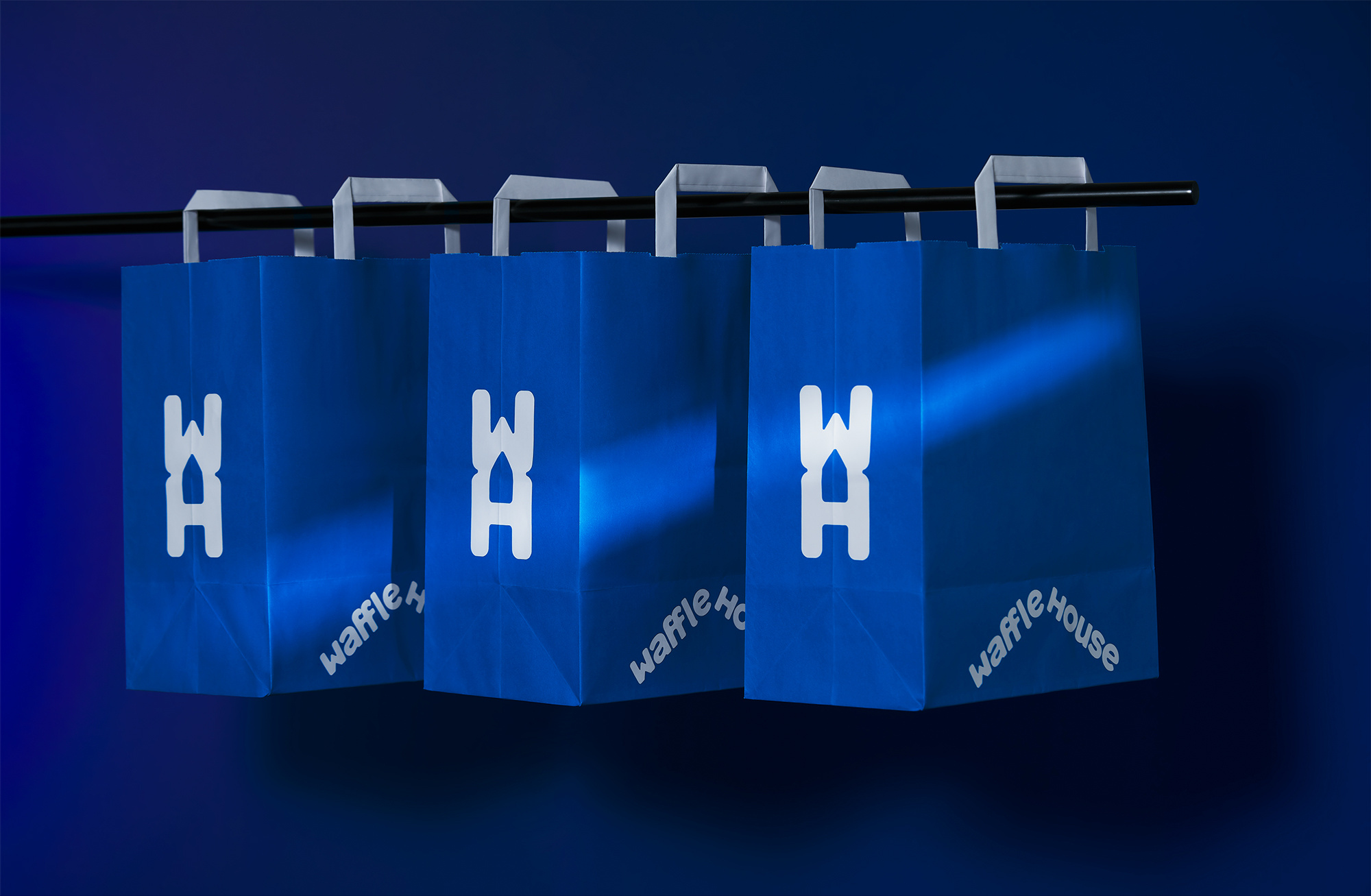
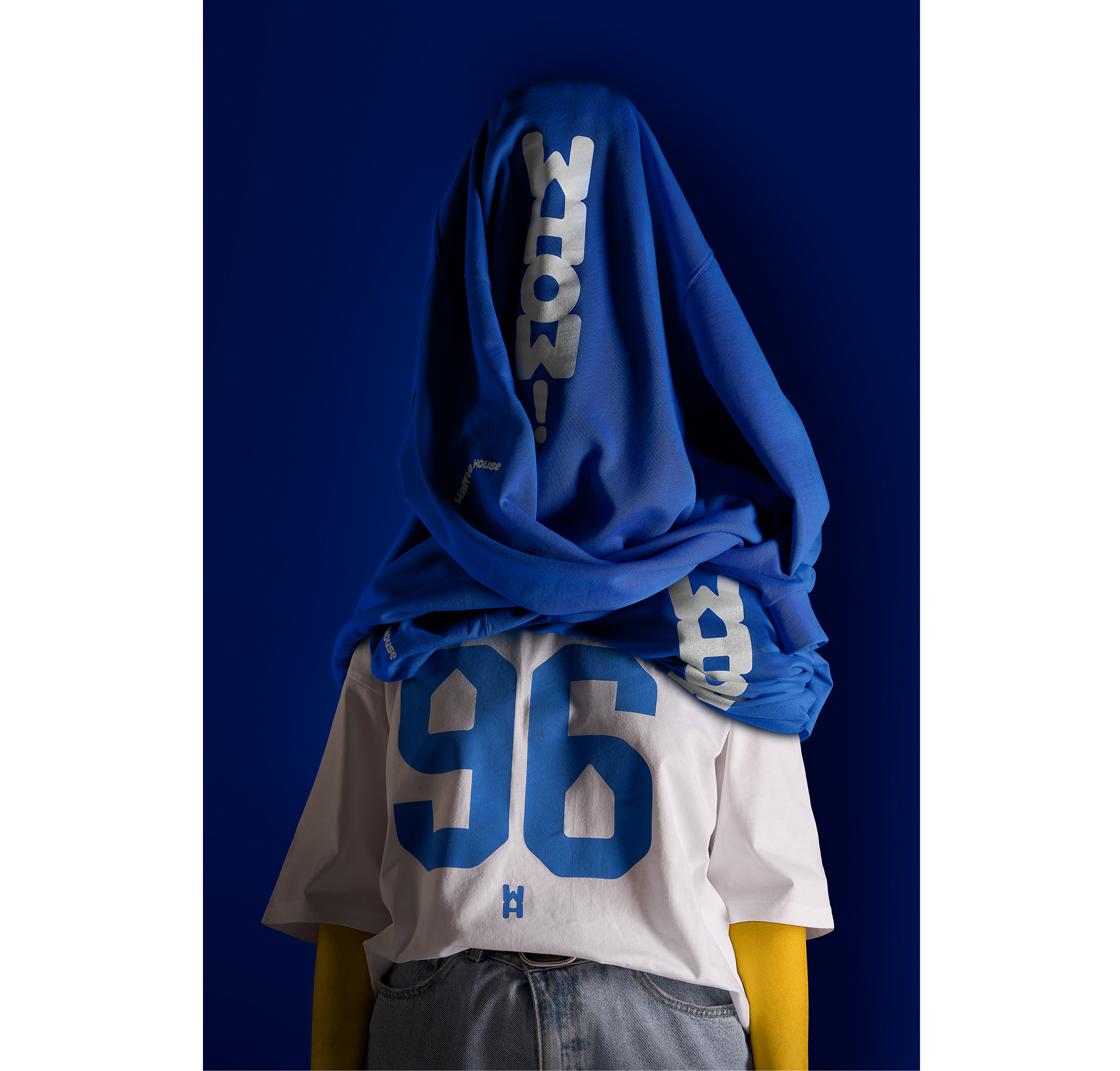
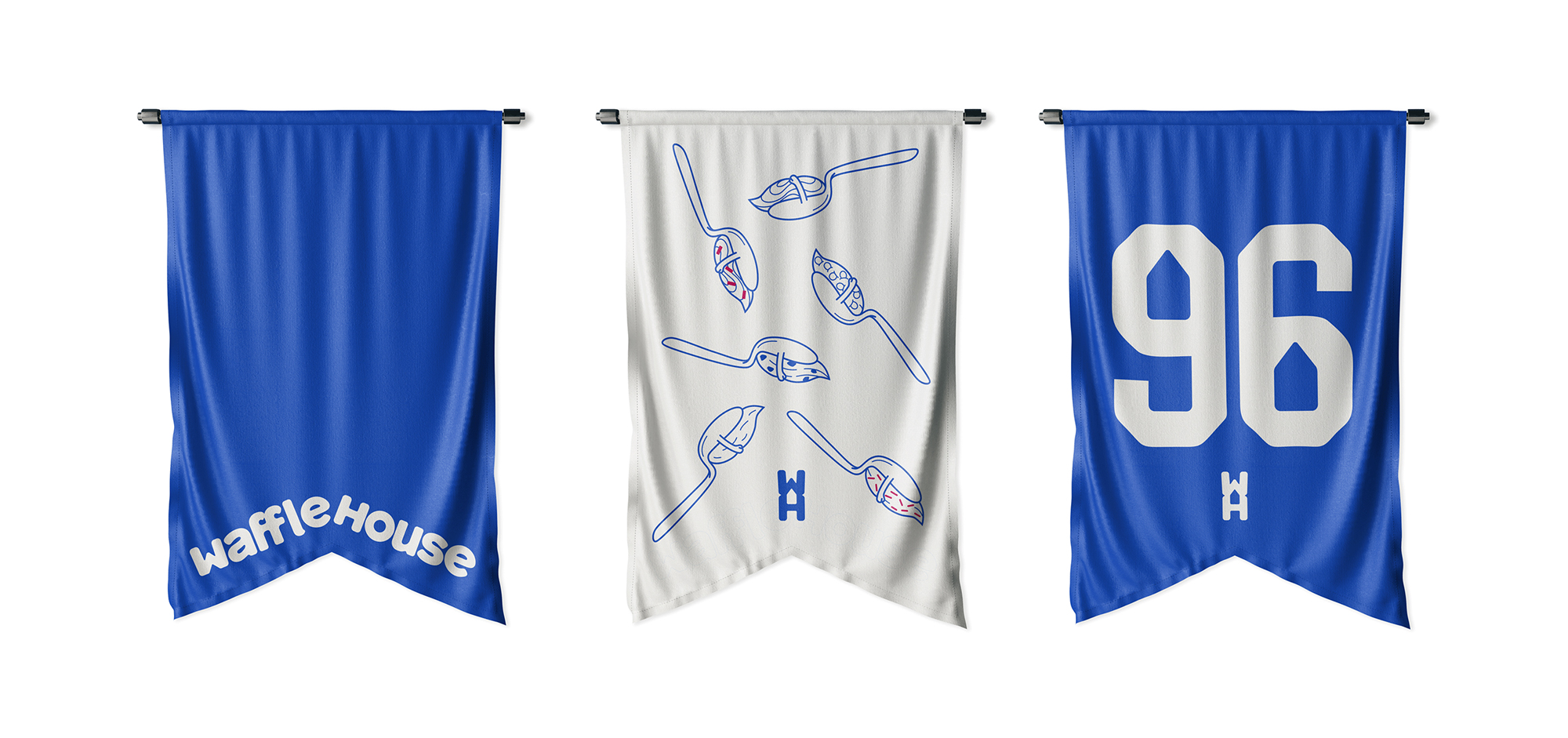
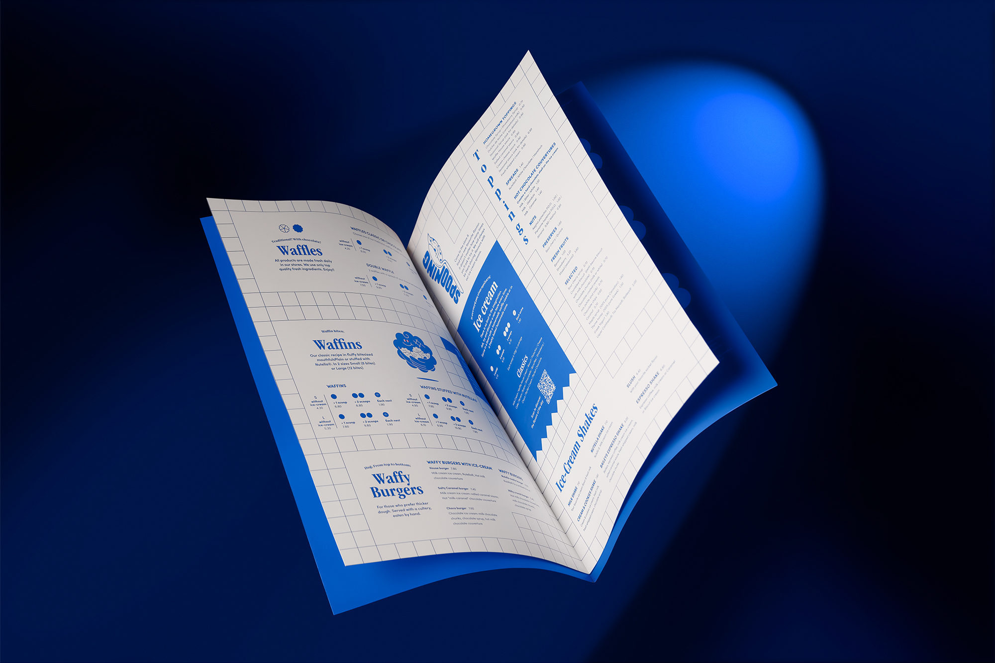
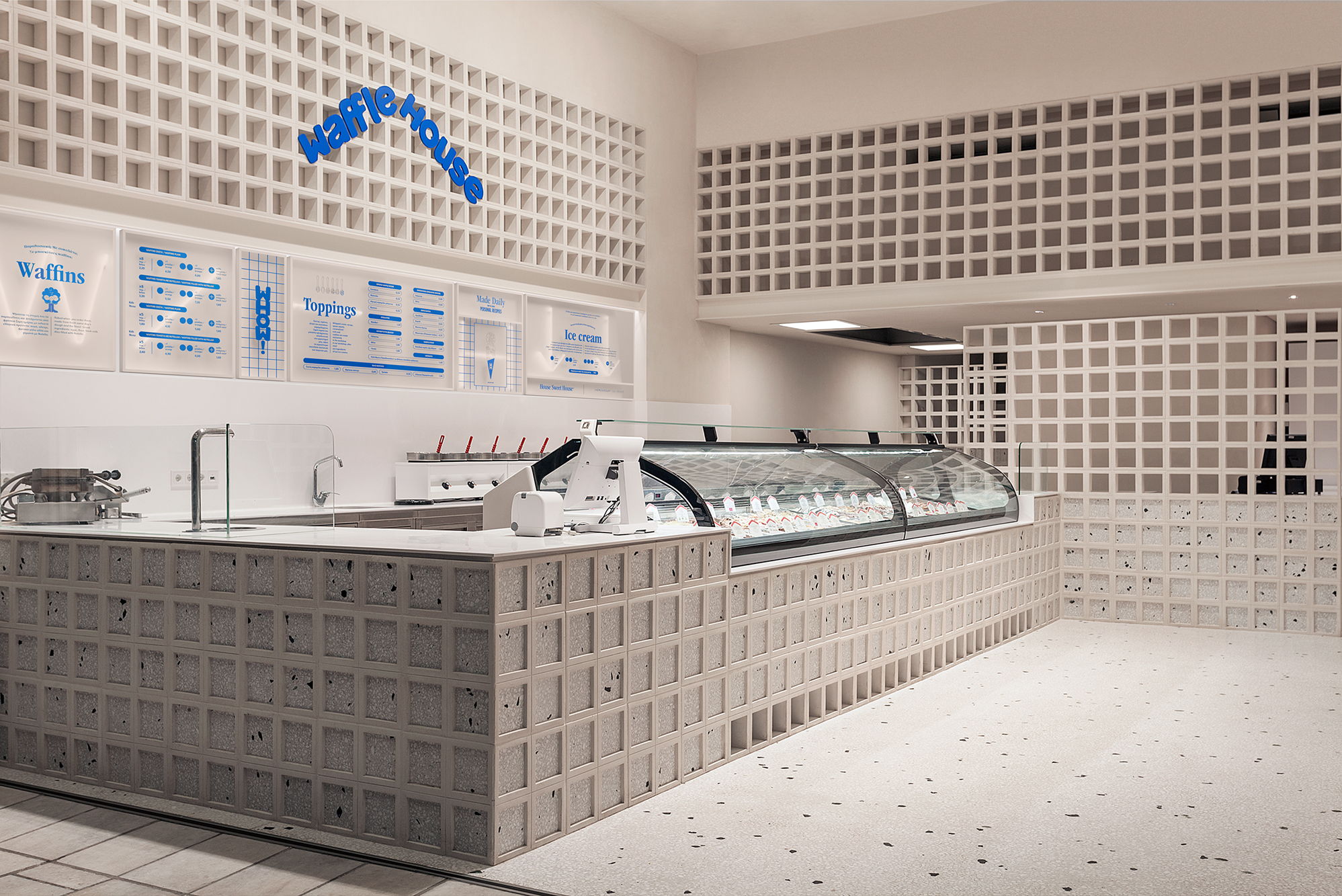
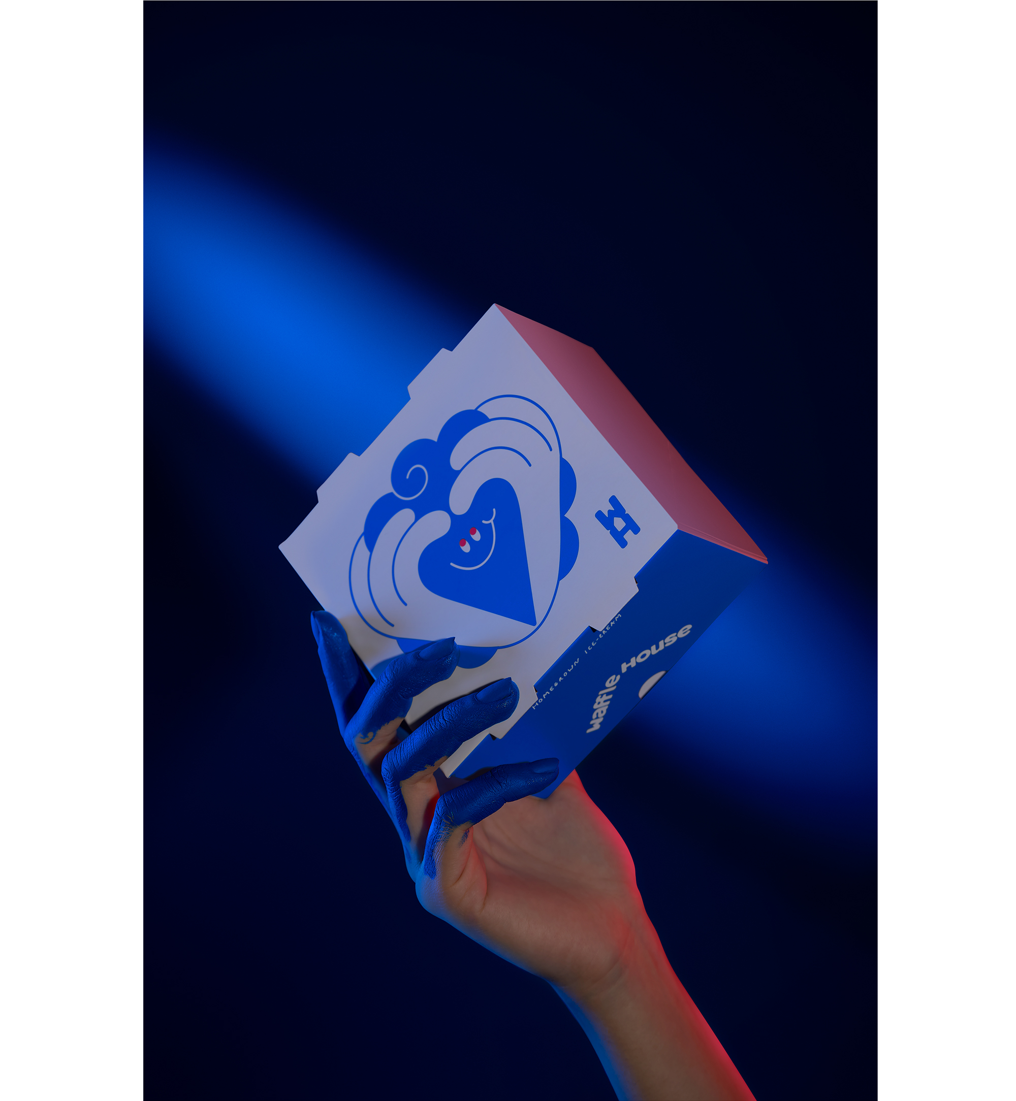
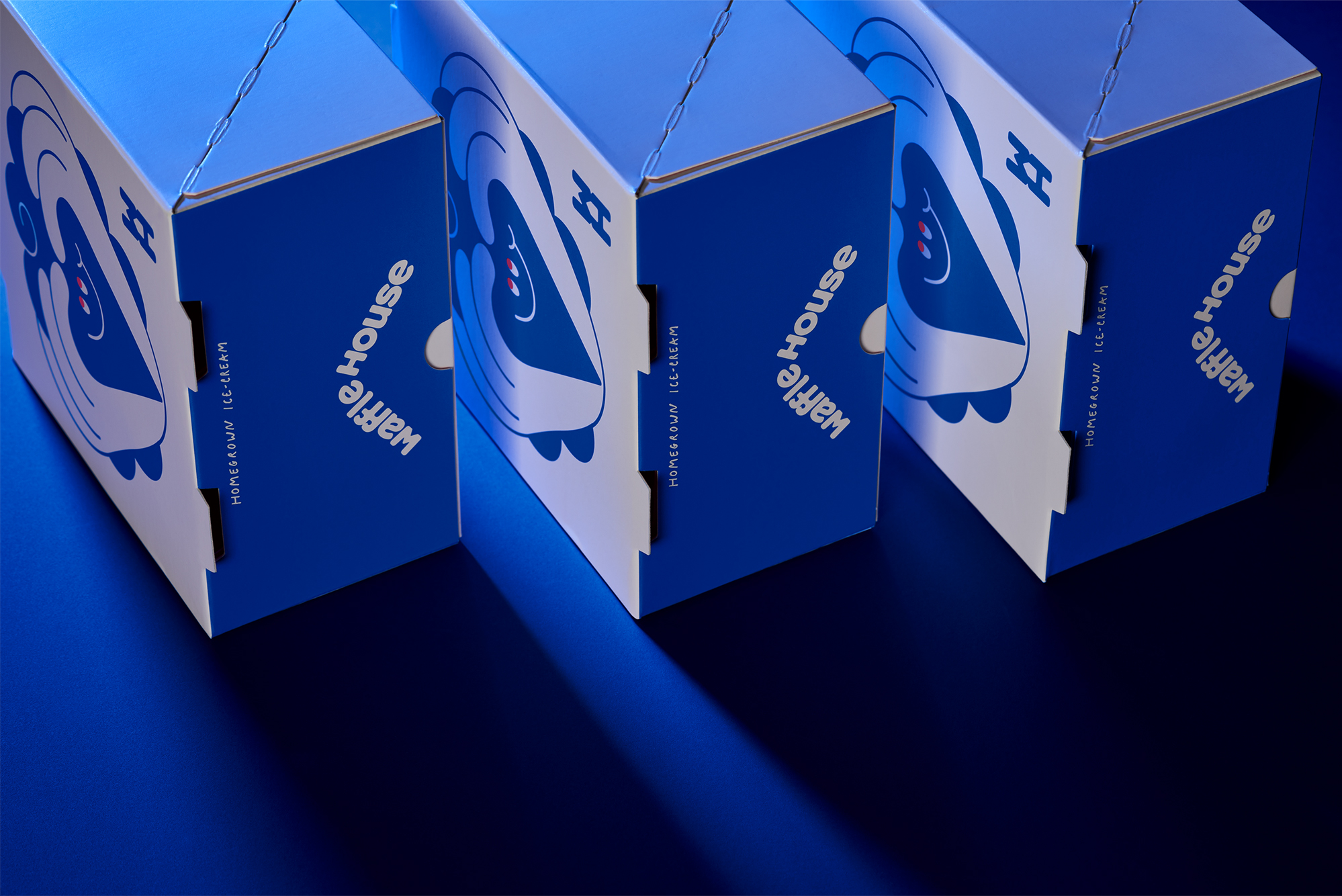
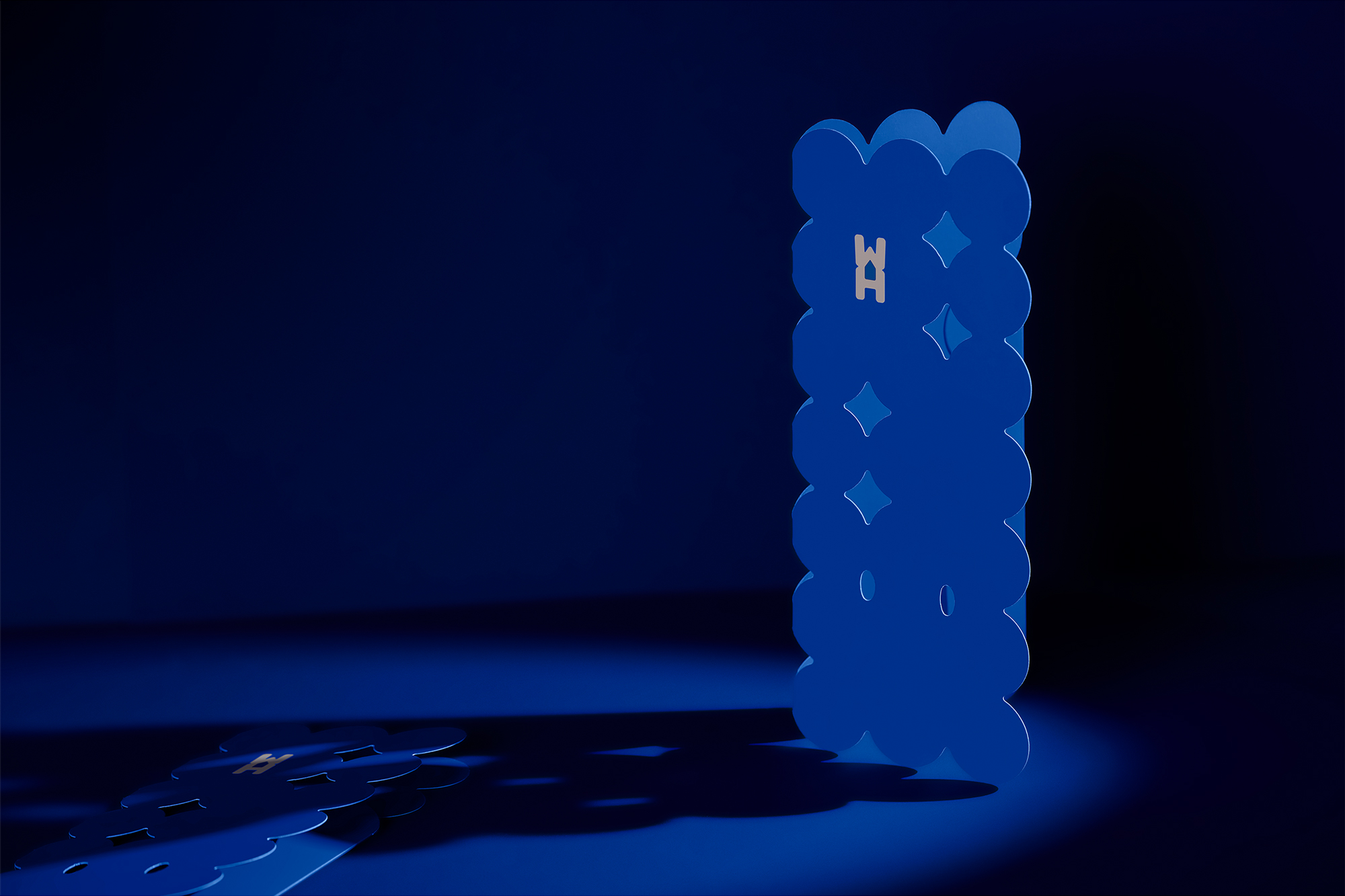
The new logo and custom typography express values found in the brand's personality such as freshness and bravery, while the predominance of blue in the color palette reflects the vibrancy expressed by the brand's audience while giving it the consistency and recognition it was lacking.
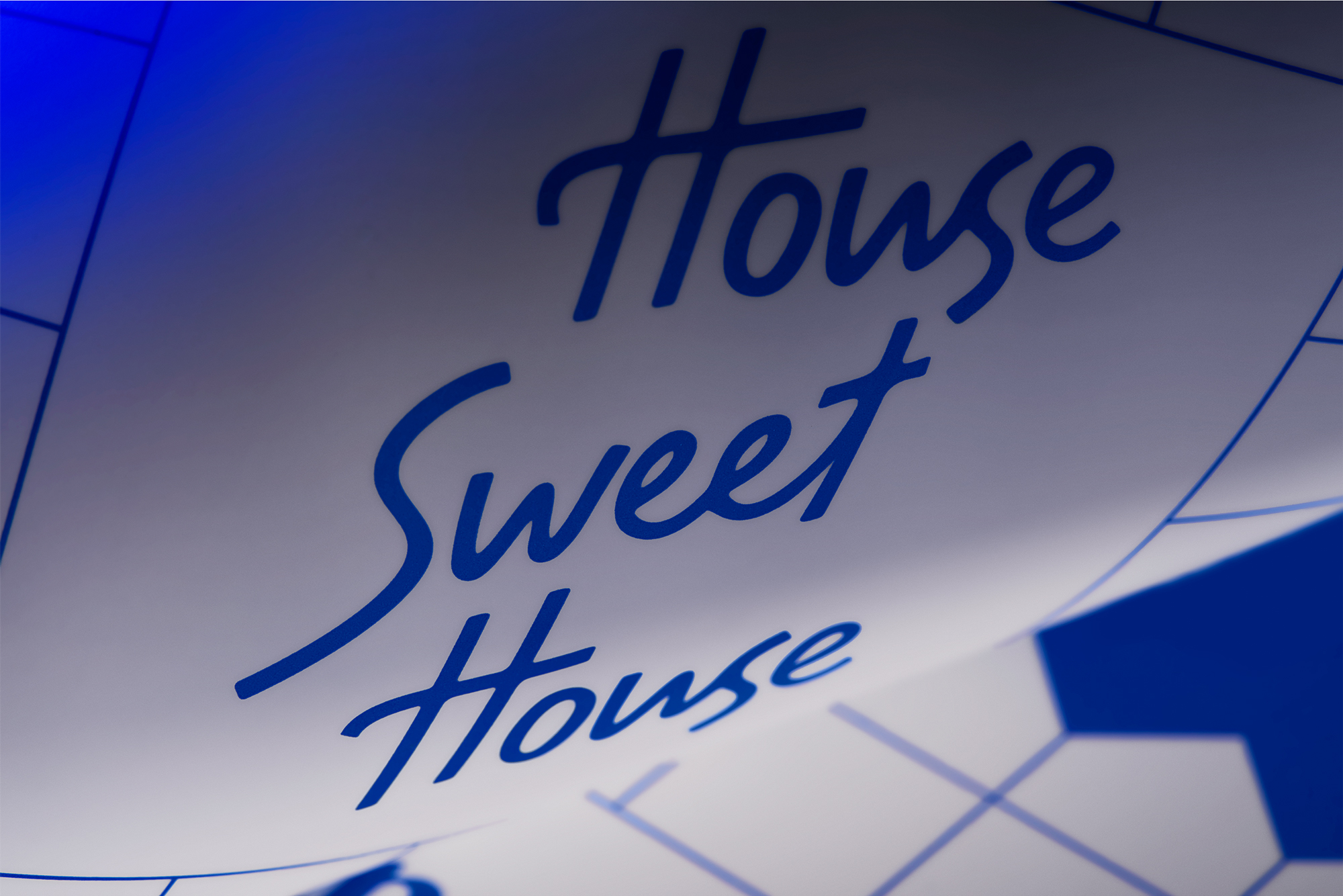
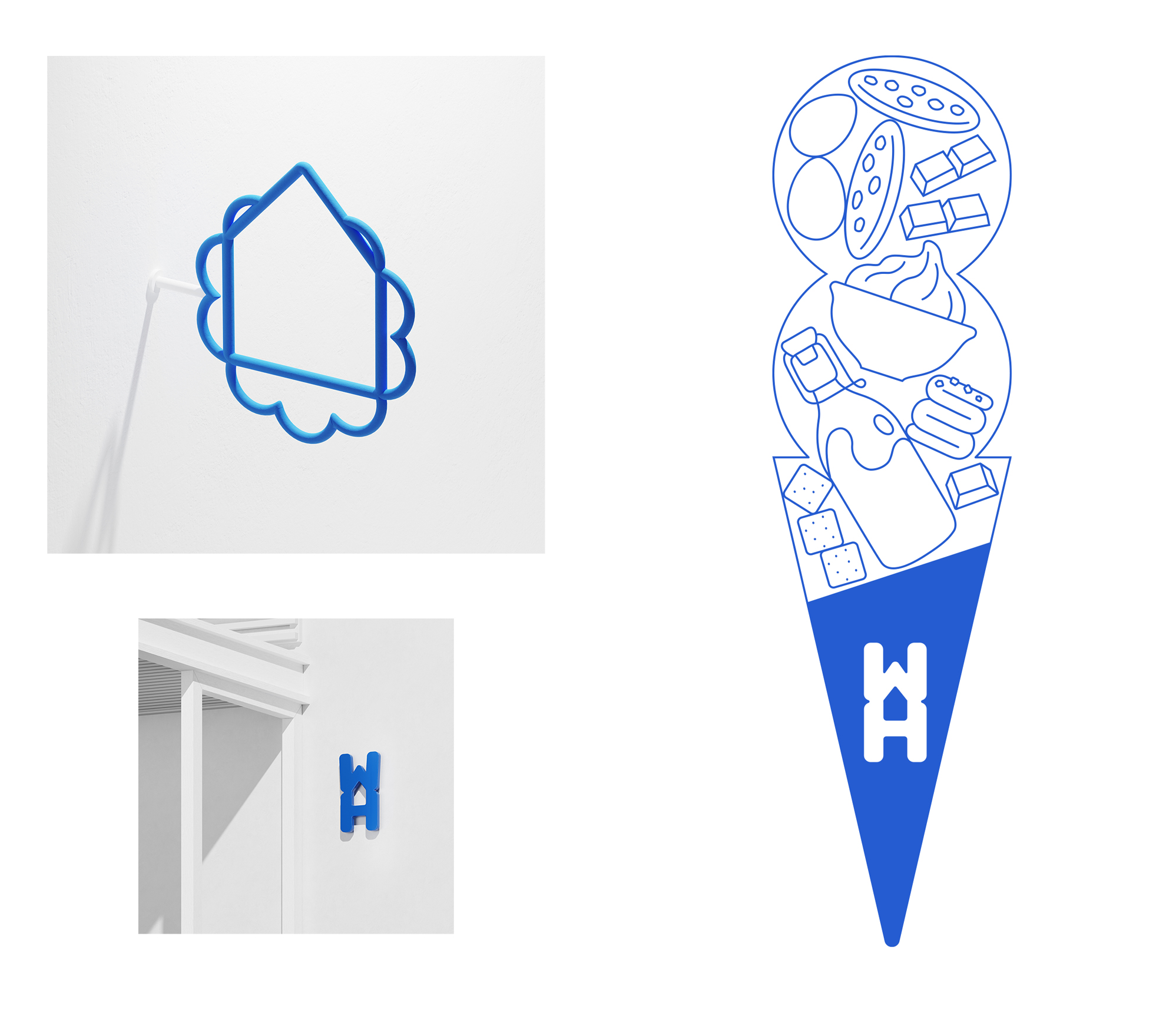
Among other things in the system we developed, the brand's initials create a second, hidden reading in the idea of homemade ice cream expressed by Waffle House. We also transformed the brand motto from Homemade ice cream to Homegrown ice cream, suggesting not just a method, but an entire philosophy of making pure, homemade ice-cream.
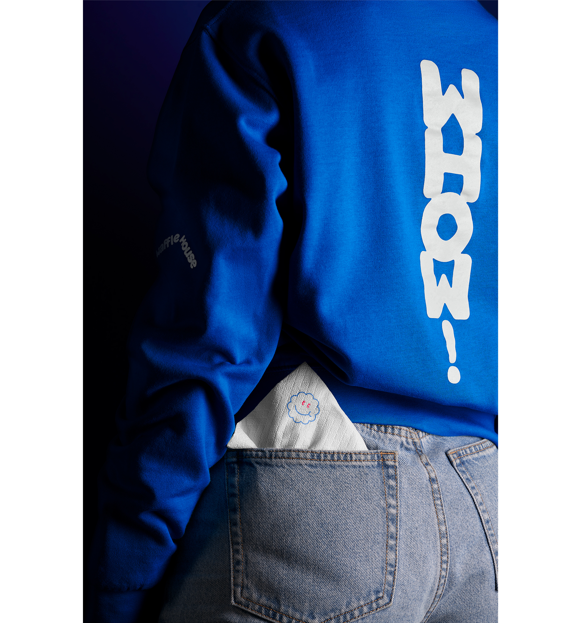
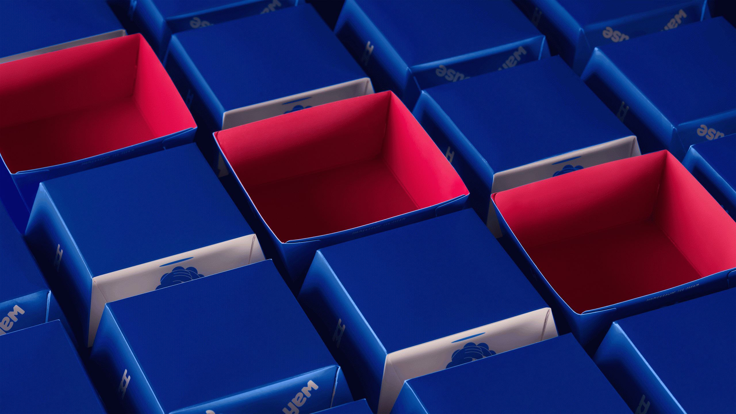
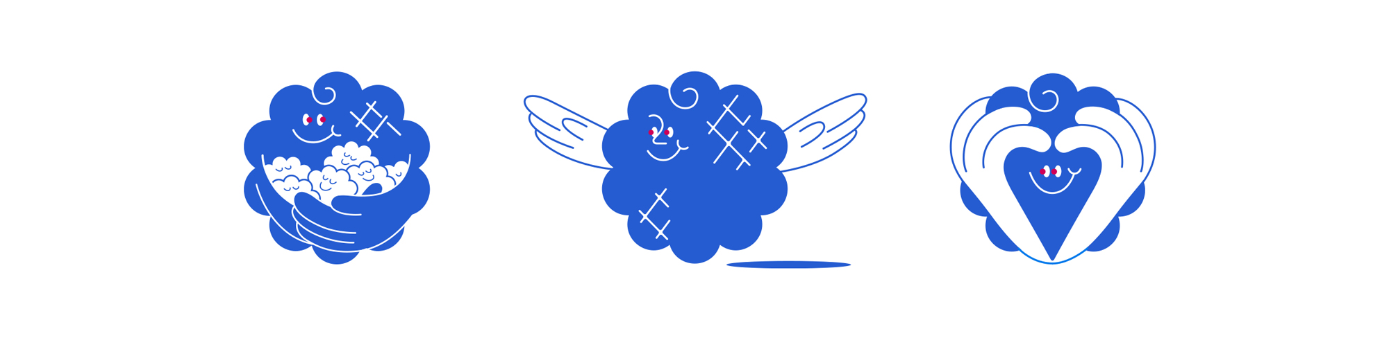
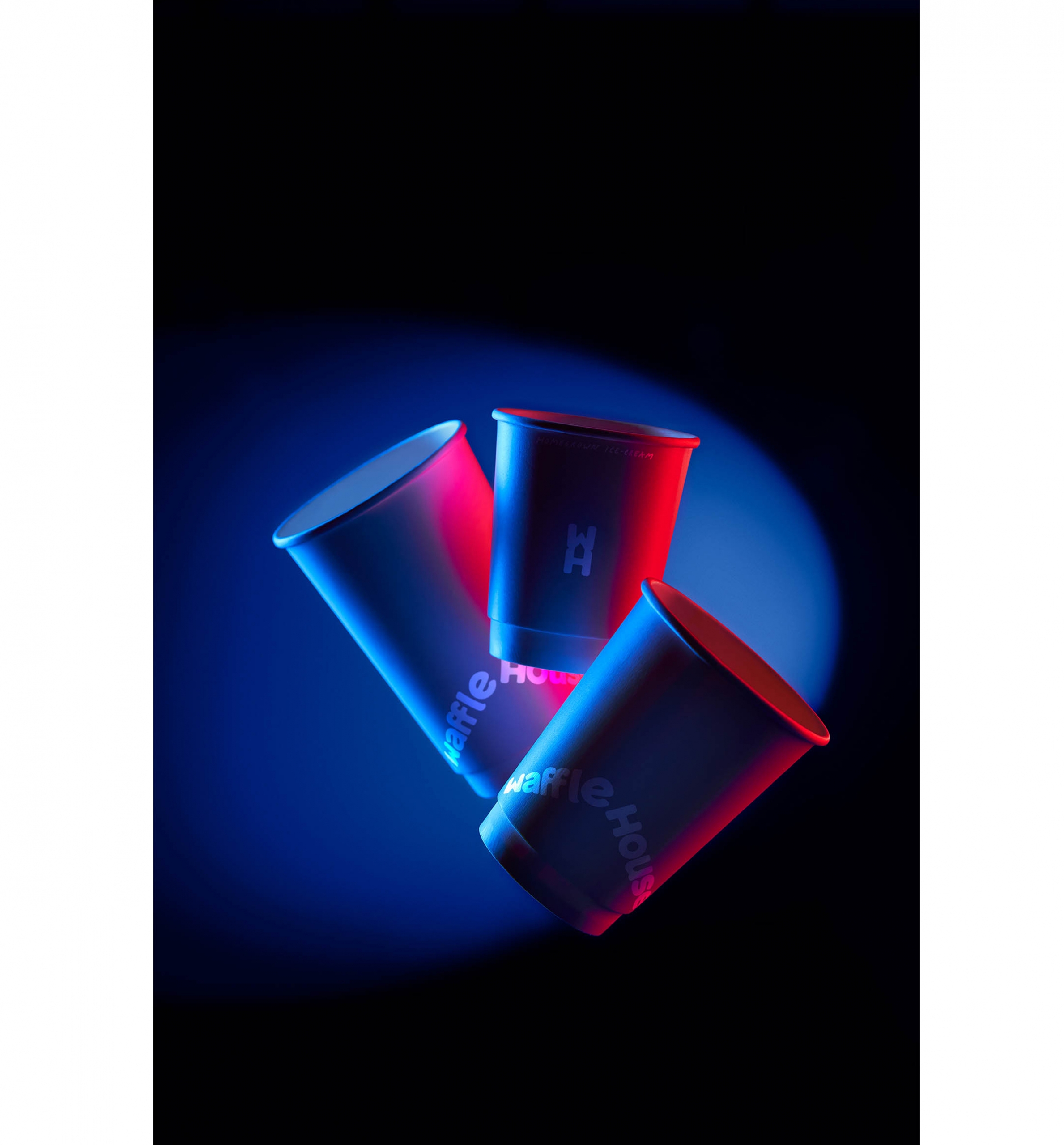
For the brand applications, the system of illustrations, design elements, and verbal elements we created emphasize storytelling related to the production process and practices such as tasting, which is practiced as a point-of-sale practice. By creating a whole world that appeals to ice cream lovers our approach expresses values such as care and enjoyment, welcoming the audience to the new era of Waffle House.


We focus on branding and design with purpose. We produce every project with passion, achieving expressive, bold and innovative communication.
STUDIO
We help brands empower their vision through meaningful design solutions.
We are a group of creatives with expertise in different skills, providing innovative alternatives beyond the predictable.
Numbers in our agency remain consciously small, while a solid network of professionals complements our work.
Every single project can be monitored at any stage before its completion, in a flexible and effective manner.
Designers communicate directly with clients, taking their needs into account and helping them gain their share in the domestic and international market.
Drop us a line.
We're looking forward to speaking with you.
Distinctions ___


Branding ___
Creative direction
Logotype
Visual identity
Packaging design
Naming
Printing material design
Signance & Enviroment
Logotype
Visual identity
Packaging design
Naming
Printing material design
Signance & Enviroment
Digital ___
Website
E-commerce
Application
Content development
E-commerce
Application
Content development
Production ___
Photography
Print process
Supervision
Print process
Supervision
-
Publications ___
-
Responsive LogoSandu Publishing, 2018
-
Monocle, Issue 109Monocle, 2017-18
-
Slanted #30 - AthensSlanted Publishers, 2017
-
Regional Product PackagingImages Publishing, 2017
-
BRANDLife: Concept Stores & Pop-upsVictionary, 2017
-
Los Logos 8Gestalten, 2016
-
Clothing Packaging DesignImages Publishing, 2016
-
Takeaway Food Packaging NowImages Publishing, 2016
-
Logo ParadeSandu Publishing, 2016
-
Gallery magazineChois publishing, 2015
-
Sample. magazine2015
-
Unpack Me Again!Sandu Publishing, 2015
We shape our team. We stay nimble.
We are always on the lookout for effective and creative people. We currently have no positions or internships, but you may send us your portfolio for consideration in the future.